
Professional Services
Brand Strategy, Visual Identity, Brand Guidelines, Web Design
The Brand
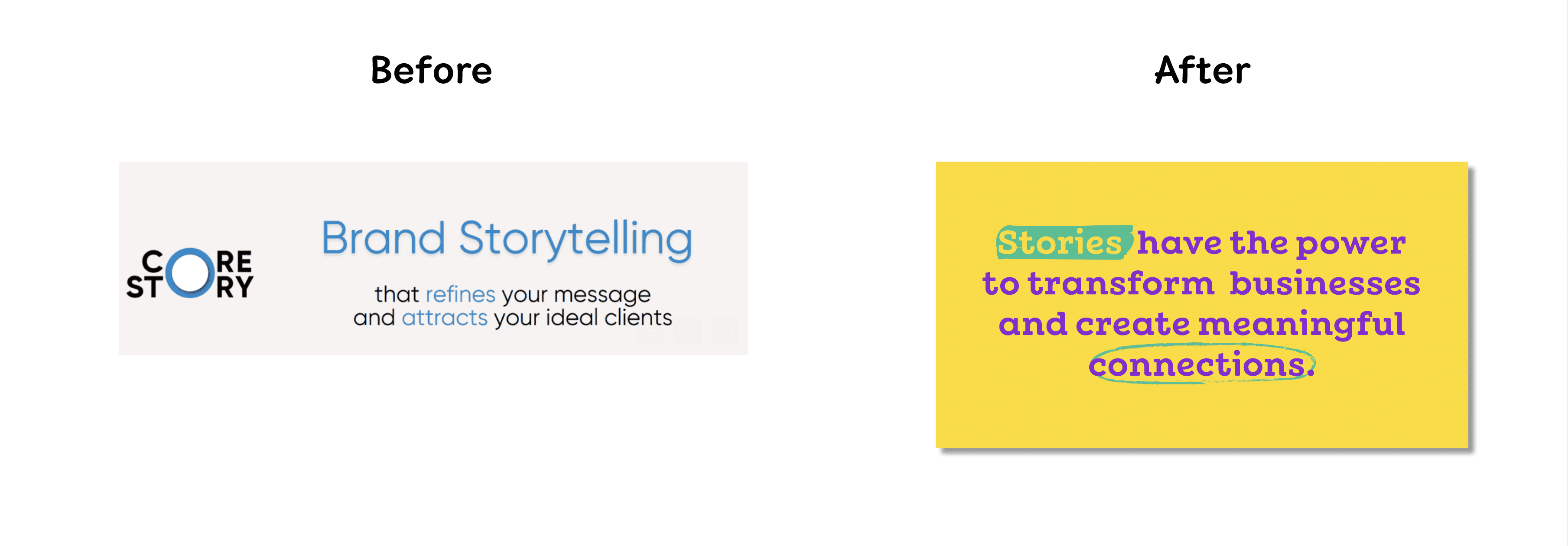
Core Story is built on a simple belief: stories connect us in ways nothing else can.
Their mission is to transform businesses by uncovering and articulating stories that deeply resonate with their audiences, teams, and communities.
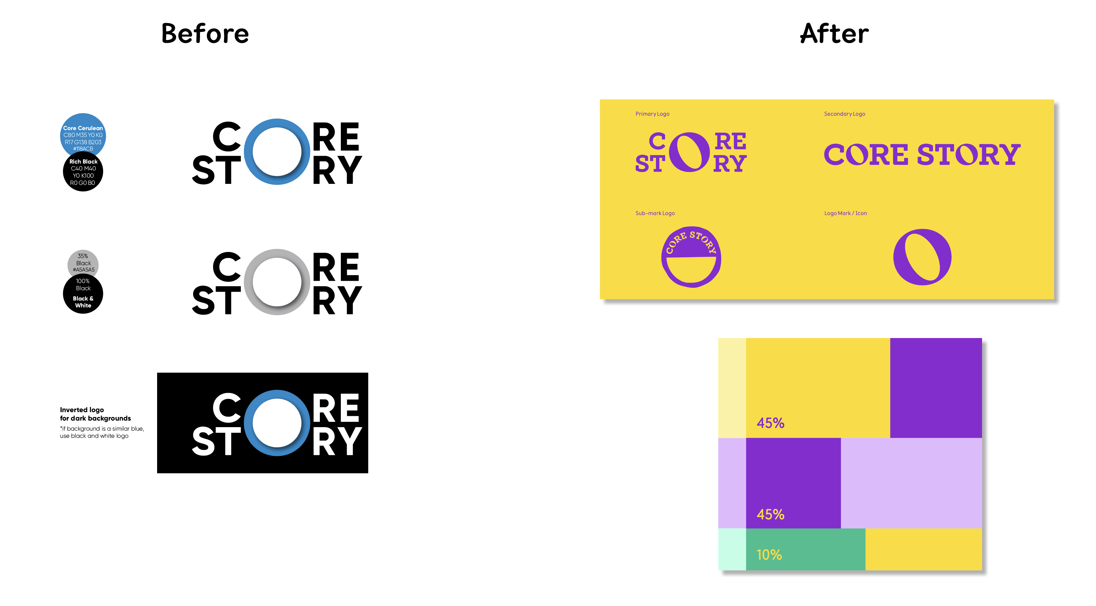
As Core Story grew, it became clear that the original identity no longer reflected the brand’s maturity or purpose. The business had evolved, but its visuals and messaging still spoke to an earlier stage. It was time for a rebrand that could align who they are today with the story they wanted to tell next.
The Challenge
Core Story had a strong foundation but lacked cohesion across its visual and verbal identity.
The rebrand needed to capture the essence of what they do best: simplify complex ideas and amplify what makes each brand extraordinary.
The goal was to create a system that communicates clarity, empathy, and creativity while staying warm, confident, and distinct across every touchpoint.
Brand Strategy
We began by refining the brand’s core.
Together, we defined its purpose, vision, and values to bring alignment and clarity.
Purpose: Help businesses connect with their audiences through storytelling.
Vision: Make clarity and authenticity the cornerstone of every brand’s success.
Mission: Craft stories that move people and build lasting relationships.
Values: Learning, Communication, and Creativity — curiosity, connection, and simplicity in action.
From these principles came a clear brand narrative:
Core Story is where meaningful connections begin.
We refined the brand voice to feel clear, empathetic, inspiring, and playful with purpose. Every word had to feel natural and grounded in human connection.
Visual Identity
The rebrand was designed to feel confident, human, and creatively alive.
Every element was crafted to reflect the clarity and emotional depth that define Core Story.
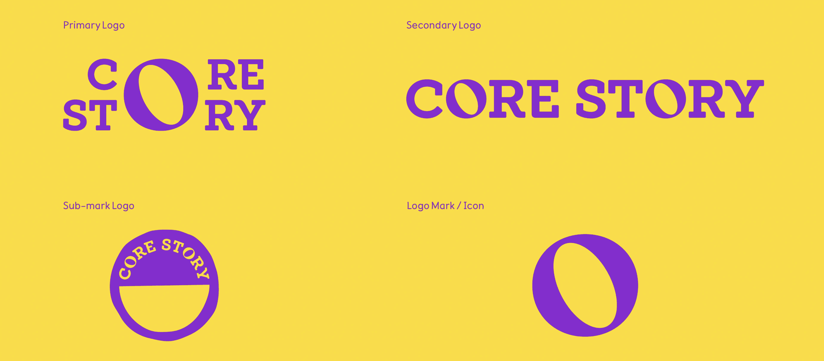
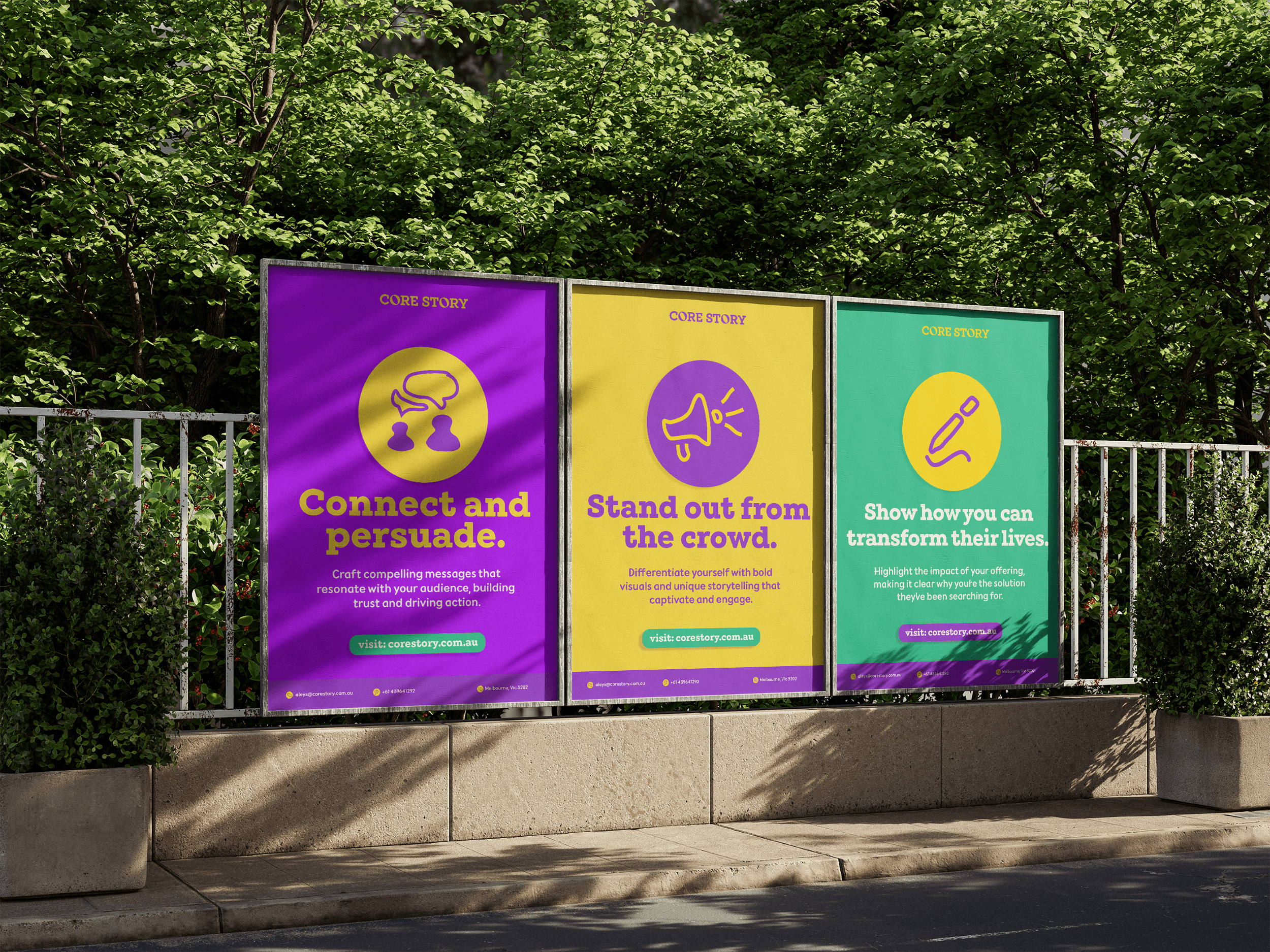
Logo
The logo represents the heart of storytelling. The circular “O” embodies connection, unity, and endless possibility. Its form feels both structured and fluid, expressing the balance between clarity and creativity.
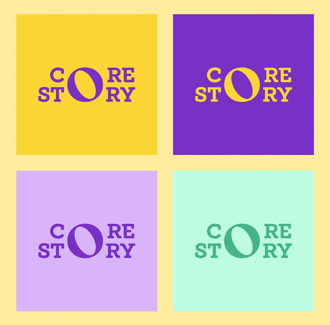
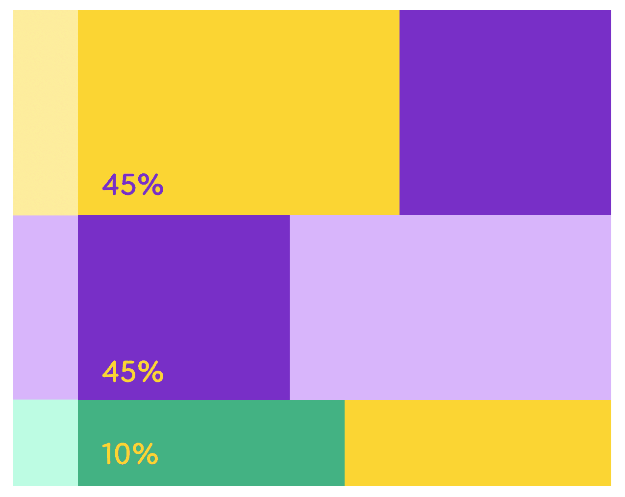
Colour Palette
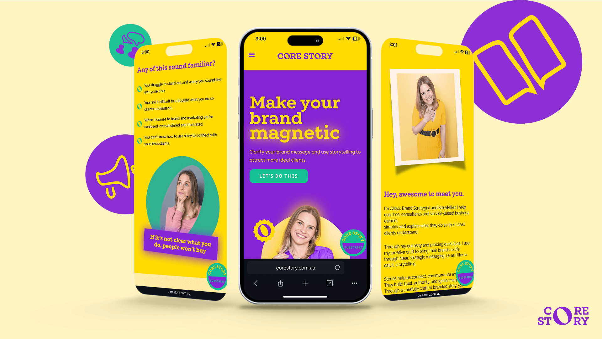
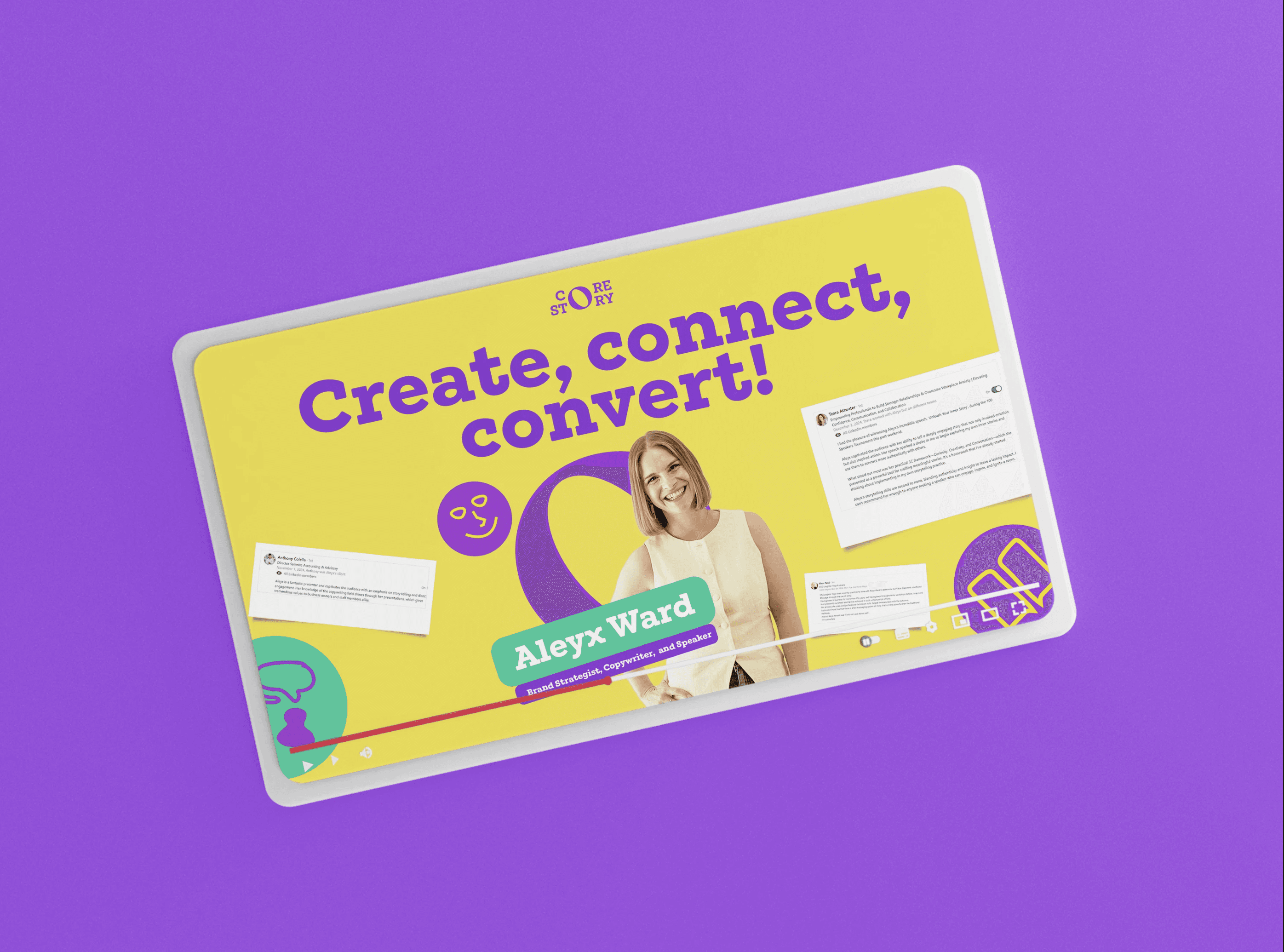
The colour system radiates energy and optimism.
Purple brings creativity and confidence.
Sunshine Yellow adds warmth and positivity.
Turquoise represents growth and clarity.
Together, they create a modern and approachable visual language that feels vibrant and alive.
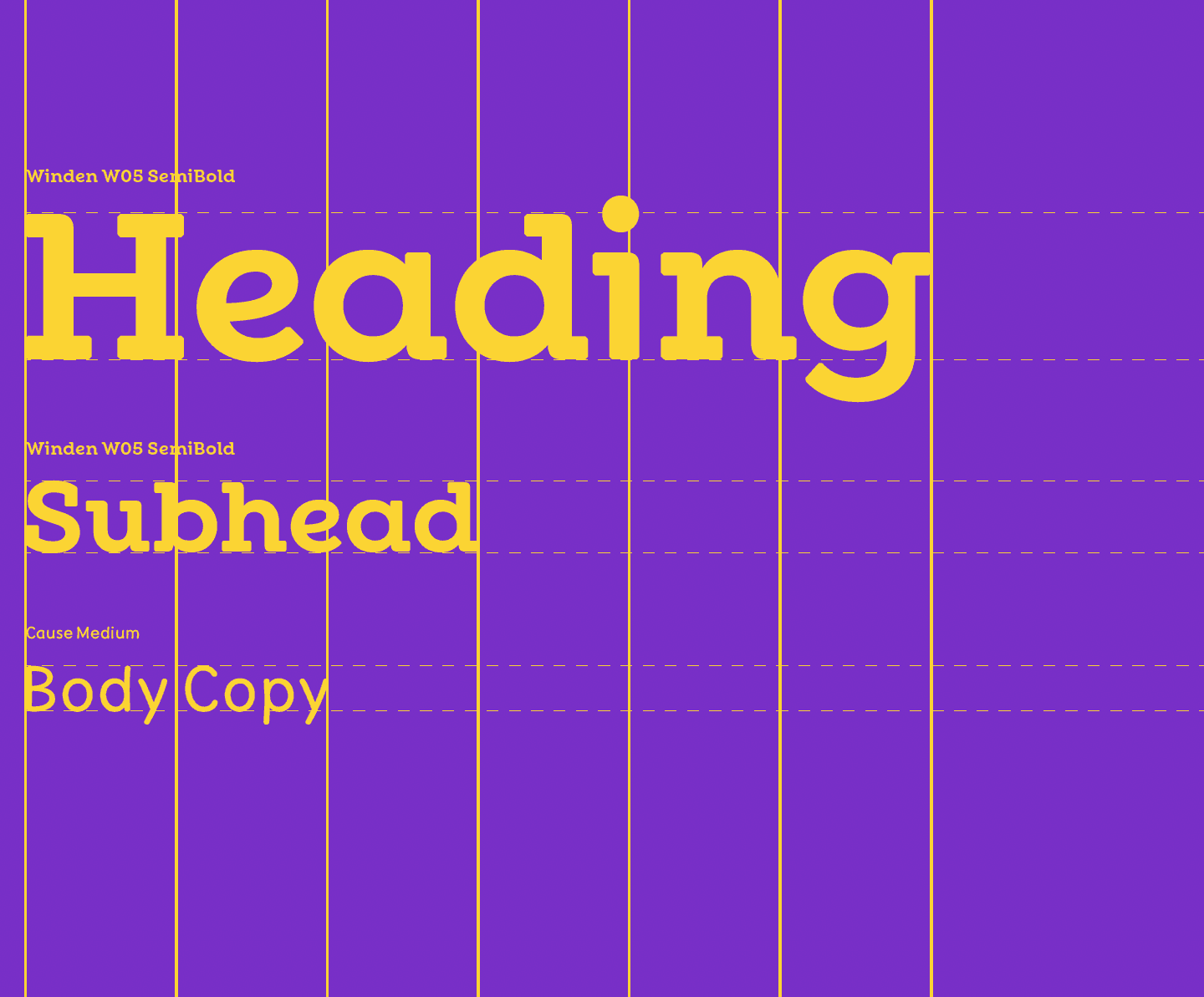
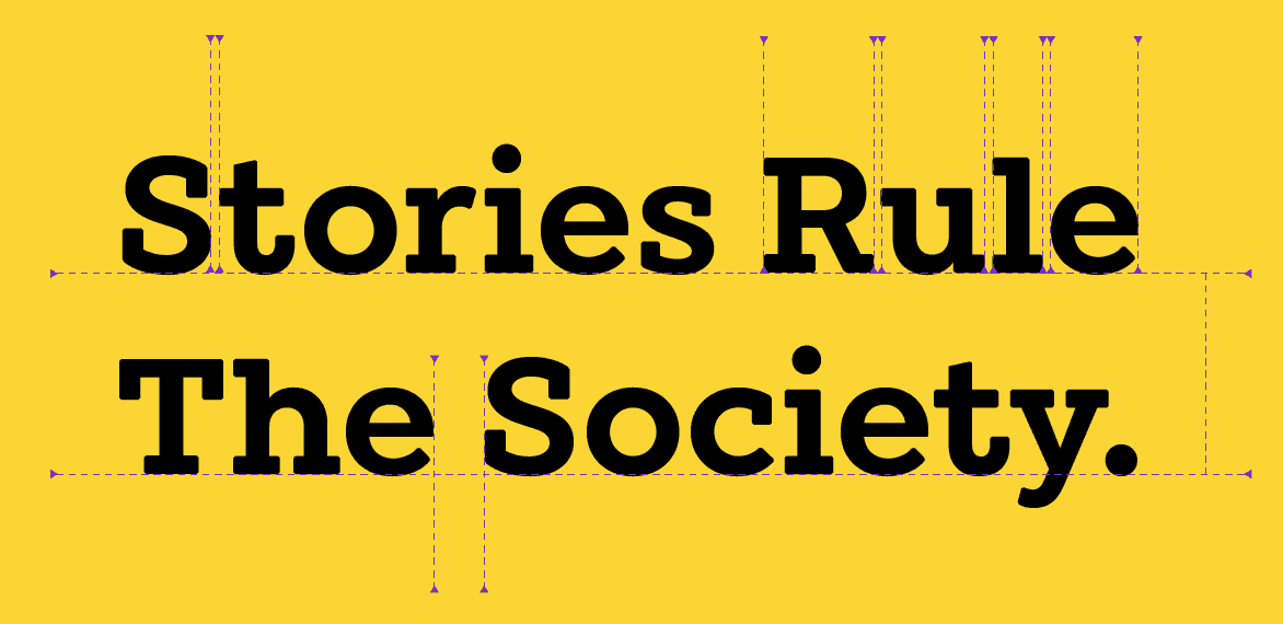
Typography
Winden delivers strength and presence for headlines, while Cause adds friendliness and flow to body text. The combination keeps the identity professional but conversational.
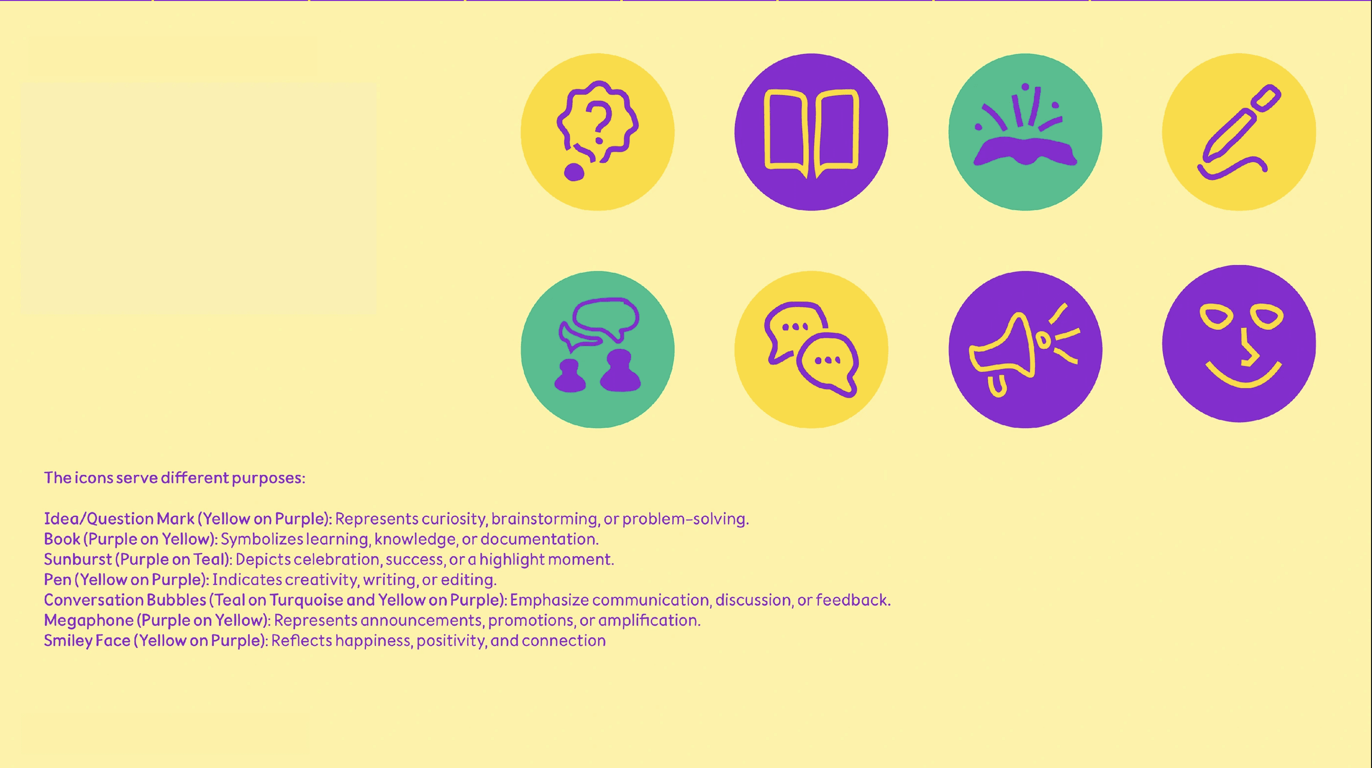
Iconography
A custom icon set adds personality and meaning to the system. Each icon reflects one of the brand’s pillars: communication, creativity, curiosity, and connection.
Brand Guidelines
All elements came together into a comprehensive brand system.
The guidelines outline how the brand looks, feels, and speaks across every medium, ensuring consistency as Core Story scales its communication.
The Outcome
The rebrand gave Core Story a clear and confident identity that matches its purpose.
It feels authentic, cohesive, and instantly recognisable — a true reflection of a brand that helps others find and tell their story.
Core Story no longer just helps brands communicate. It now embodies the power of storytelling in every detail.
Not sure if Koollab is the right fit? Let’s chat.
We’ll answer all your questions and give you an honest assessment on if we can add substantial value to you.

