Home Maintenance
Brand Strategy, Visual Identity, Motion Identity, Brand Guidelines
The Brand
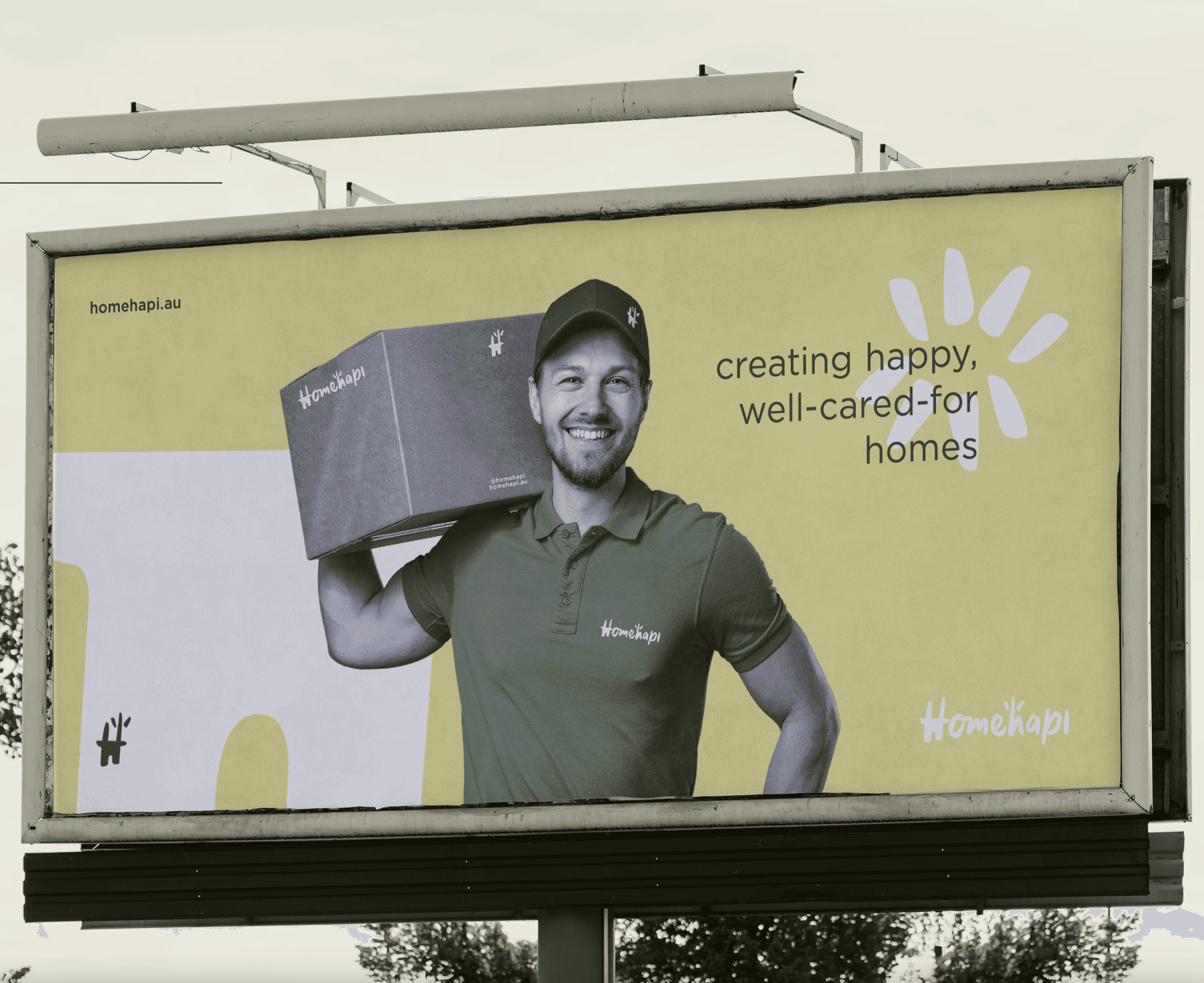
Homehapi is a smart home and property maintenance brand built to simplify home ownership. The company connects homeowners with reliable trades, services, and tools through one central platform that turns home care into a seamless experience.
As Homehapi prepared to scale, they needed a brand that felt modern, trustworthy, and relatable — something that could bridge technology and everyday life. The identity needed to appeal to both homeowners and service providers while making the experience feel simple, positive, and human.
The Challenge
Home maintenance can be stressful, fragmented, and impersonal. The challenge was to design a brand that could make it feel effortless, friendly, and intuitive.
Homehapi’s existing presence lacked cohesion and emotional warmth. The goal was to create a visual identity that felt both tech-forward and human, positioning Homehapi as a lifestyle brand rather than just another service app.
Brand Strategy
The brand strategy centred on one clear idea:
Make home care feel easy, reliable, and even enjoyable.
We defined Homehapi’s personality as approachable, dependable, and optimistic — a helper that makes people feel at ease. The name itself guided the emotional direction: it should look and sound like happiness, but feel grounded and functional.
Tone of voice was built around clarity and calm confidence, speaking to people in a way that inspires trust without overpromising. The visual identity was designed to reflect that same simplicity — straightforward yet warm, innovative yet familiar.
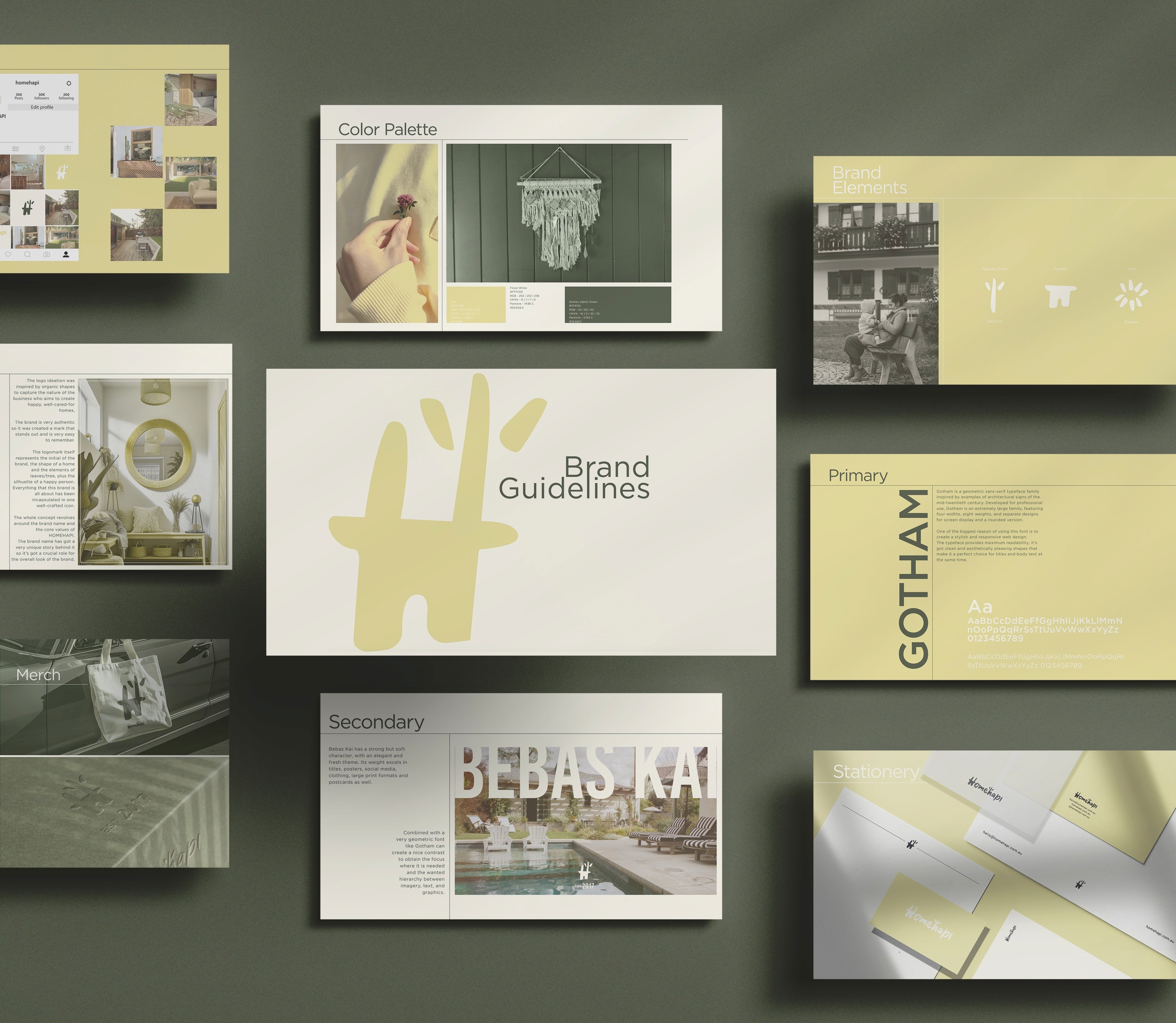
Visual Identity
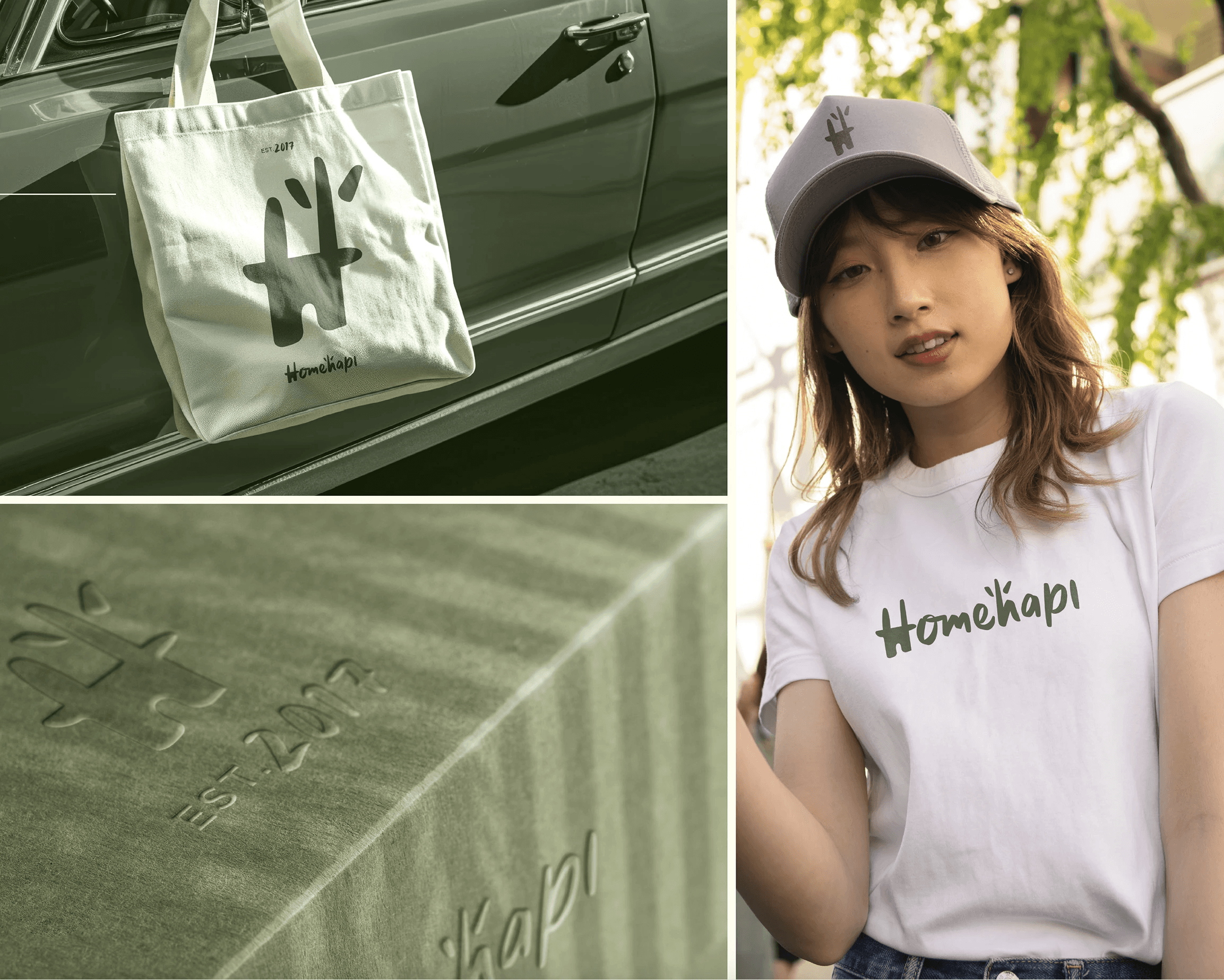
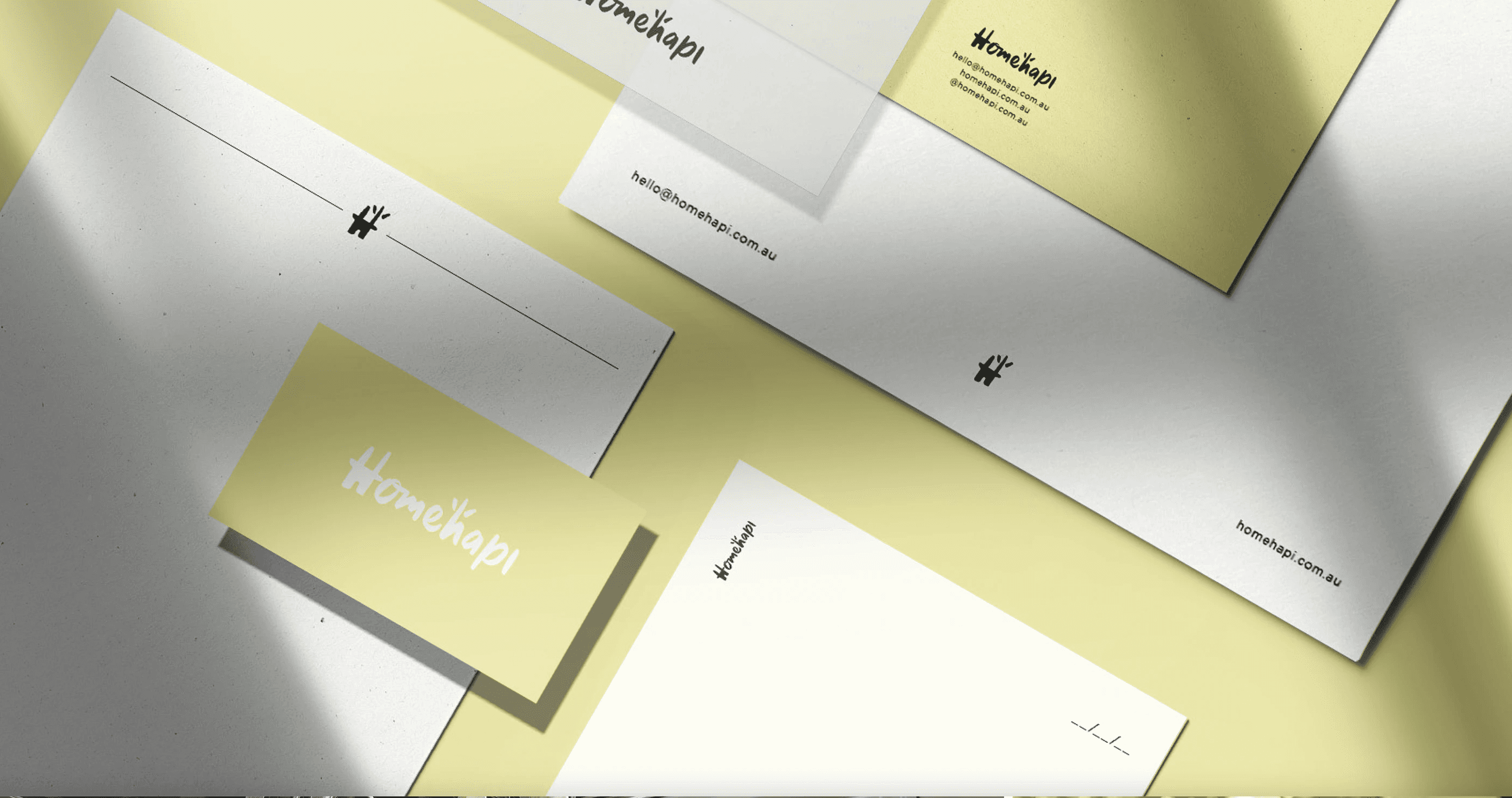
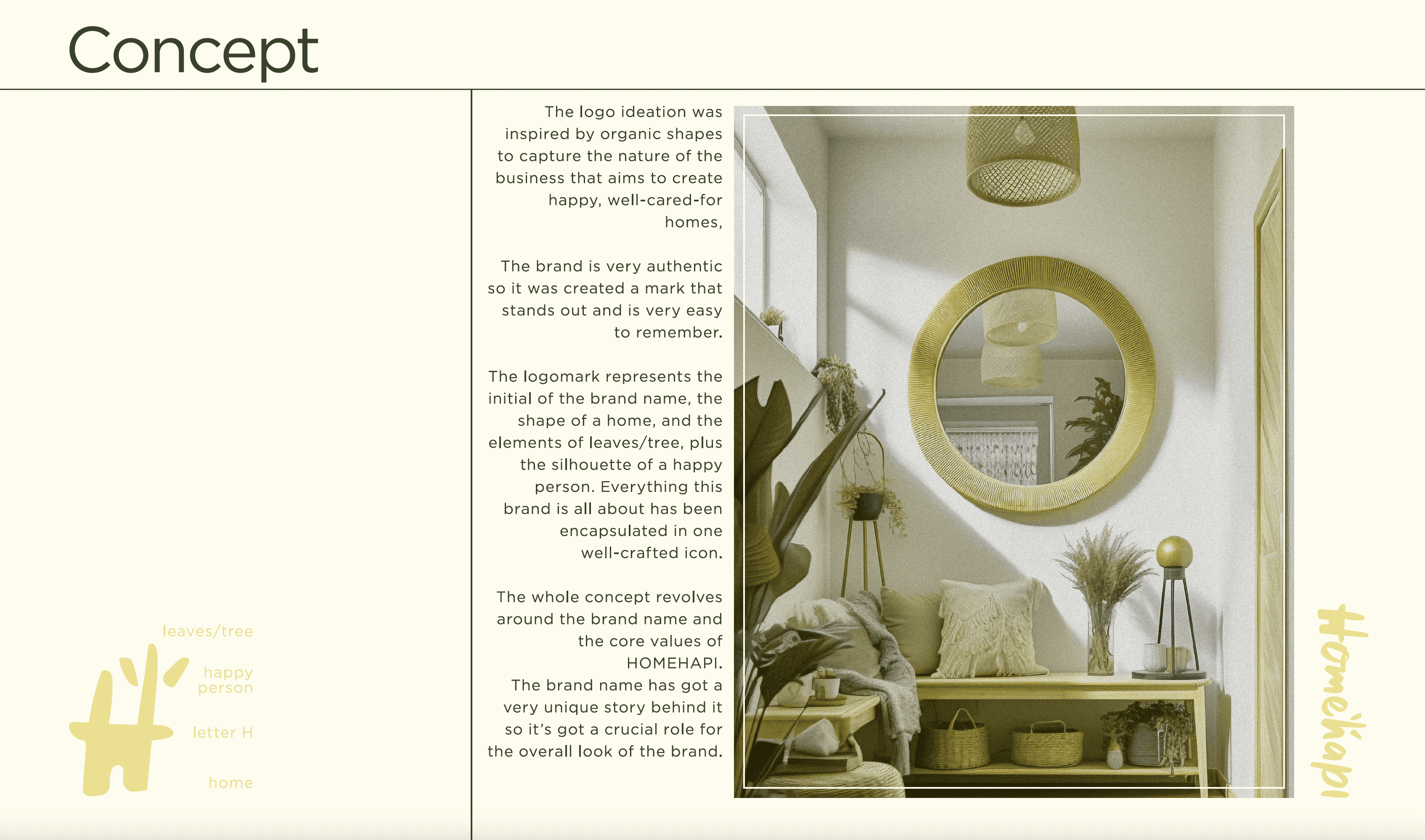
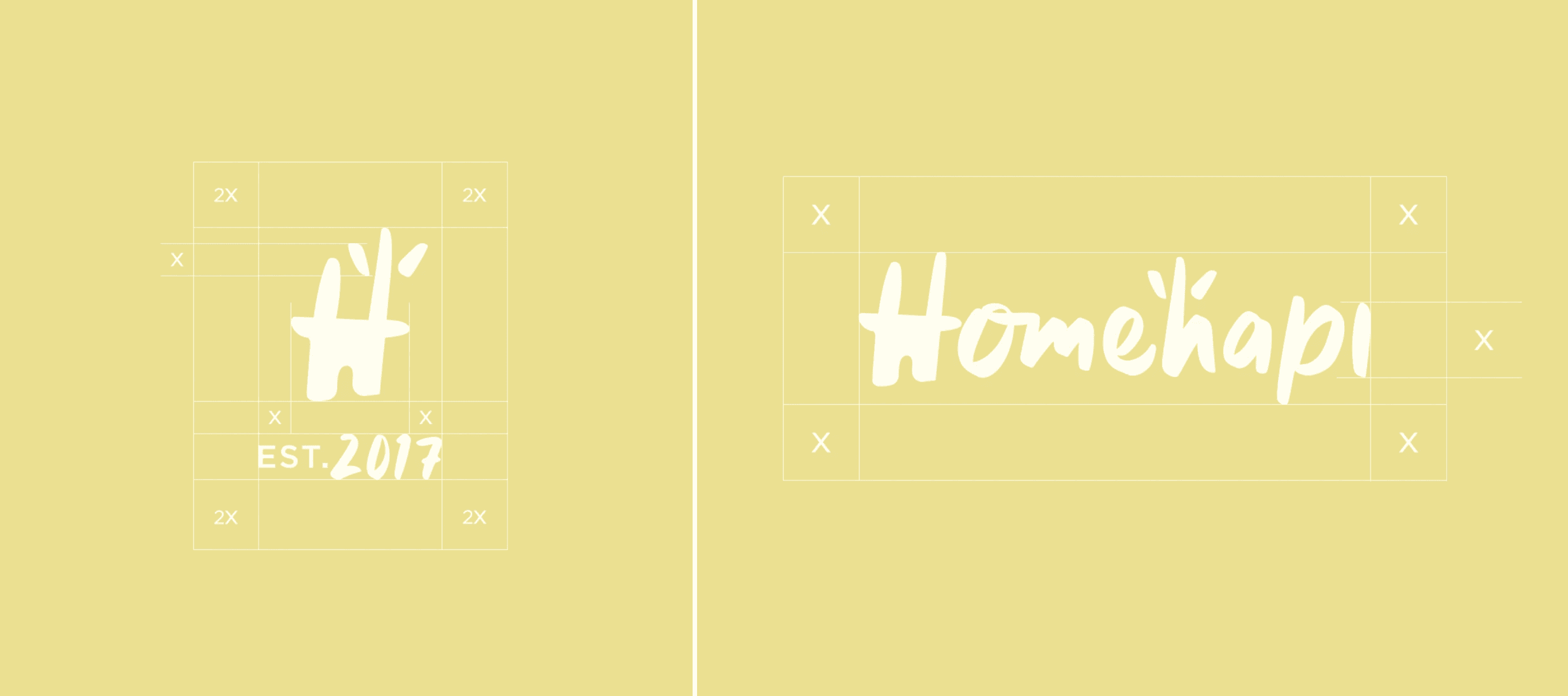
Logo
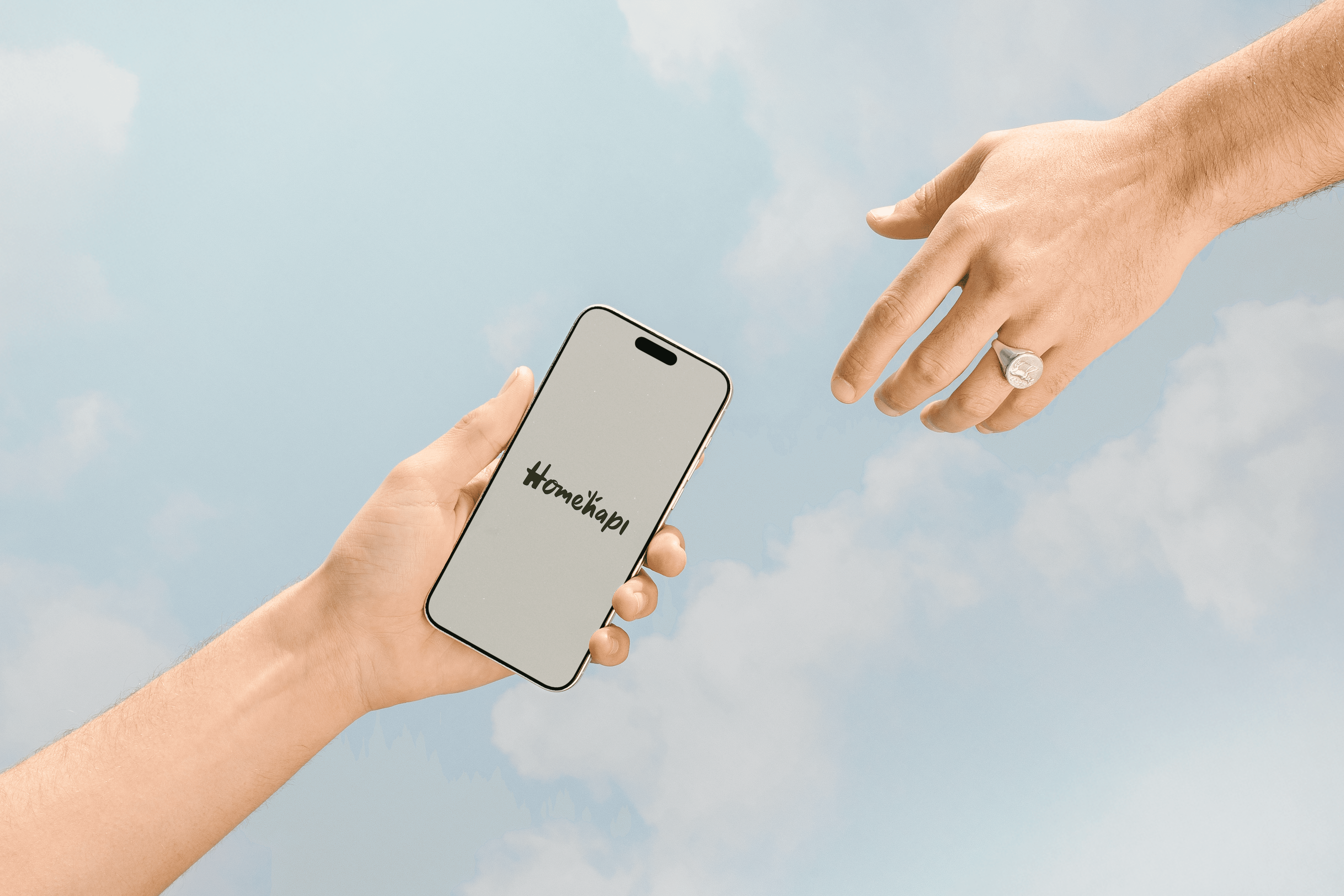
The logo captures the essence of Homehapi’s purpose. Its rounded letterforms and friendly geometry convey comfort and approachability, while maintaining a sense of structure and reliability. The subtle motion concept built into the logo animation represents the smooth flow between home, happiness, and help — the core of what Homehapi stands for.
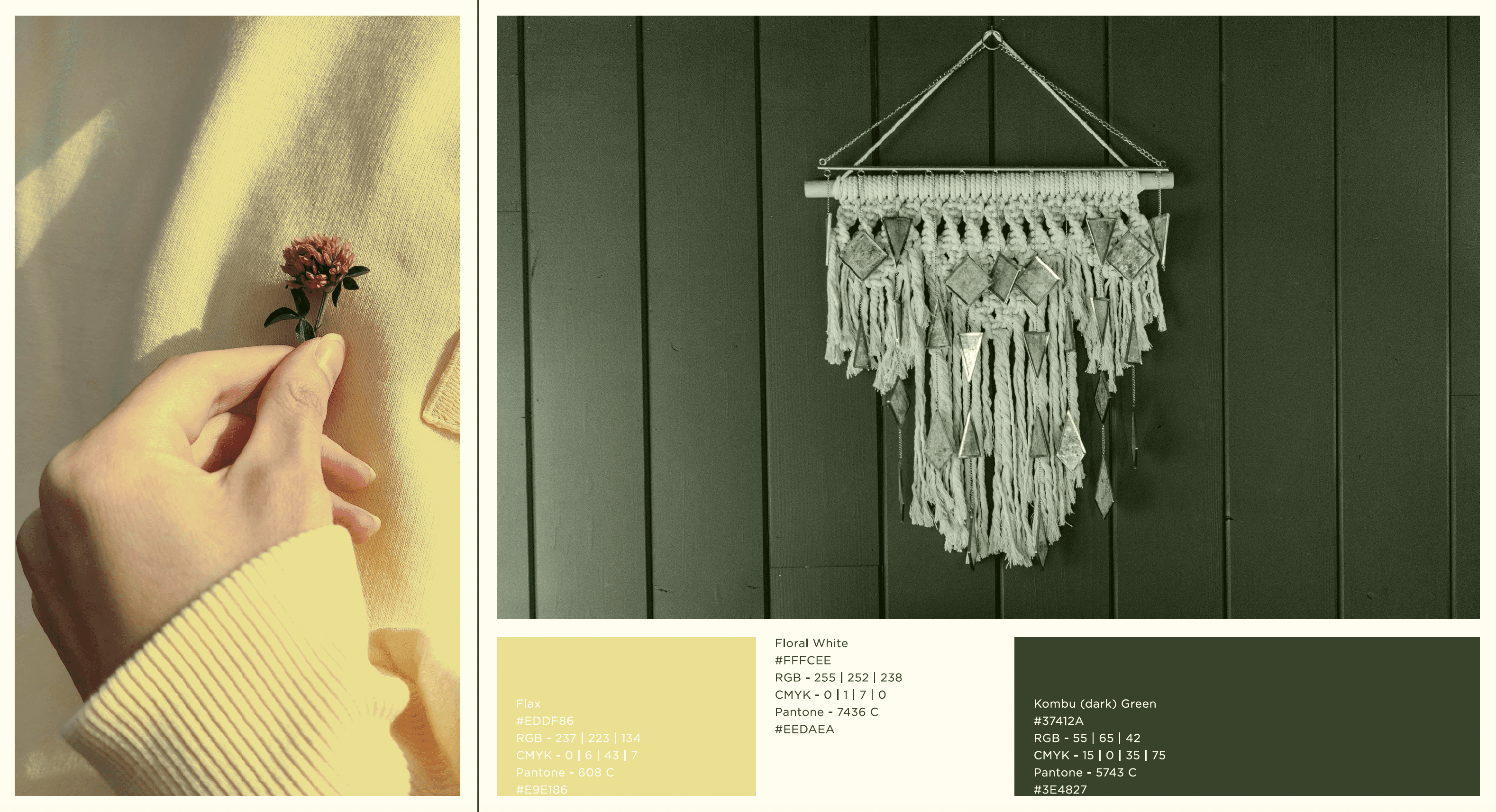
Colour Palette
The colour palette combines soft warmth with modern clarity.
The main tones are Sunny Yellow and Deep Blue, symbolising optimism and trust. These are supported by neutral tones to provide balance across digital and physical applications. Together they create a calm yet confident visual system that works seamlessly across the app, web, and marketing materials.
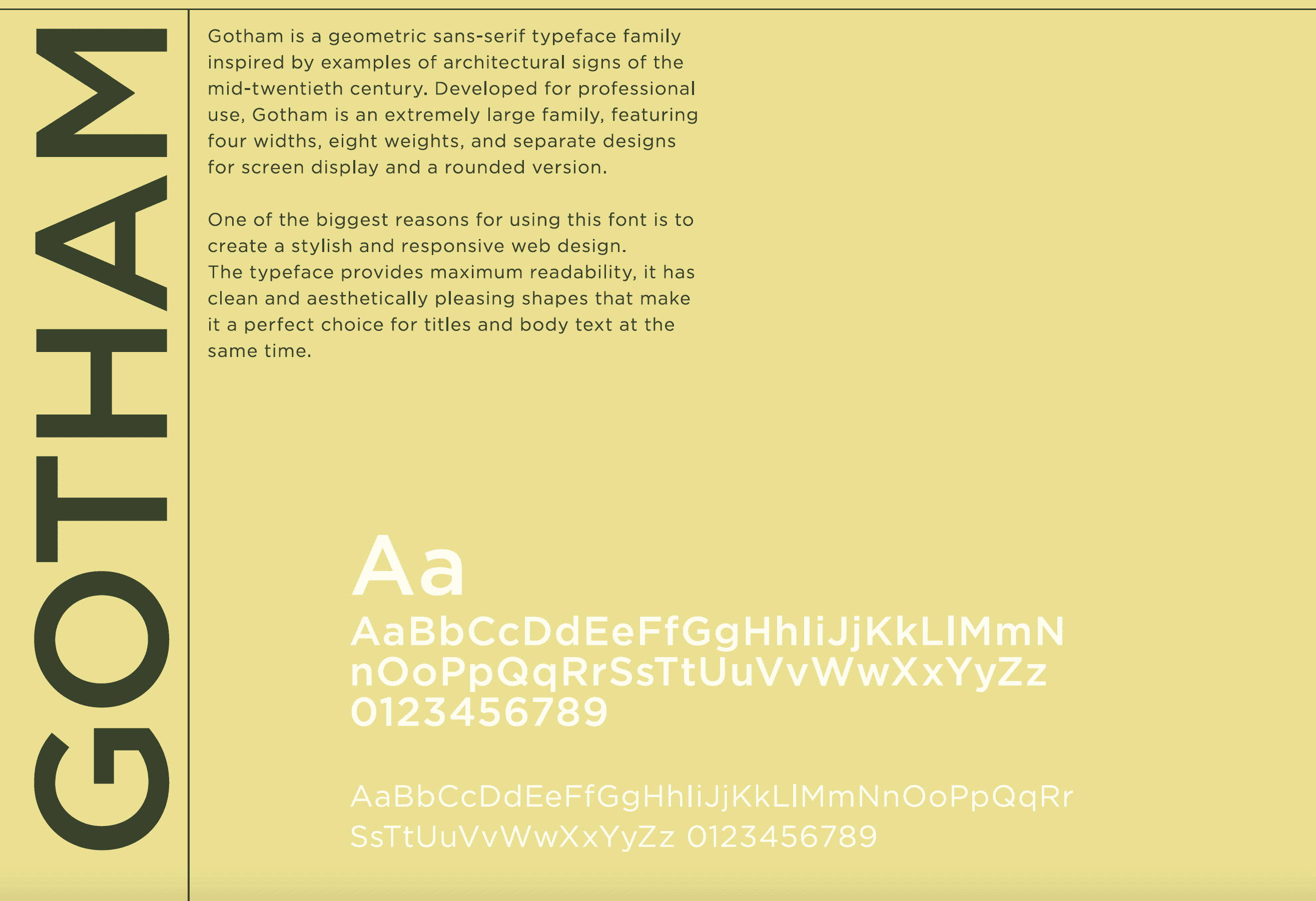
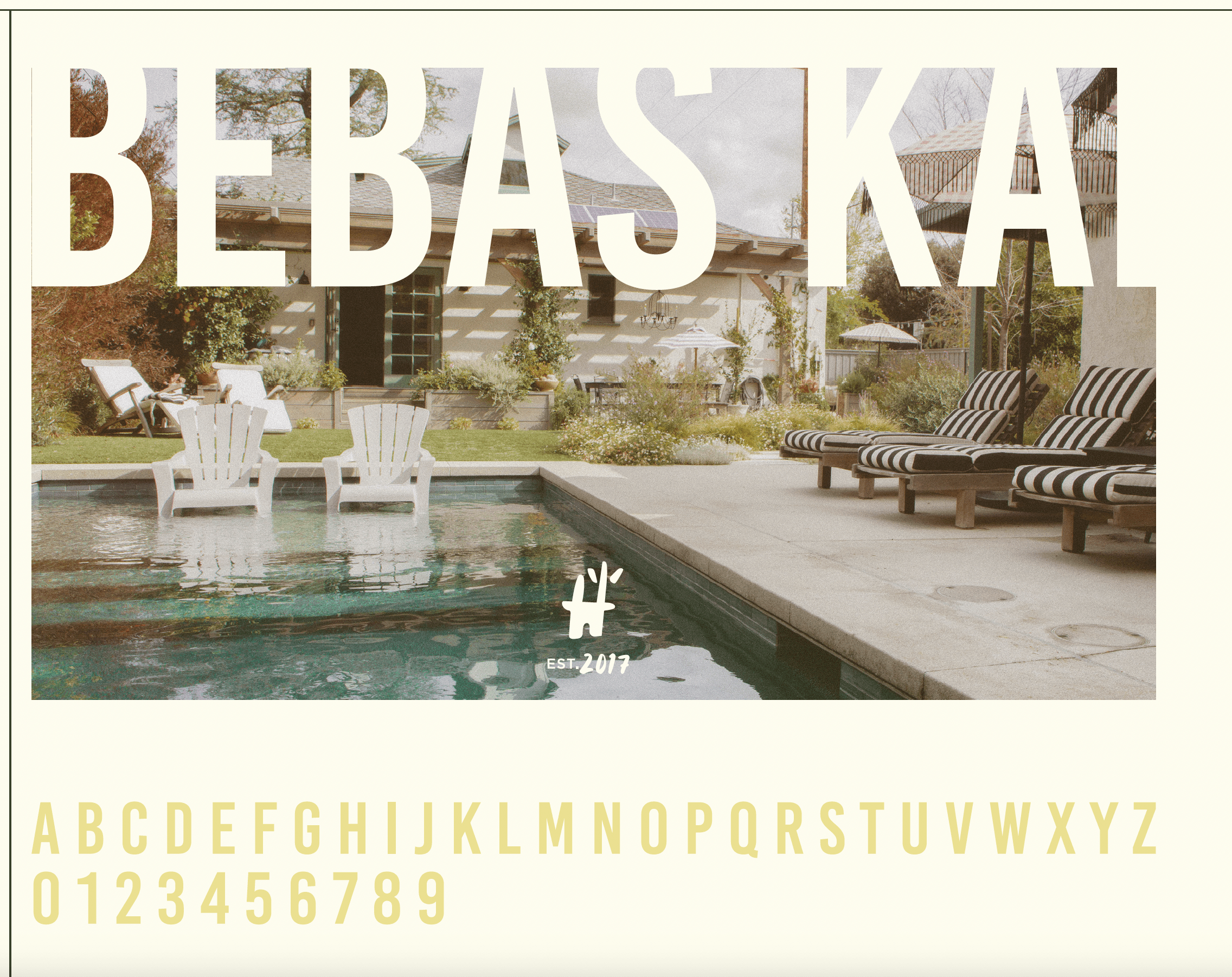
Typography
Typography plays a central role in building recognition and accessibility.
A clean sans-serif typeface was chosen for its readability and versatility. Rounded edges mirror the logo’s softness, while strong proportions ensure clarity at every size. The combination feels both modern and friendly, reflecting Homehapi’s focus on simplicity and reliability.
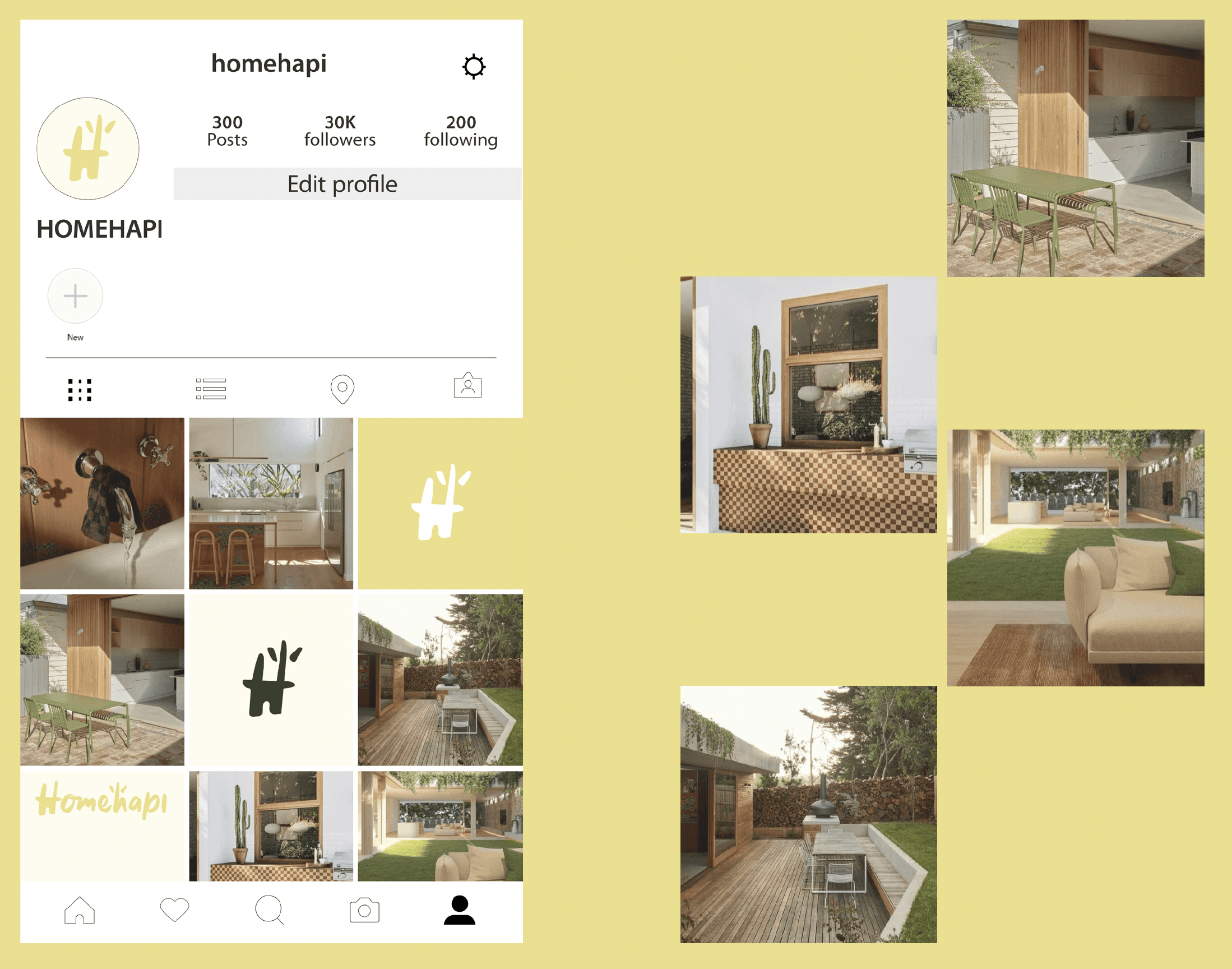
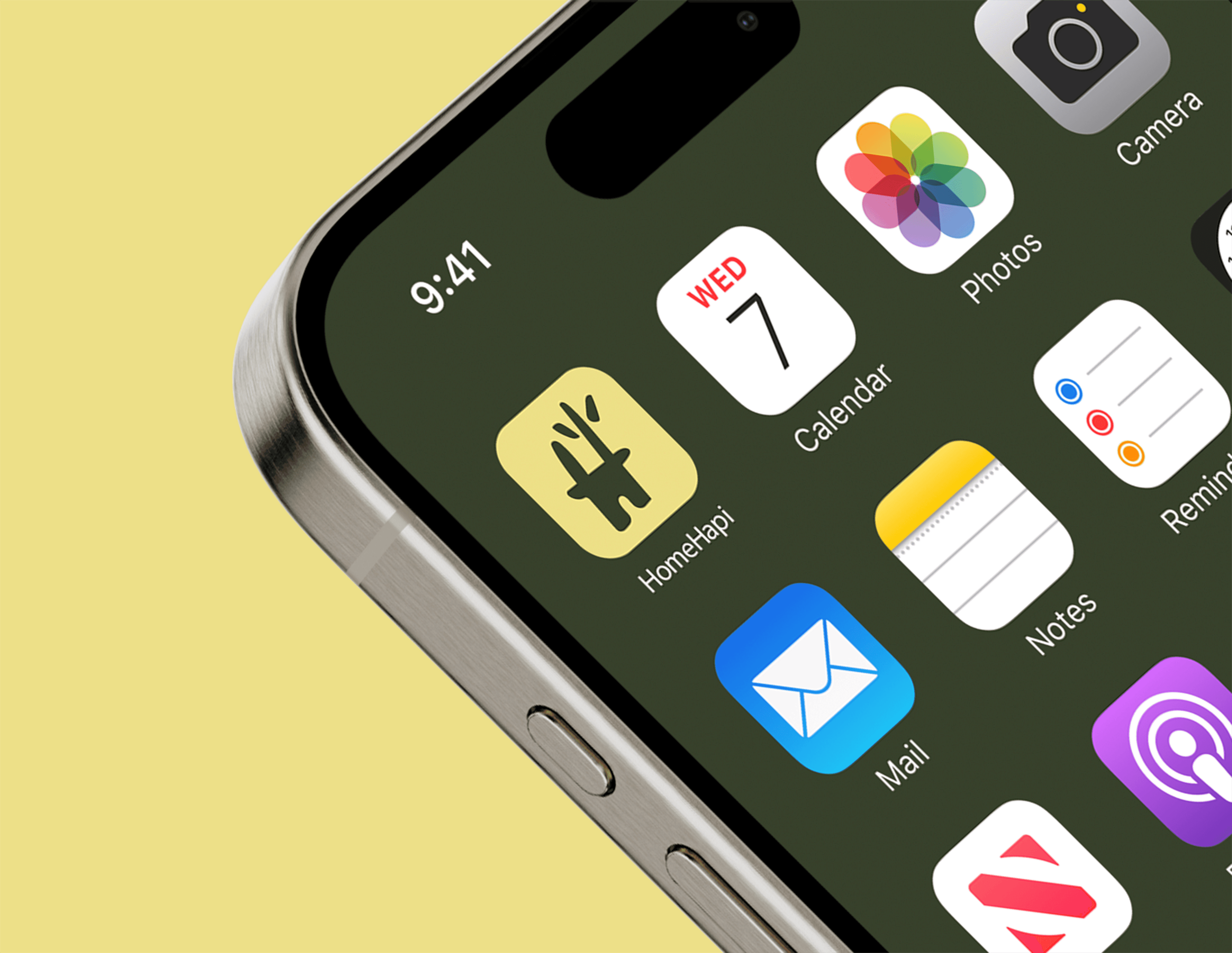
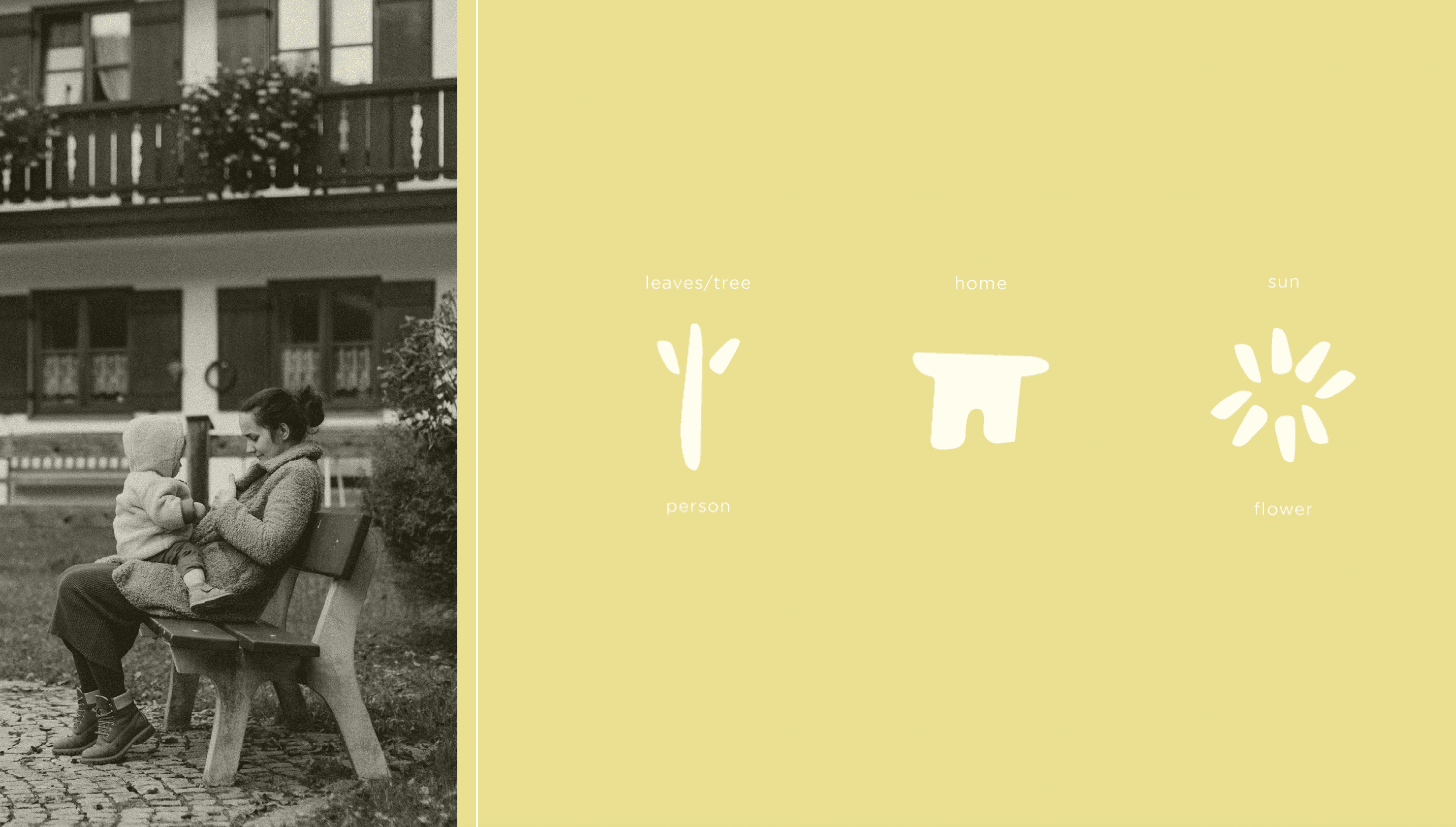
Iconography and Motion
Icons are built with simple geometric shapes, using consistent line weights and soft corners to echo the brand’s personality.
The motion identity adds a layer of life and optimism — subtle transitions and flowing animations reinforce the idea of ease and movement without overwhelming the experience.
Brand Guidelines
All visual elements were unified into a flexible design system.
The guidelines include colour ratios, typography hierarchy, icon usage, and motion direction, ensuring the brand can scale while staying consistent. Every component was built for adaptability across the mobile app, marketing website, and print materials.
Outcome
The result is a cohesive brand that feels human, intelligent, and full of optimism.
Homehapi now stands out in the home services industry as a tech brand that leads with empathy and simplicity. The new identity helped position them as a trusted partner for homeowners and a forward-thinking platform for service providers.
Homehapi’s rebrand transformed home maintenance from a chore into a calm, connected experience — making life at home feel a little happier.