
Home Maintenance
Brand Development, Discovery & Research, Positioning, Brand Guideline, Visual Identity
About the Brand
Challenge
The Bedside Crew came to us with a clear mission, but no name, identity, or direction for how to bring it to life. The challenge was to build the brand from the ground up—starting with a name that captured their warmth, care, and commitment to making a real difference in people’s lives. It needed to balance medical credibility with emotional connection, standing out in a space often filled with cold, clinical brands.
Outcome
We developed a name and brand that feels human, supportive, and easy to trust. The Bedside Crew communicates care and presence from the very first touchpoint. The visual identity builds on this feeling with calming colours, soft typography, and imagery centred around real people and real moments. The result is a brand that’s not only professional and credible—but genuinely comforting and memorable.
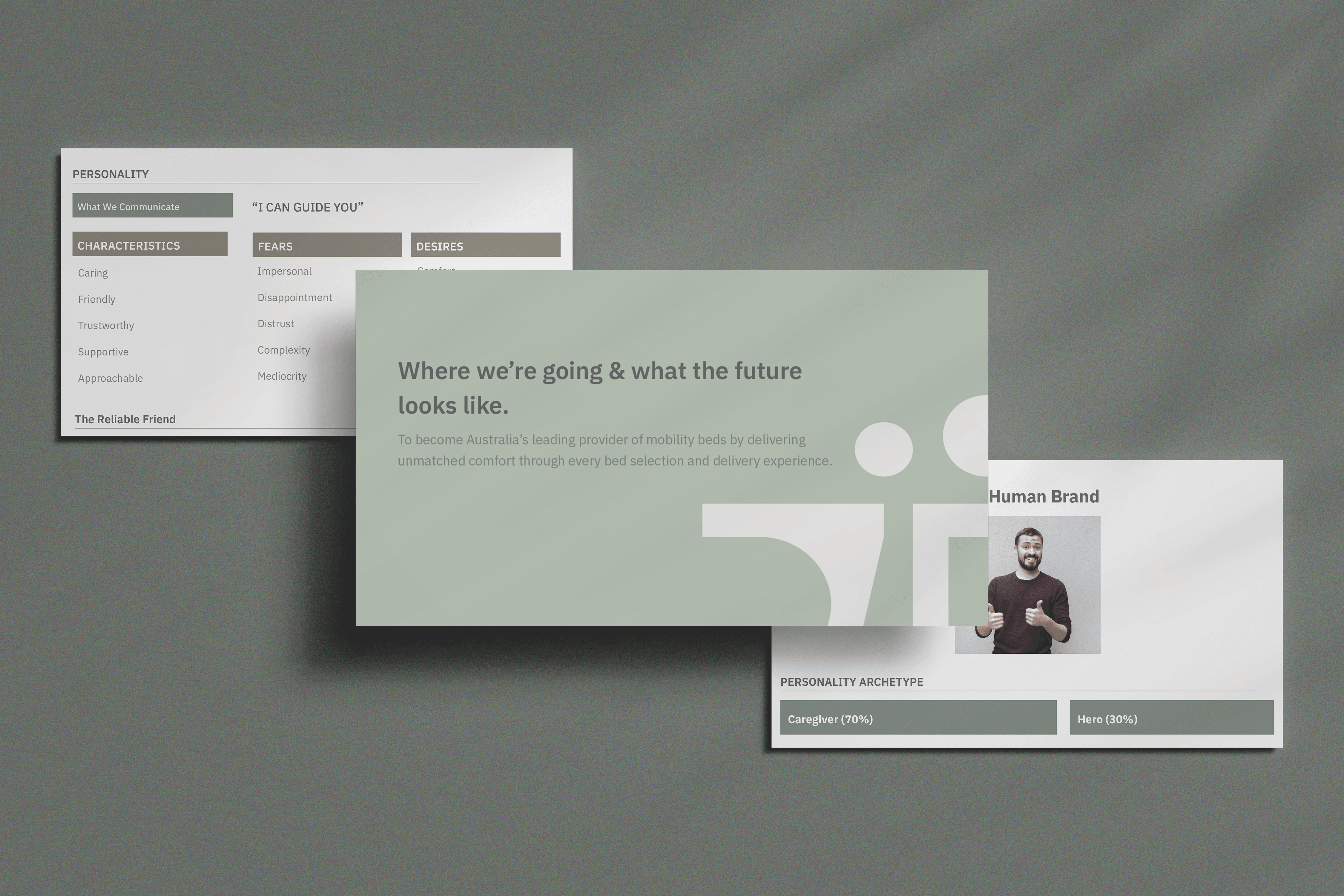
Brand Strategy
Discovery
We conducted in-depth brand strategy work with the founder to uncover the business’s long-term vision, market challenges, and the unique opportunity it brings. Through competitor analysis and audience insight, we identified a saturated landscape filled with tactical execution, short-term thinking, and brands that looked and sounded the same. This opened the door to build something distinctly different—one that signals momentum, creativity, and growth.
Focus
Our research showed that businesses were tired of disjointed execution and brand fluff. To solve this, we positioned the brand as a forward-thinking partner that blends strategic leadership with innovation—backed by a SaaS product designed to scale impact. The brand leads with energy, clarity, and a strong sense of partnership, offering a fresh alternative to the status quo.
Visual Identity
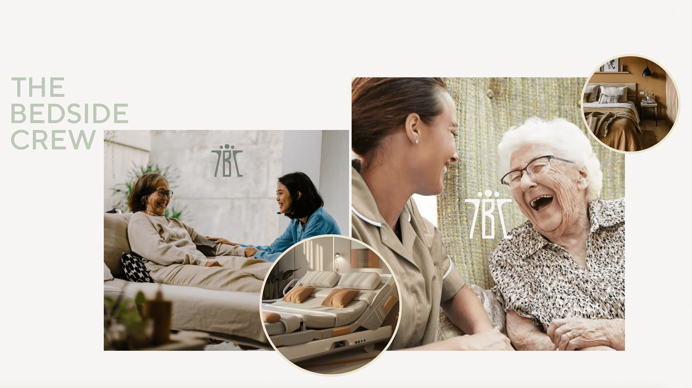
The visual language of The Bedside Crew is calm, welcoming, and human-centred. It’s designed to reflect the care, compassion, and support that define the brand’s mission. Clean compositions, soft tones, and customer-focused imagery create a consistent and approachable feel across all brand touchpoints.
By incorporating brand colours and focusing on real-life, relatable moments, the visual style reinforces the sense of comfort, trust, and dignity we aim to provide. Every element is thoughtfully chosen to support a seamless, stress-free experience—mirroring the values that guide us in every interaction.
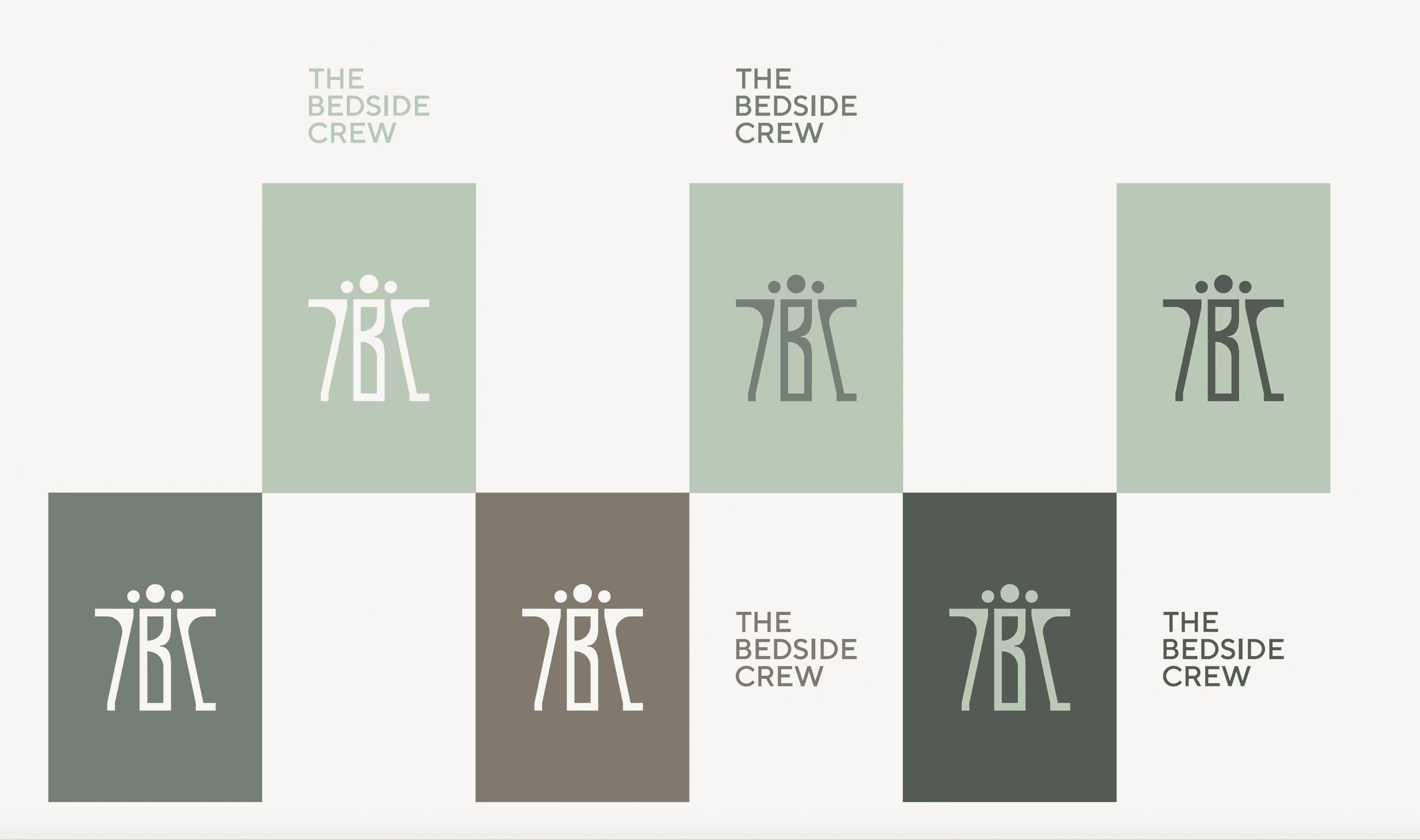
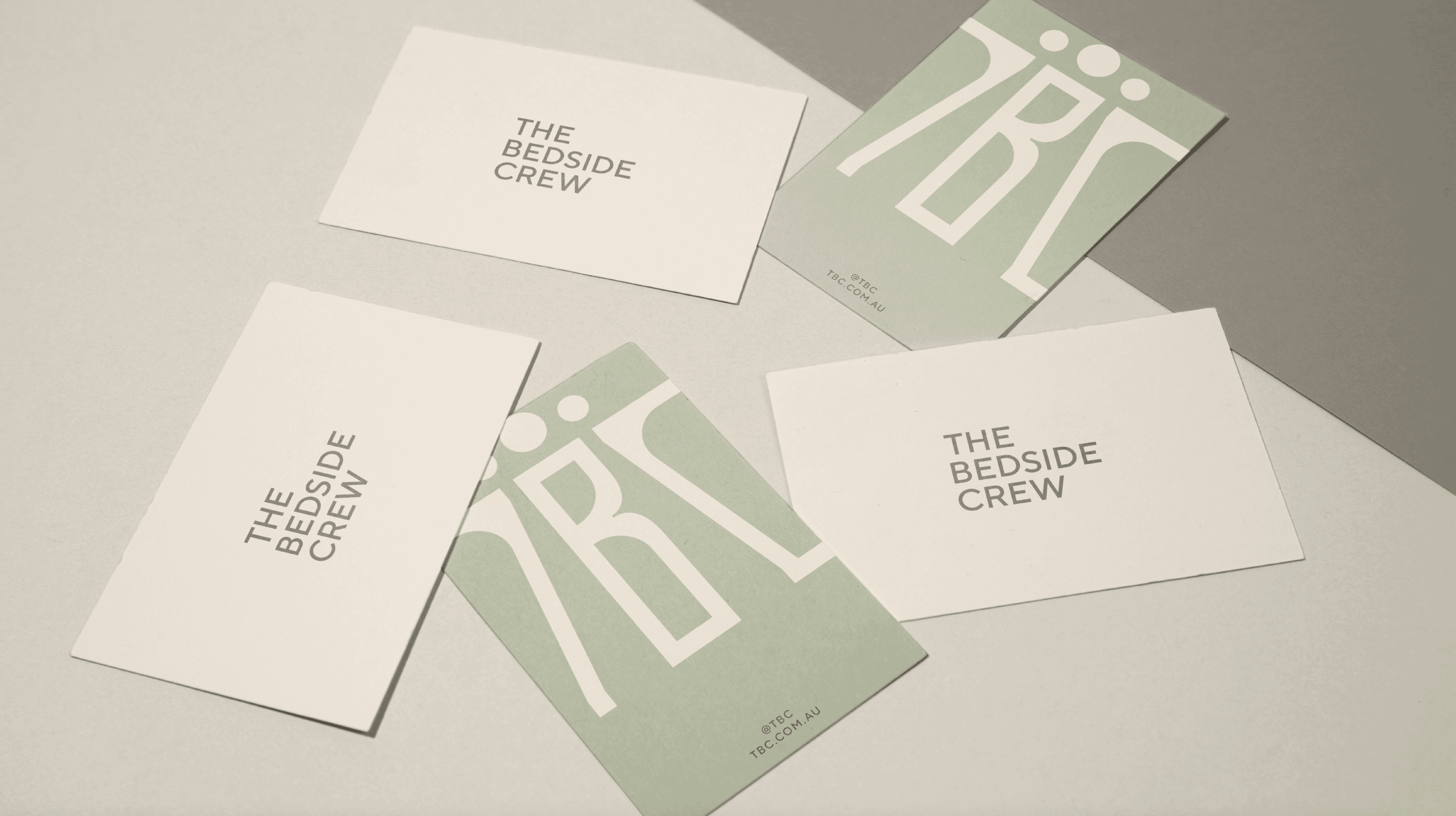
Logo
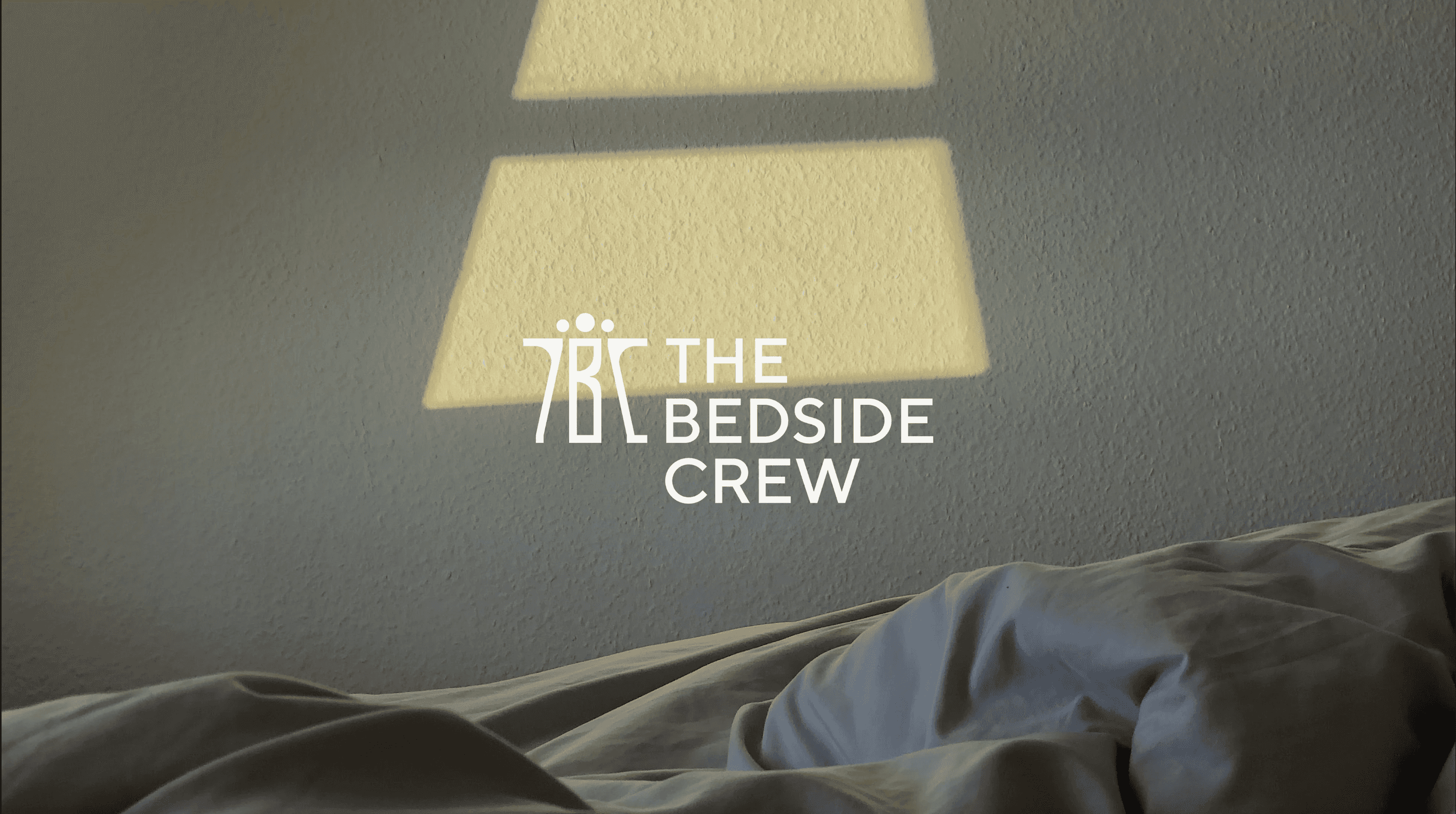
The TBC logo has been designed to reflect warmth, trust, and professionalism. Its clean, minimal structure ensures clarity and legibility while maintaining a sense of calm and support. The simplicity of the design allows it to feel both modern and timeless, aligning with the brand’s focus on delivering dependable, high-quality care.
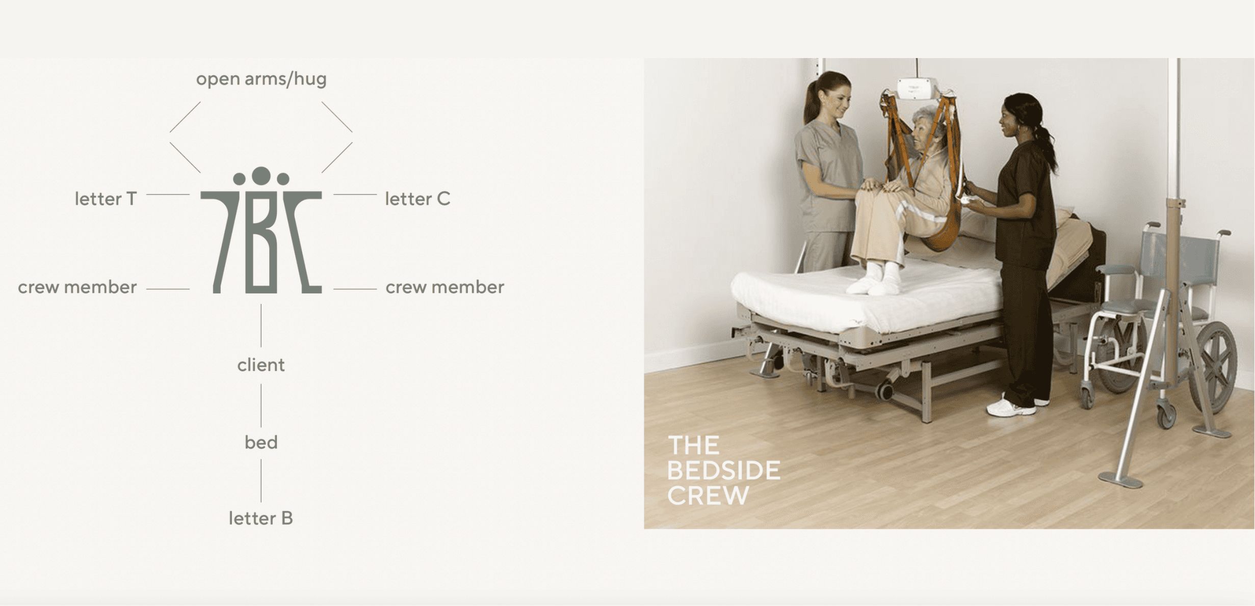
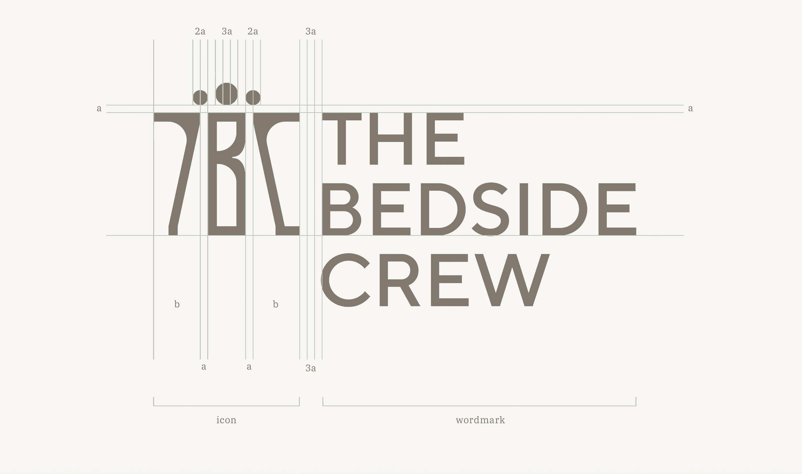
The logo’s balanced proportions and thoughtful spacing reinforce a sense of stability and ease—mirroring the reliable, compassionate experience we provide for every customer. Whether used digitally or in print, the logo anchors the brand with quiet confidence and approachability.
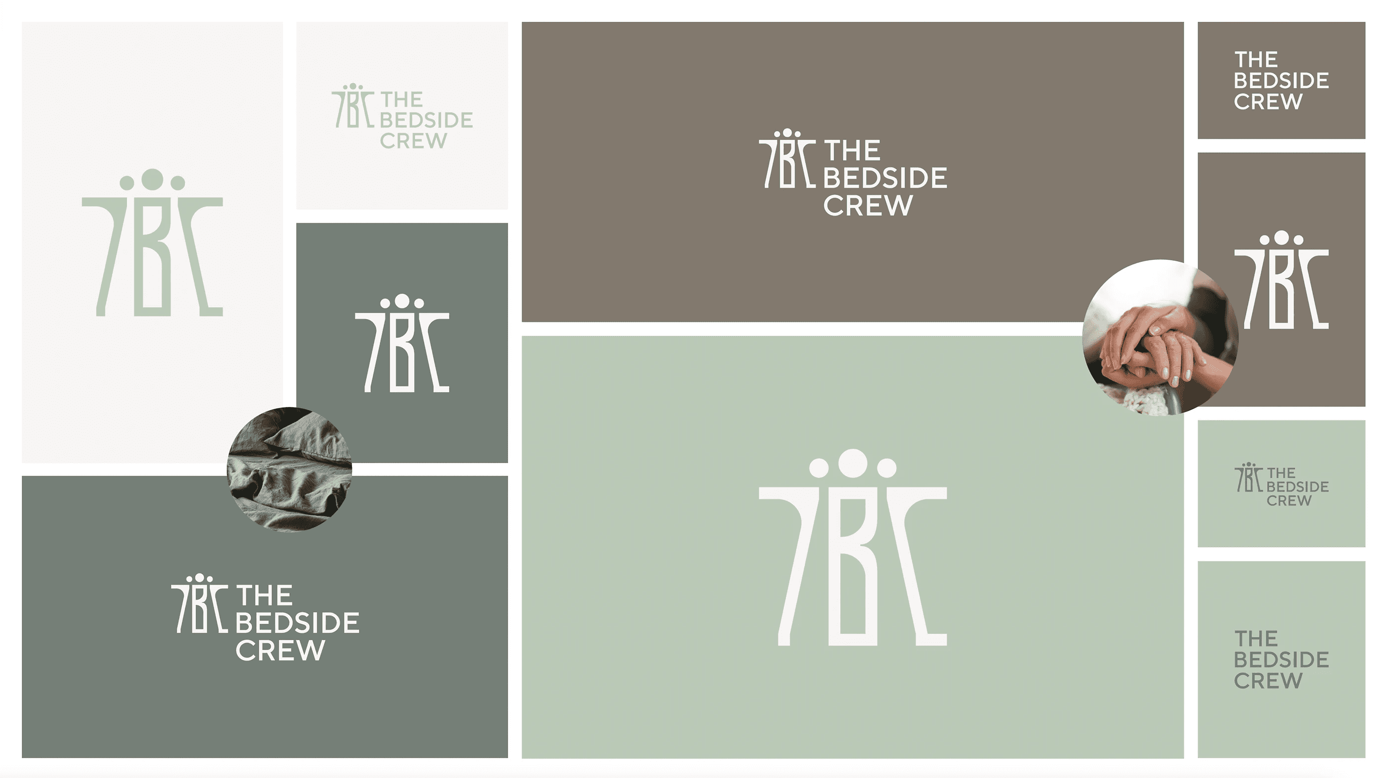
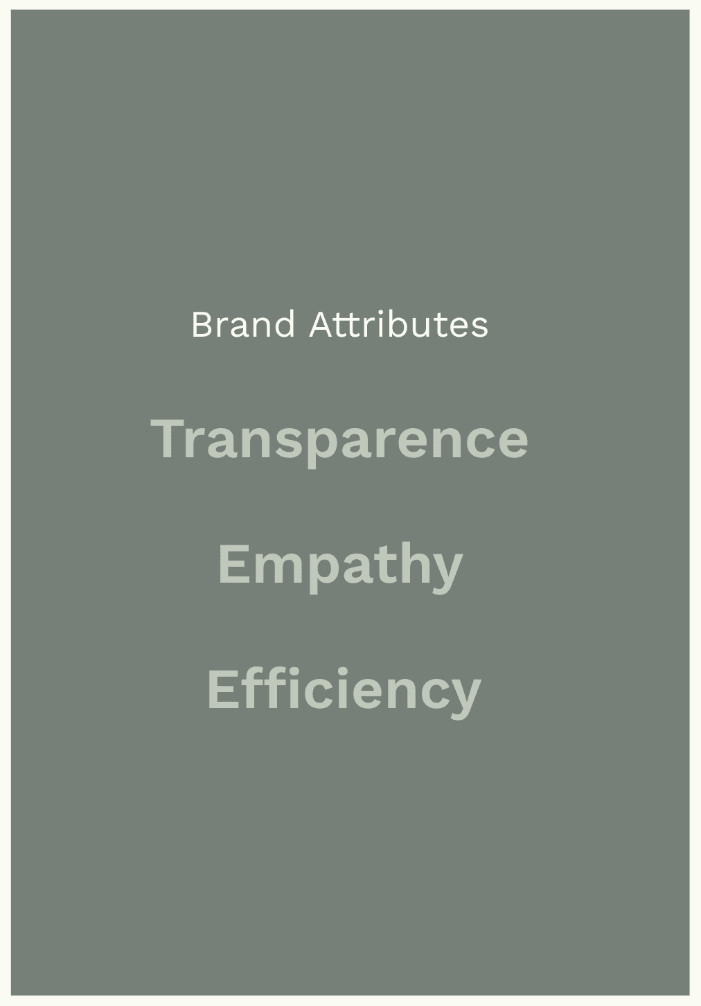
Colour
An earthy, calming palette built around sage green, soft neutrals, and green-grey tones provides a sense of reassurance and dignity. High-contrast dark tones support legibility, while secondary shades bring warmth and flexibility across applications.
Typography
Headlines use Giotto FLF for distinctiveness and warmth, while IBM Plex Serif ensures professionalism and readability in subheads and body copy. The combination establishes hierarchy and clarity, striking a balance between approachability and authority.
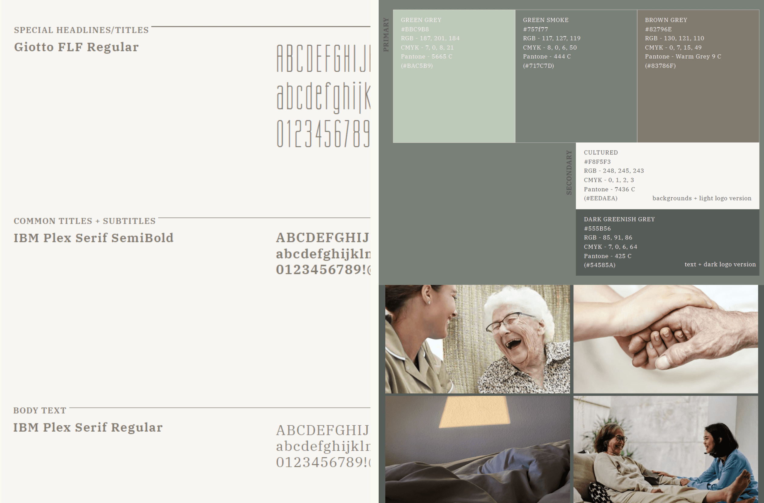
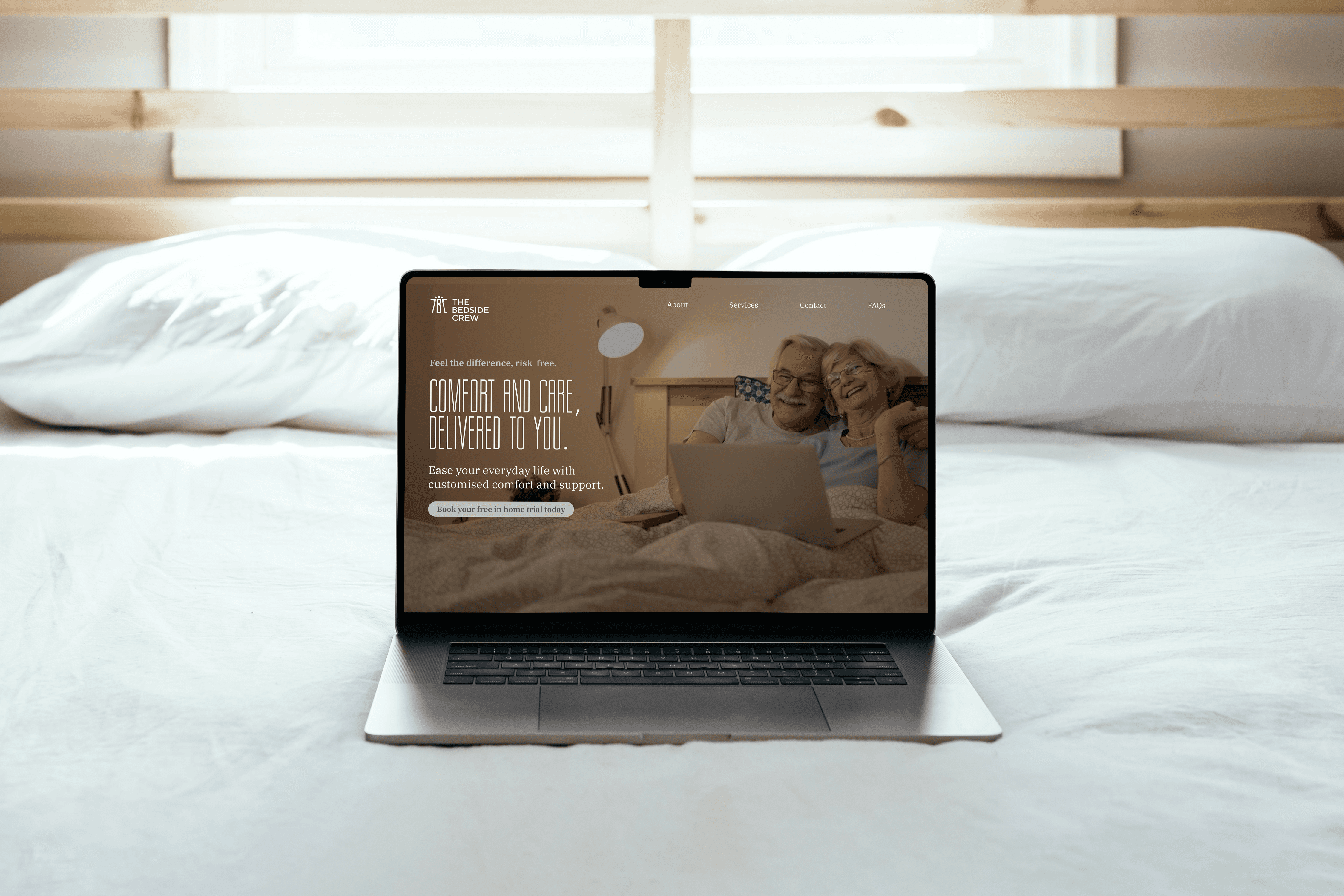
Photography
Imagery is customer-centred and authentic, emphasising calm environments and lived experiences. Photos highlight real interactions, in-home trials, and supportive moments—always reflecting the brand values of care and dignity.
Application
The identity system comes to life through accessible and consistent brand assets:
Business cards and print collateral with clear typography and calming colour use
Website and digital assets designed to feel supportive and easy to navigate
OT-facing materials and brochures that highlight reliability and partnership
Social presence guided by authentic stories, testimonials, and lifestyle imagery
Not sure if Koollab is the right fit? Let’s chat.
We’ll answer all your questions and give you an honest assessment on if we can add substantial value to you.

