
Health
Brand Development, Discovery & Research, Positioning, Visual Identity, Verbal Identity, Social Media Content
About the brand
The Skin Wellness Hub redefines skin health as a medical specialty, combining advanced dermatological expertise with a patient-first approach. In an industry where short-term fixes and sales-driven treatments are common, it stands apart by prioritizing trust, education, and long-term results.
Every consultation is an opportunity to educate, every treatment is backed by science, and every recommendation is made with integrity and expertise. Designed for those who seek the highest standard in skin wellness, The Skin Wellness Hub is more than a clinic—it’s a commitment to empowering patients with knowledge, confidence, and skin health that lasts a lifetime.
Challenge
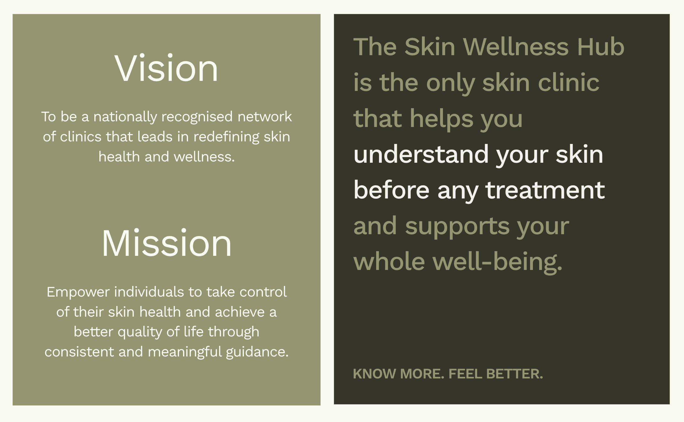
The Skin Wellness Hub is built on a vision to empower patients through expert-led education, ethical care, and premium, long-term skin health solutions. In a market flooded with misinformation, sales-driven clinics, and one-size-fits-all treatments, patients struggle to find expert care they can trust.
The brand needed an identity that reflected its depth of expertise, medical integrity, and exclusive, patient-first approach. It was time to create a brand that immediately signaled trust, education, and a premium experience, one that stands apart in an industry filled with quick fixes and cosmetic trends.
Brand Strategy
Discovery
We conducted in-depth strategy sessions with the founder to deeply understand the business’s mission, challenges, and unique approach. Through competitive research of five key clinics, we identified industry gaps and refined how The Skin Wellness Hub could stand apart from transactional, trend-driven clinics.

Focus
Our research revealed that patients were overwhelmed by misinformation and uncertain whom to trust. To solve this, we positioned The Skin Wellness Hub as the go-to expert in medical skin wellness—emphasizing clarity, education, and long-term patient empowerment.
We also conducted ideal client research to go beyond demographics, uncovering patient motivations, values, and pain points. This informed a messaging framework that resonated deeply, ensuring patients felt both informed and confident in their choices.
Verbal Identity
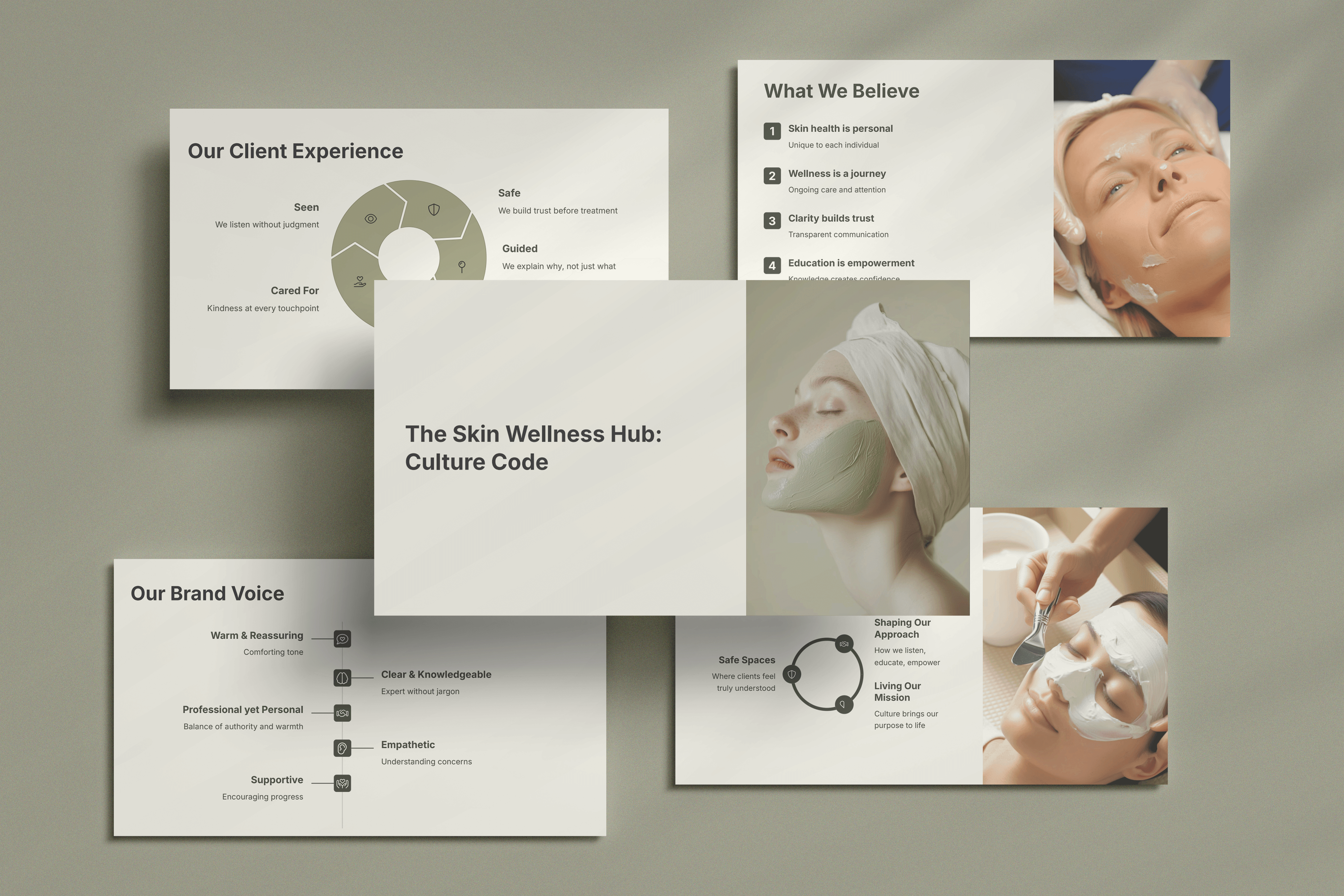
Voice and Tone
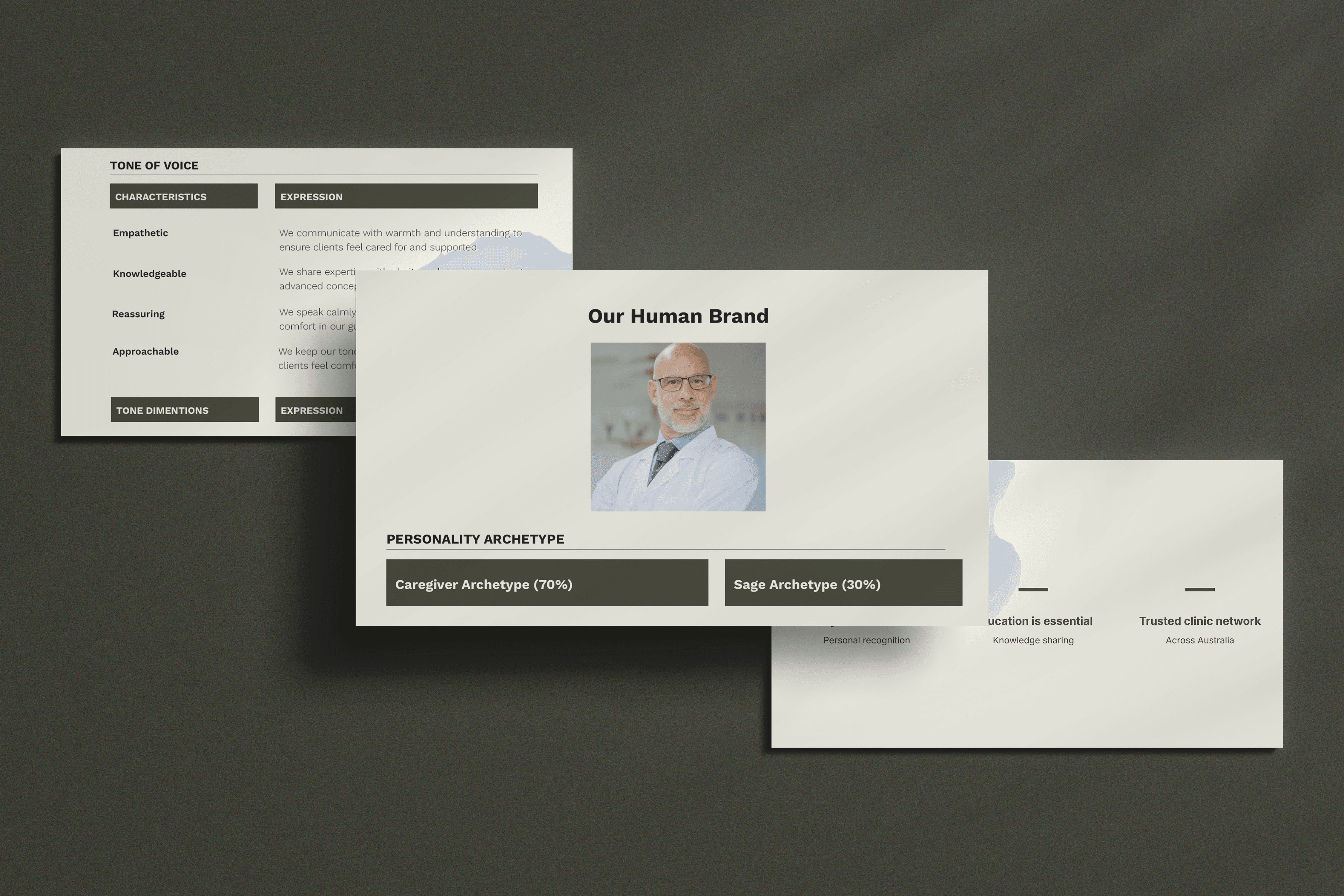
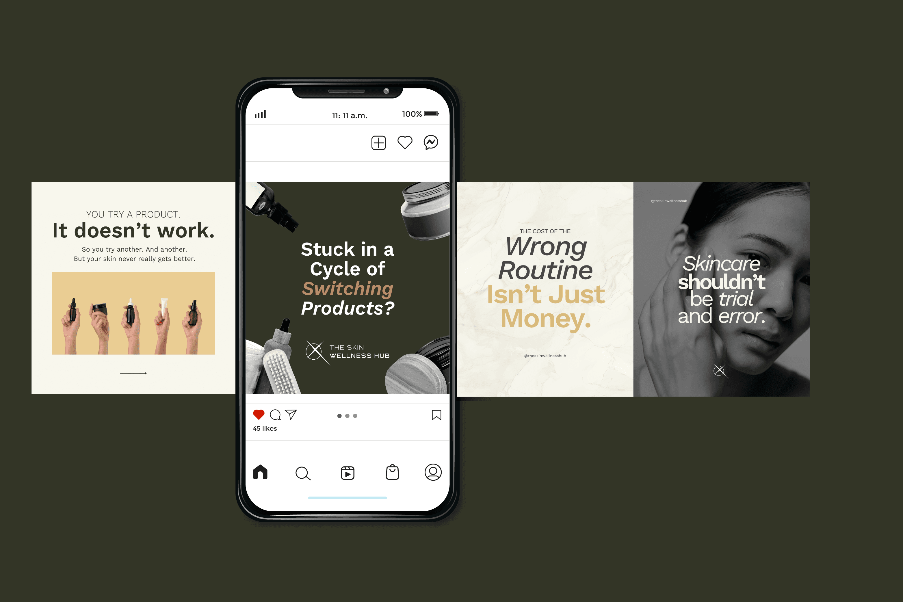
The new verbal identity balances expert authority with warmth and approachability. It’s clear, educational, and ethical, avoiding fear-based marketing or sales-driven pressure. Every piece of communication—from consultations to digital content—reinforces The Skin Wellness Hub as a trusted, knowledgeable, and patient-first brand.

Brand Story & Messaging
The messaging framework was designed to:
Position skin health as a medical specialty, not just a cosmetic service.
Emphasize education, ethical care, and long-term results over quick fixes.
Empower patients with knowledge, making them active participants in their skin health journey.
A refined tagline and onlyness statement further cement the brand’s unique role in the industry, ensuring consistency across all touchpoints.
Visual Identity
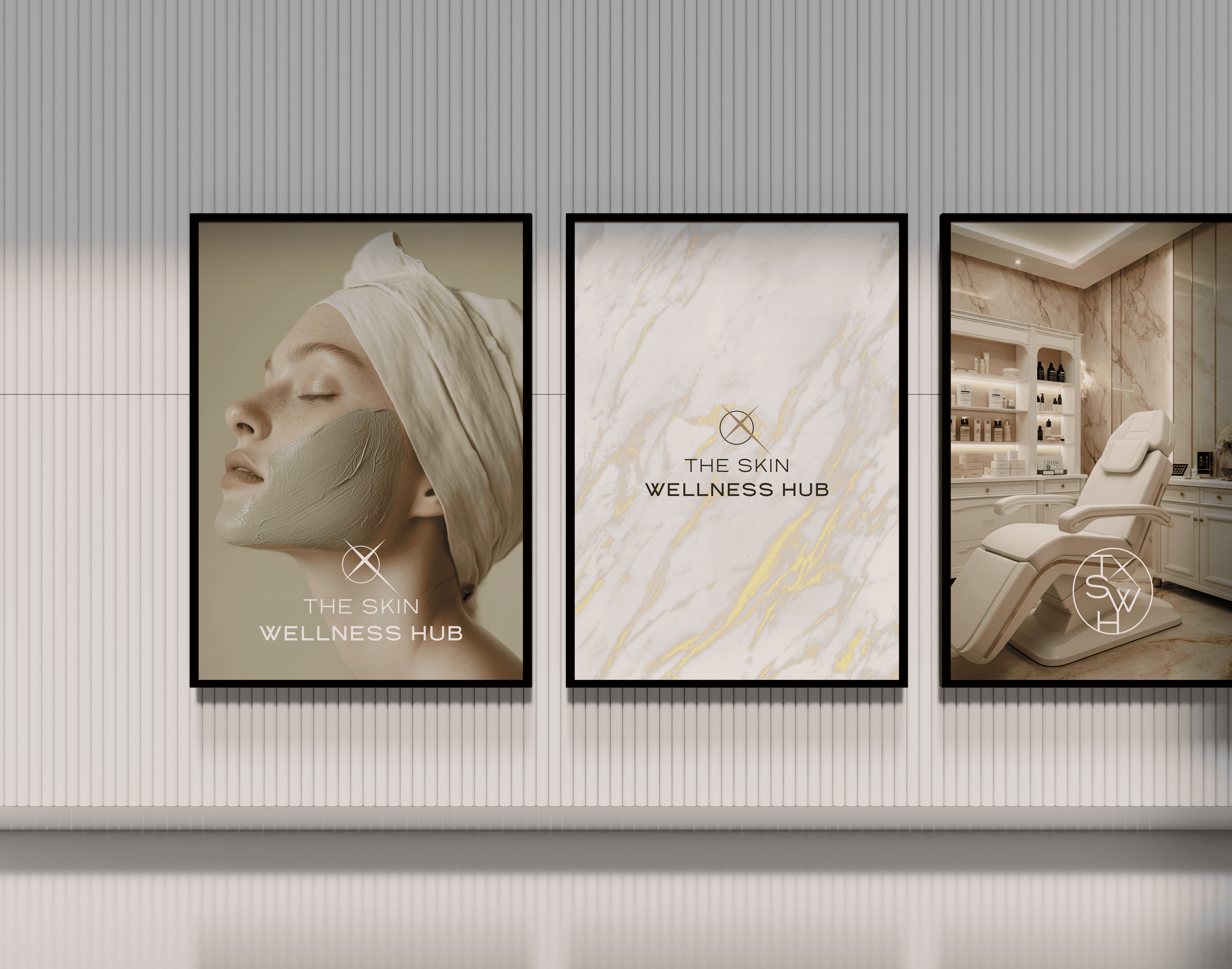
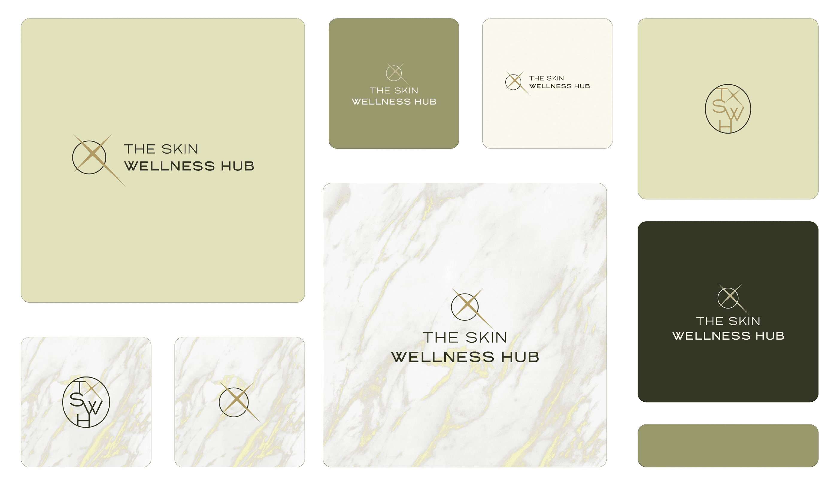
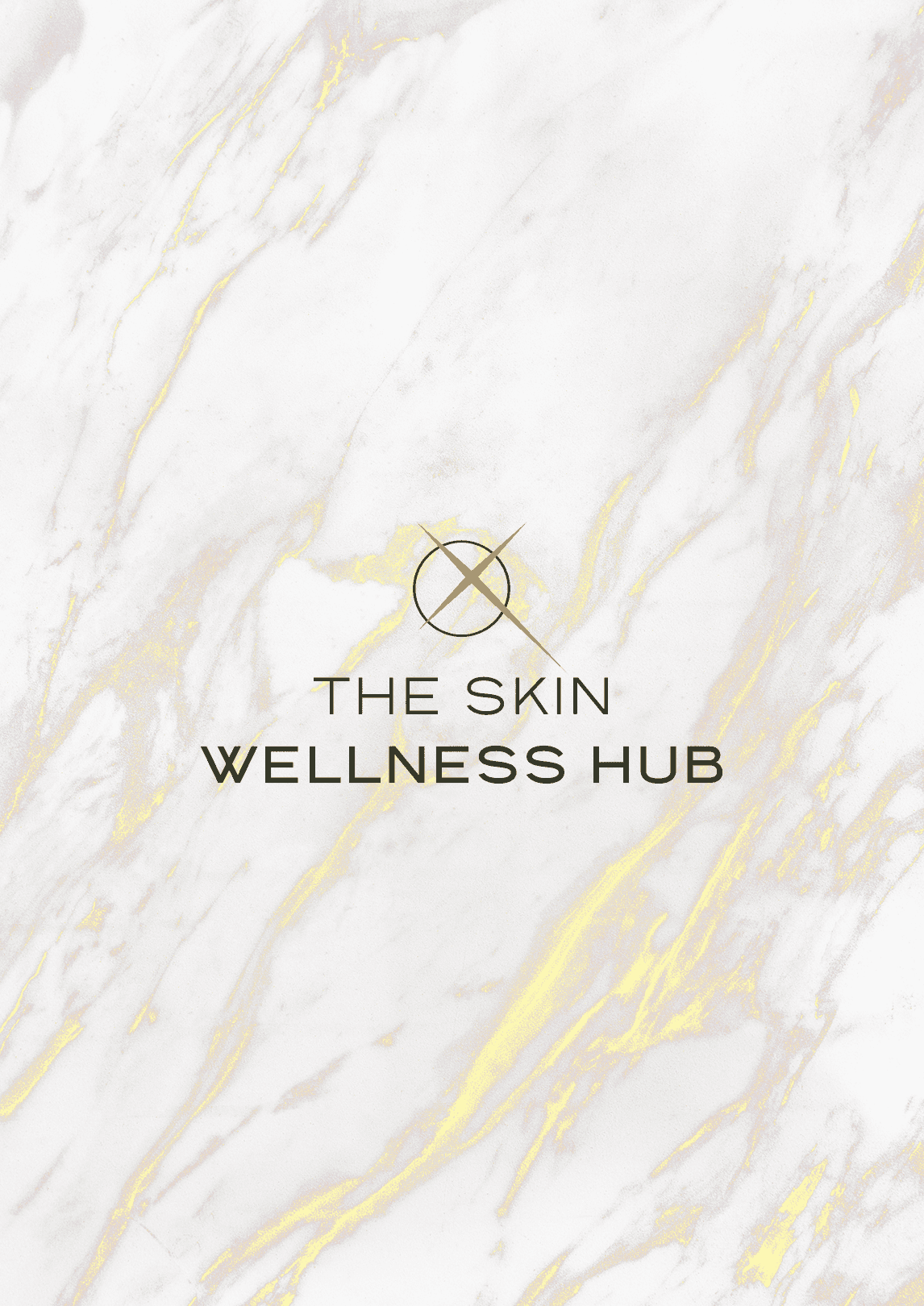
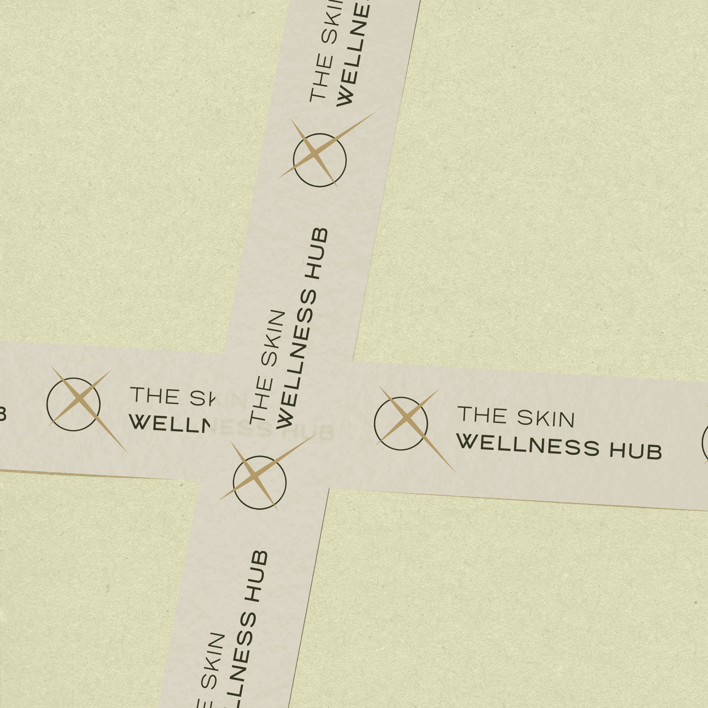
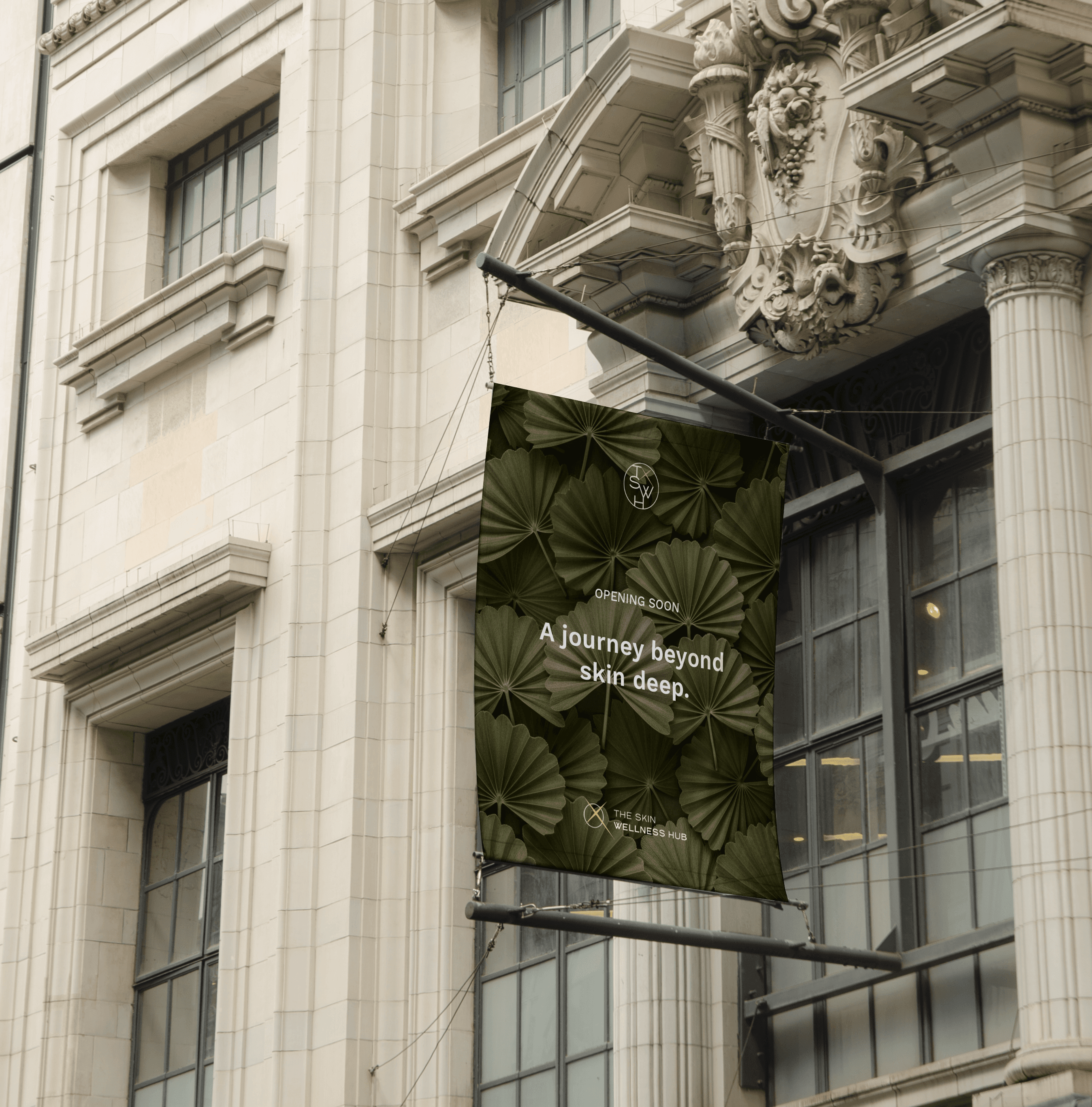
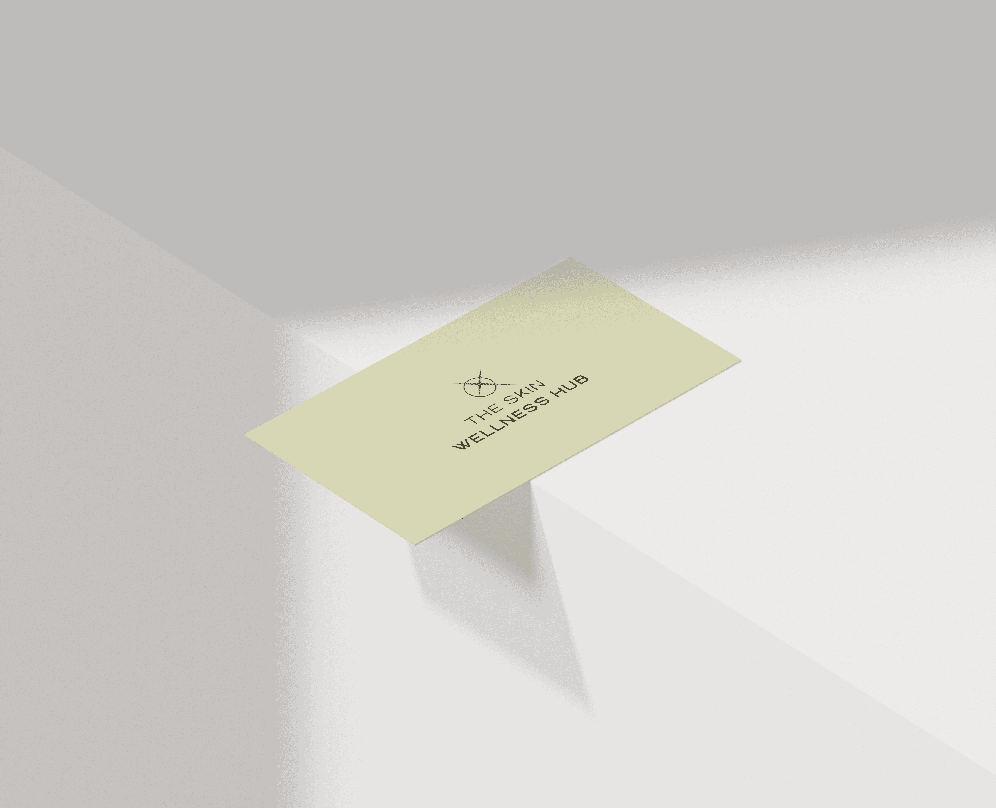
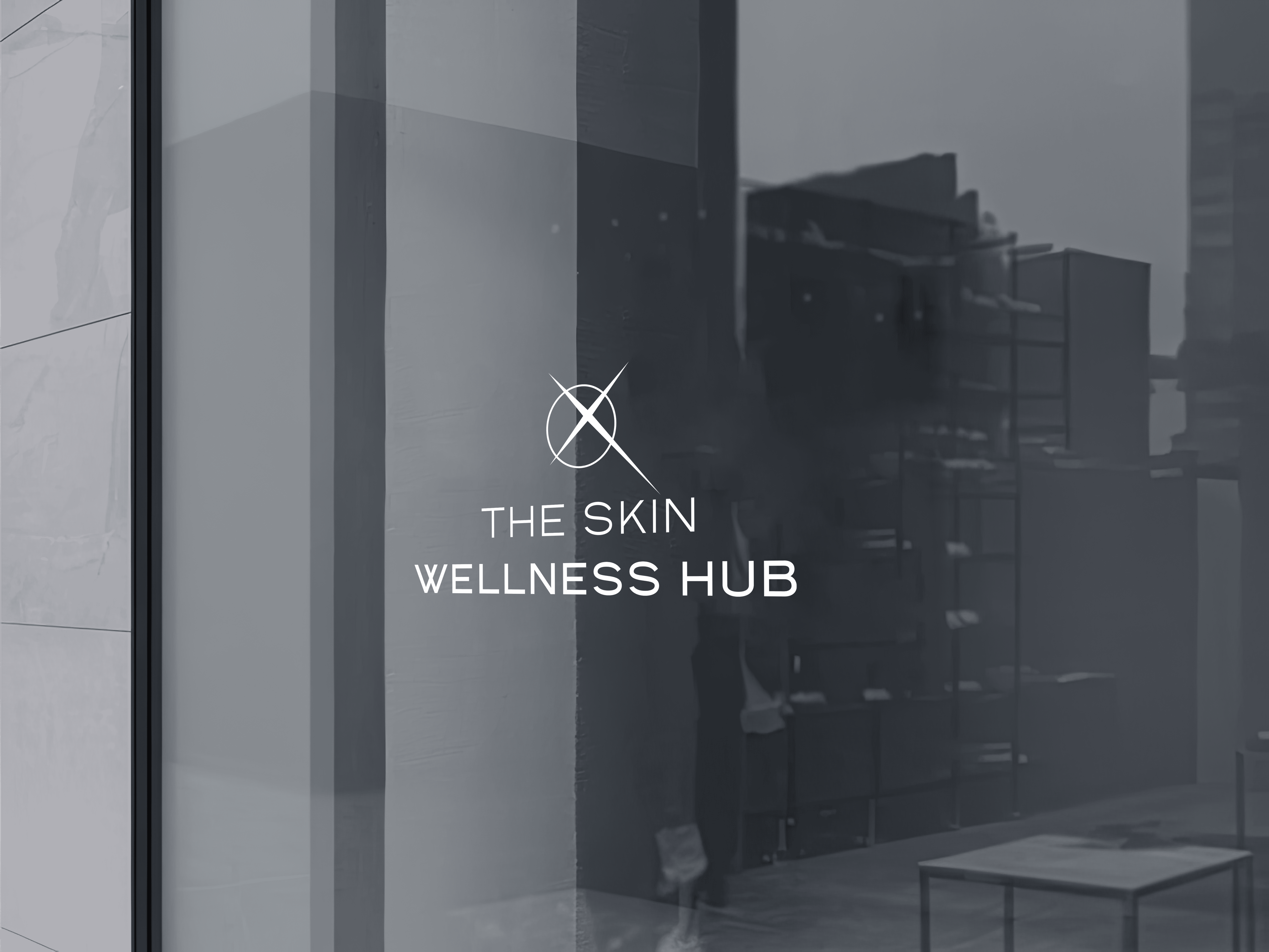
The Logo Suite
The logo has been designed to balance sophistication and modernity, reflecting The Skin Wellness Hub’s fusion of medical expertise and holistic wellness. The identity is minimal yet distinctive, ensuring a professional, high-end aesthetic that feels both trustworthy and approachable.
 |  |
 |  |
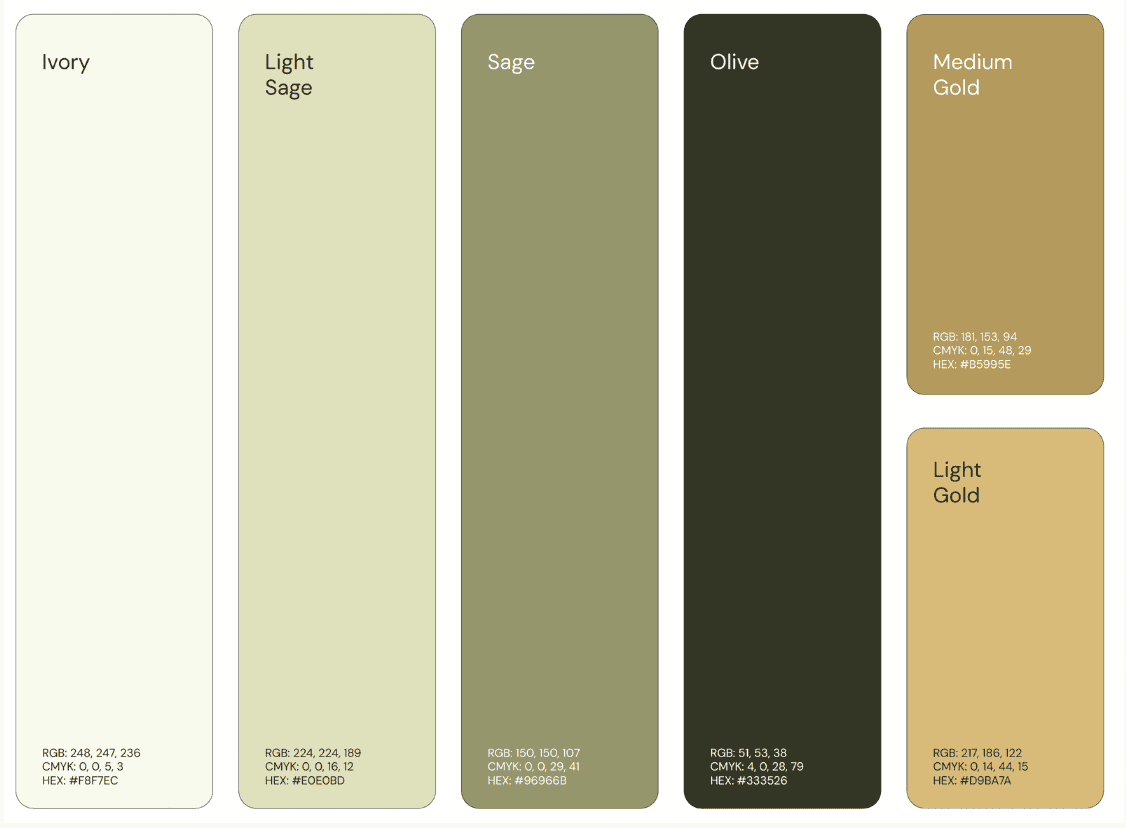
Colours
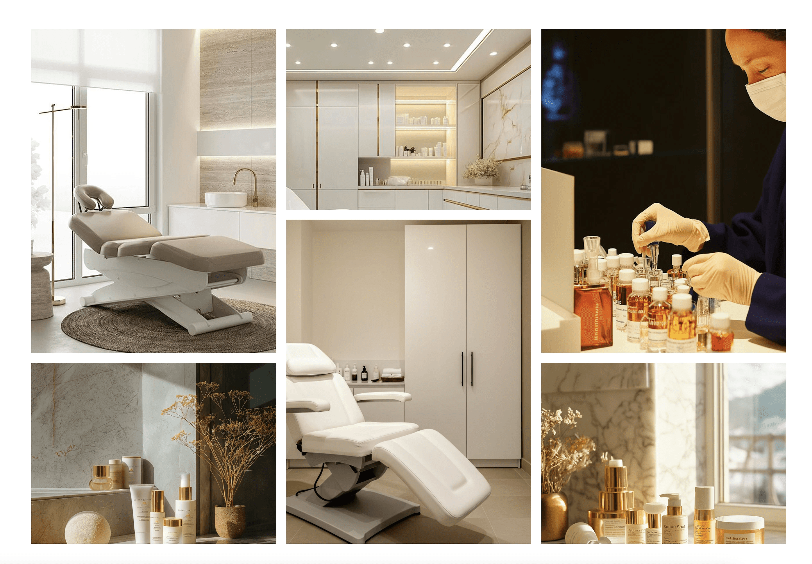
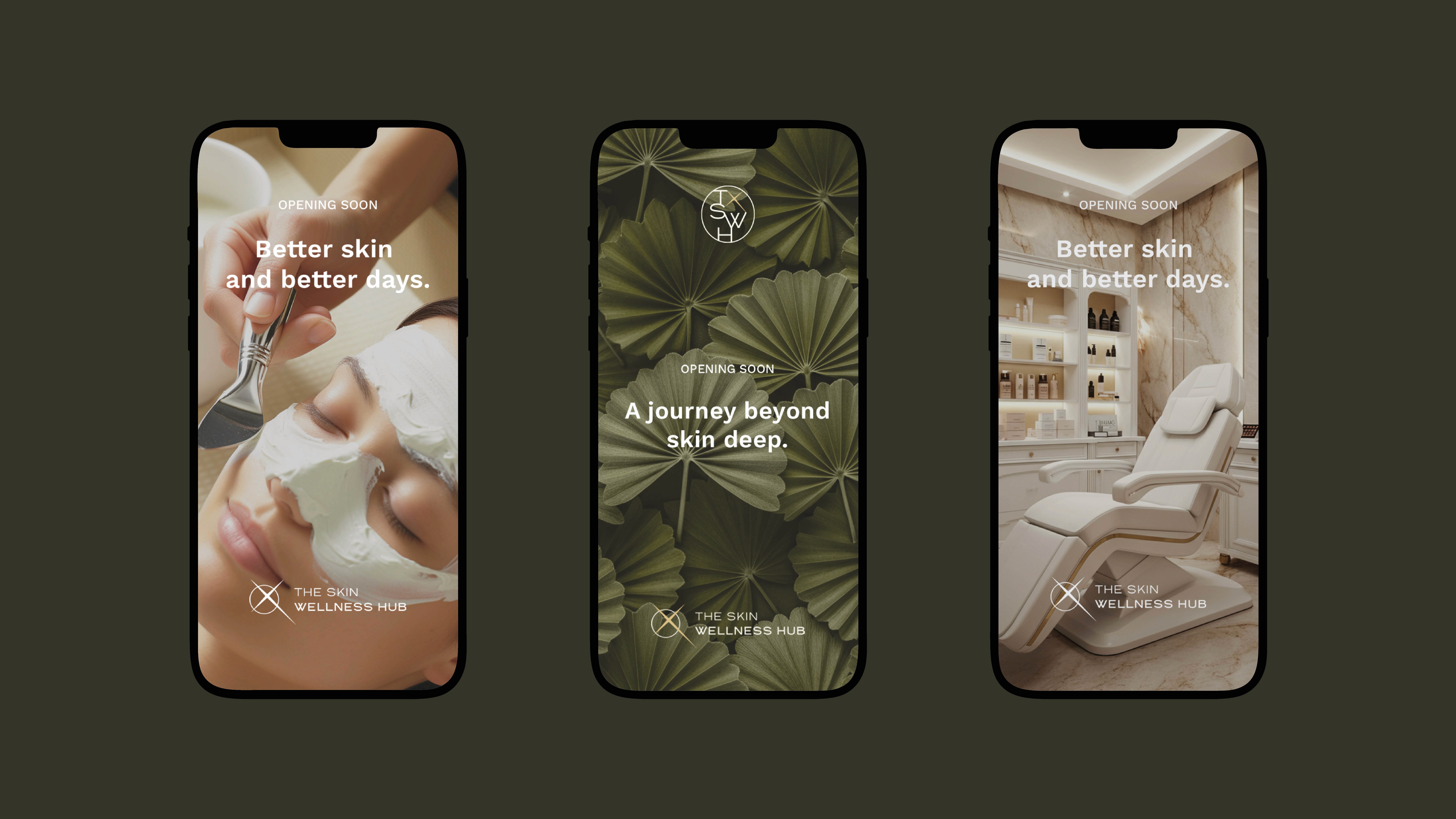
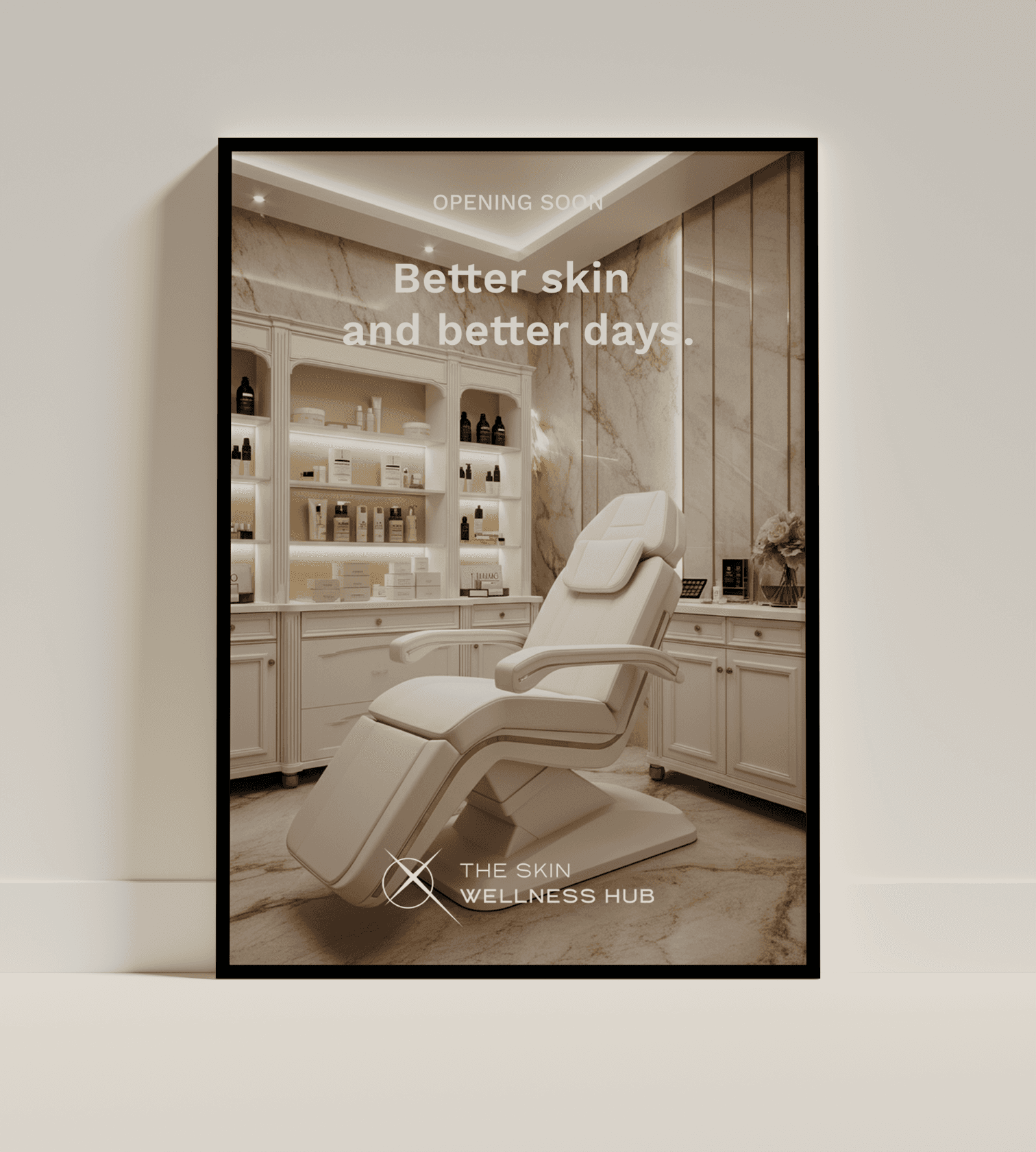
Rooted in nature, longevity, and luxury, carefully selected to evoke a sense of trust, wellness, and premium care. Olive & Sage Greens: Represent renewal, growth, and the holistic connection between skincare and overall well-being. Ivory: A soft, neutral base that enhances clarity and cleanliness, reinforcing the clinical yet inviting nature of the brand. Dark, Medium & Light Gold: Symbolise luxury, warmth, and high-end service, adding a refined, premium touch while maintaining approachability. This palette ensures a harmonious balance between science and self-care, embodying The Skin Wellness Hub’s core values.
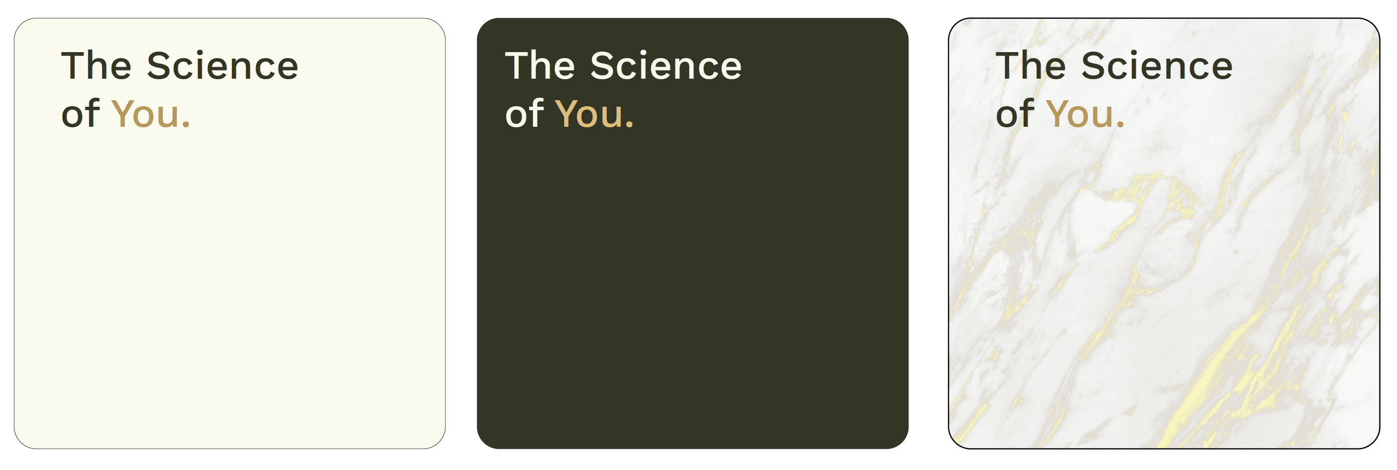
Textures
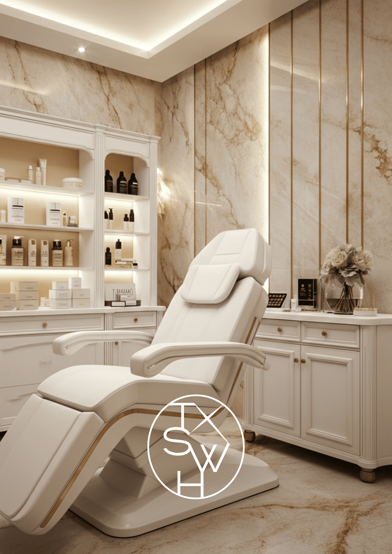
Marble texture is introduced as a symbol of purity, sophistication, and timelessness. The organic flow of marble patterns reflects the brand’s seamless blend of advanced science and holistic treatments. It subtly reinforces luxury without feeling overbearing, complementing the clean, minimalist aesthetic of the overall identity.
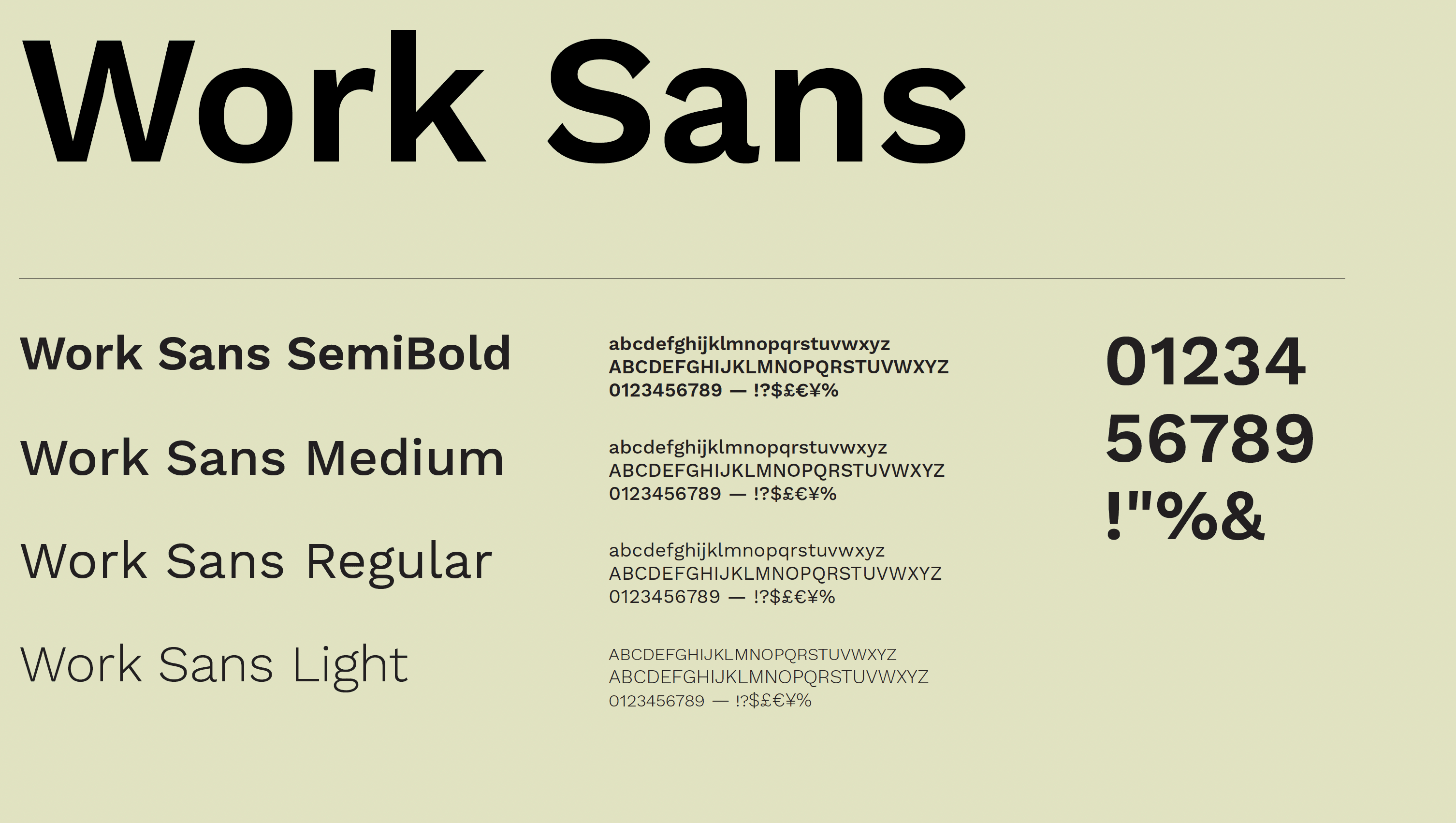
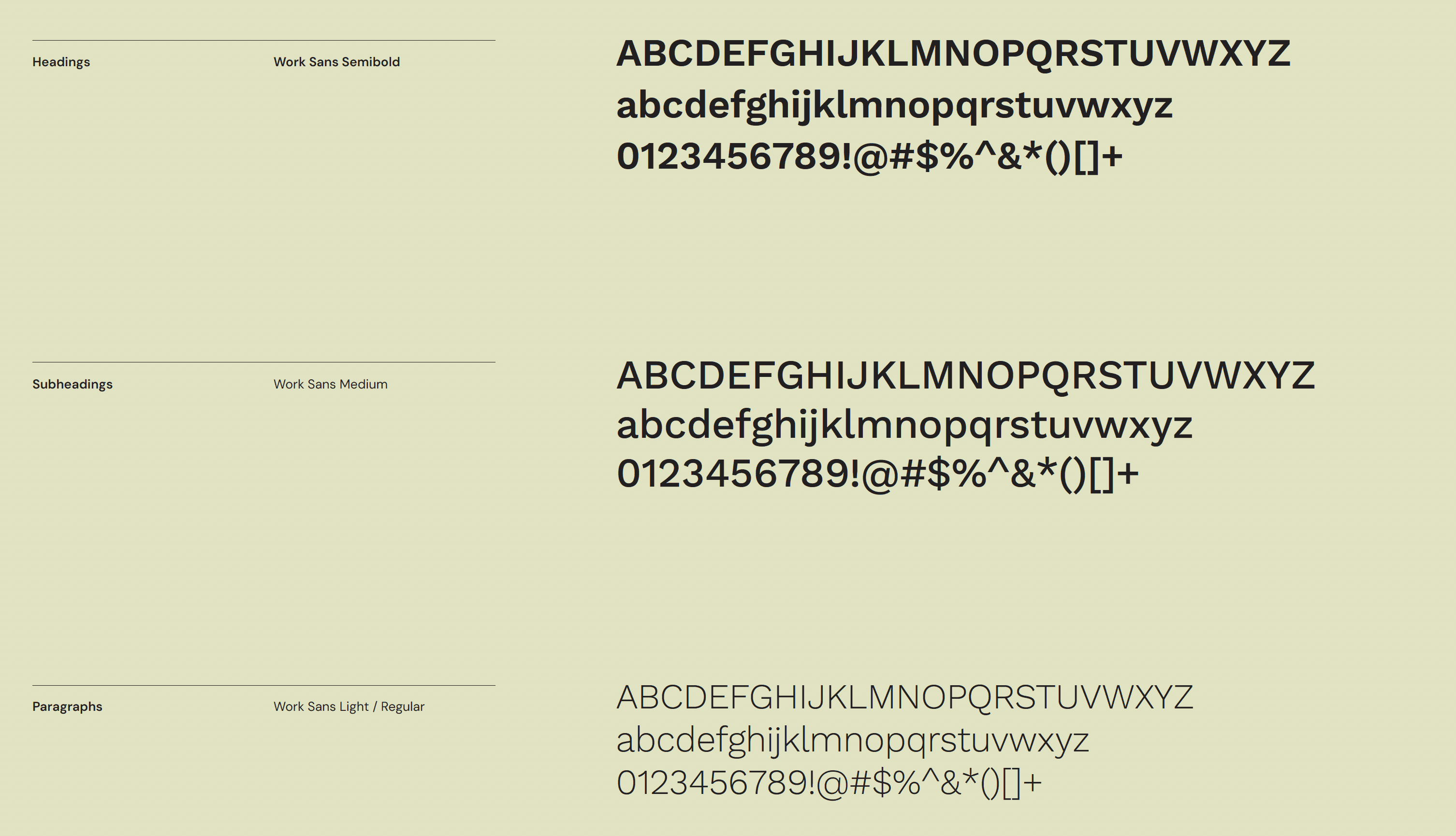
Typography
The typography system plays a crucial role in maintaining clarity, modernity, and elegance. Work Sans was chosen for its clean, refined aesthetic, aligning with the brand’s professional yet inviting tone. The mix of bold, medium, and light weights provides versatility, allowing for strong hierarchy and readability across different applications. The typography is minimalist and structured, ensuring a user-friendly experience while reflecting The Skin Wellness Hub’s commitment to transparency and professionalism.
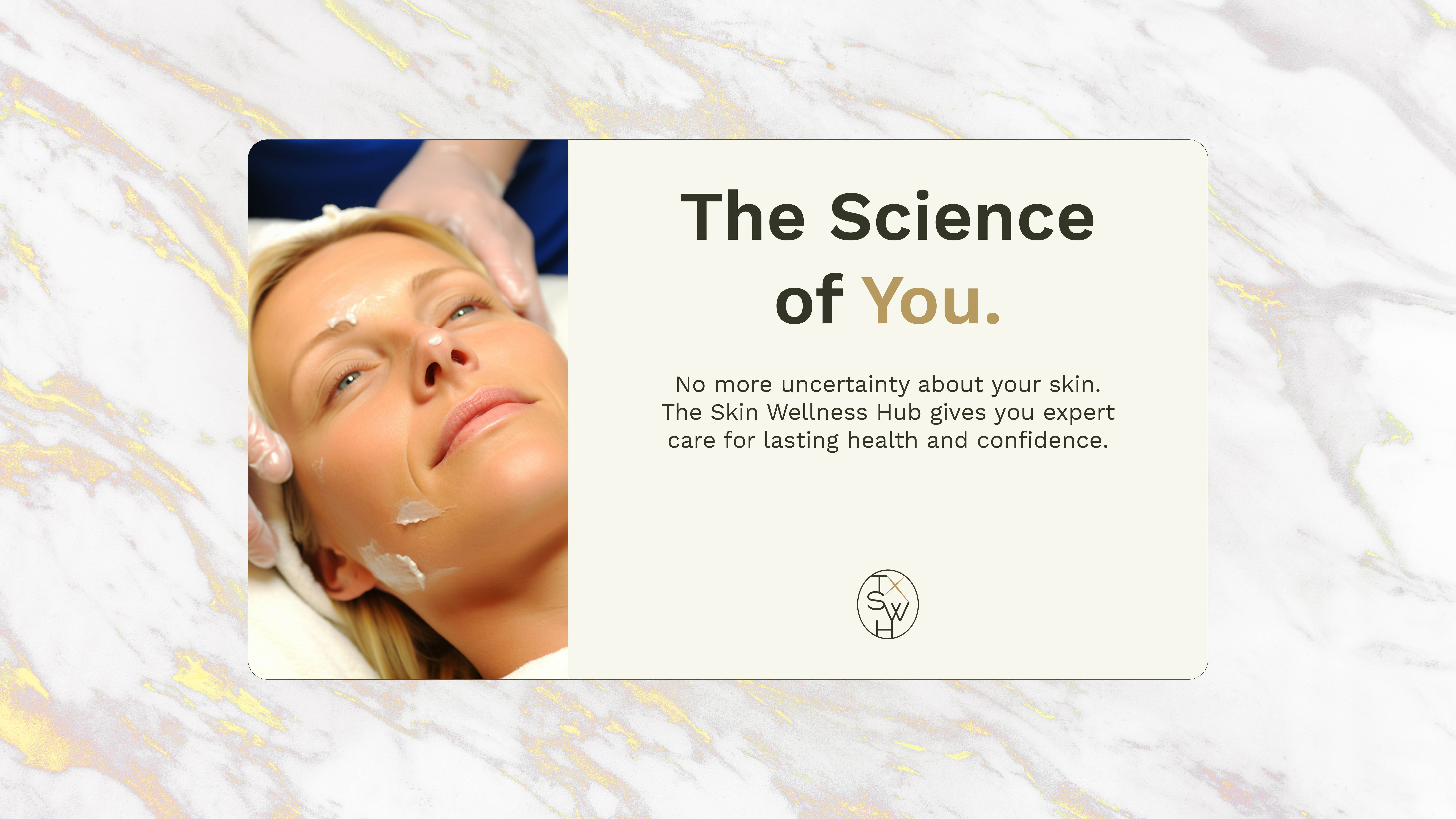
Photography
The brand’s photography style embodies natural beauty, scientific expertise, and holistic care.
 |  |
Social media
Applications

Not sure if Koollab is the right fit? Let’s chat.
We’ll answer all your questions and give you an honest assessment on if we can add substantial value to you.

