
Marketing Software
Brand Development, Brand Guideline, Visual Identity
About the brand
Challenge
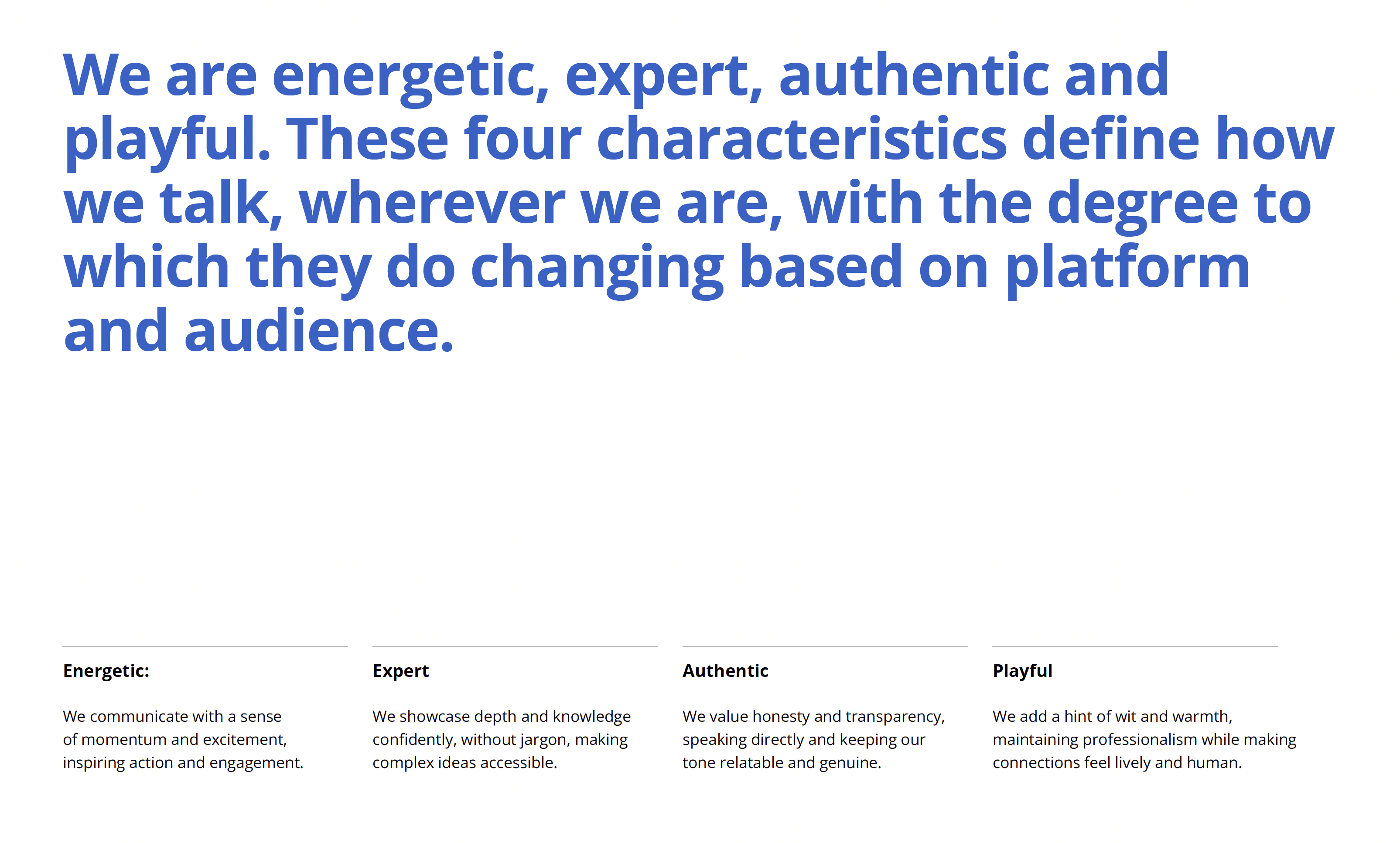
Strategic but Not Visually Defined – As marketing and branding strategists, VirtuallyCMO excelled in positioning and messaging but lacked a strong, cohesive visual identity to match their expertise.
Balancing Fun & Credibility – Their brand needed to feel engaging and approachable while still maintaining authority and trust in the marketing space.
Outcome
VirtuallyCMO now has a strong, cohesive brand that balances fun and credibility, enhancing trust and recognition. This clarity and consistency have helped them secure key partnerships, grow their team, and expand their impact.
Brand Strategy
Discovery
We ran strategic deep-dive sessions with the founder to unpack the vision behind the brand, its growth challenges, and the shift it is creating in the market. Through competitor and category analysis, we identified common patterns in the space, such as tactical services, outdated systems, and a lack of brand distinction. This helped us pinpoint clear opportunities to position the brand differently.
Focus
Our strategy is centred around one core truth: the market is ready for a more dynamic, human, and future-focused approach. We positioned the brand as a bold alternative to the norm — playful, innovative, and driven by meaningful partnerships. With a SaaS product in development, the brand needed to communicate momentum and long-term thinking from the start. The result is a strategic foundation that feels fresh, approachable, and built for scale.
Visual Identity
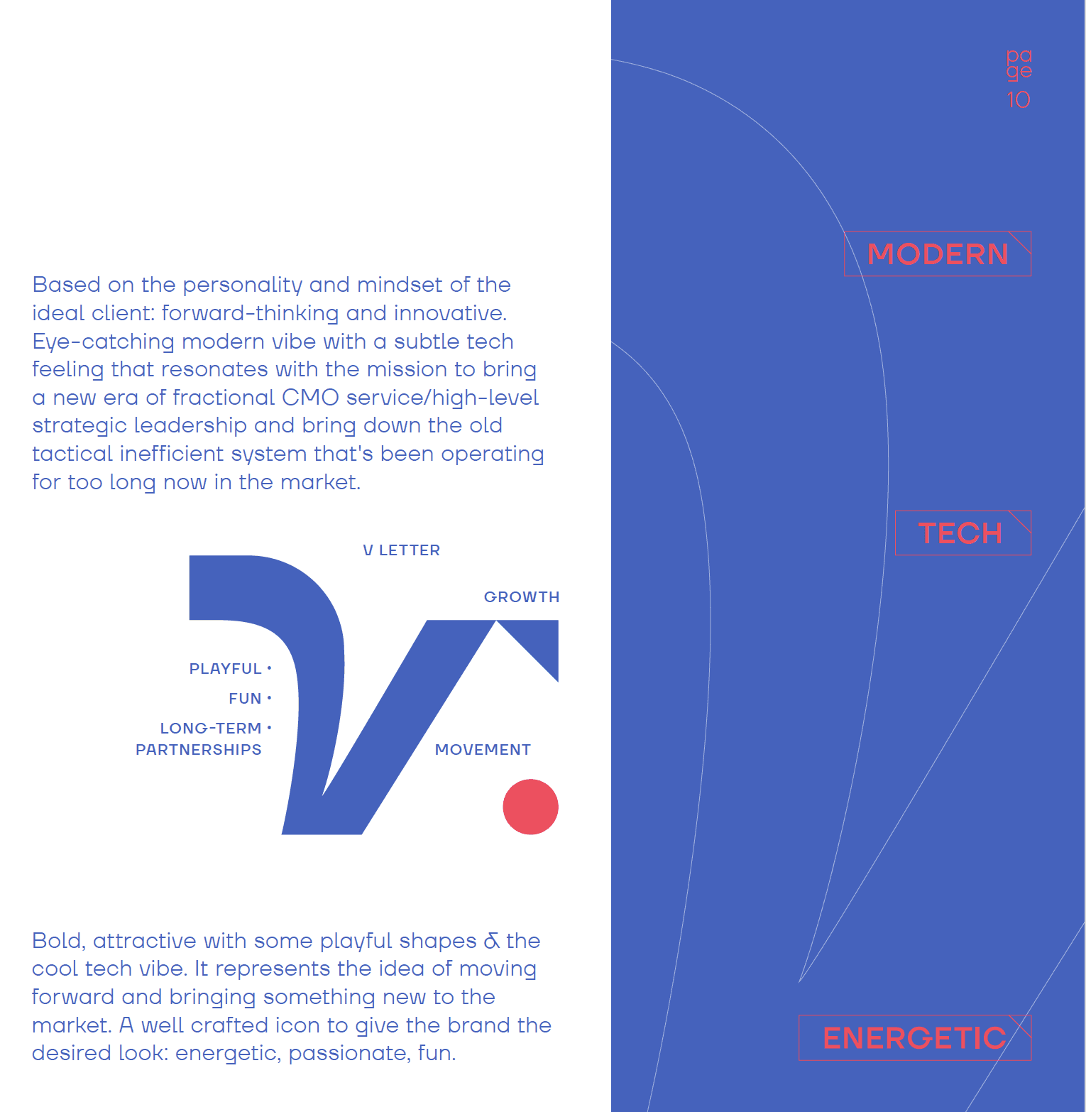
Based on the personality and mindset of the ideal client: forward-thinking and innovative. Eye-catching modern vibe with a subtle tech feeling that resonates with the mission to bring a new era of fractional CMO service/high-level strategic leadership and bring down the old, tactical, inefficient system that's been operating for too long now in the
Bold, attractive with some playful shapes & the cool tech vibe. It represents the idea of moving forward and bringing something new to the market—a well-crafted icon to give the brand the desired look: energetic, passionate, fun.
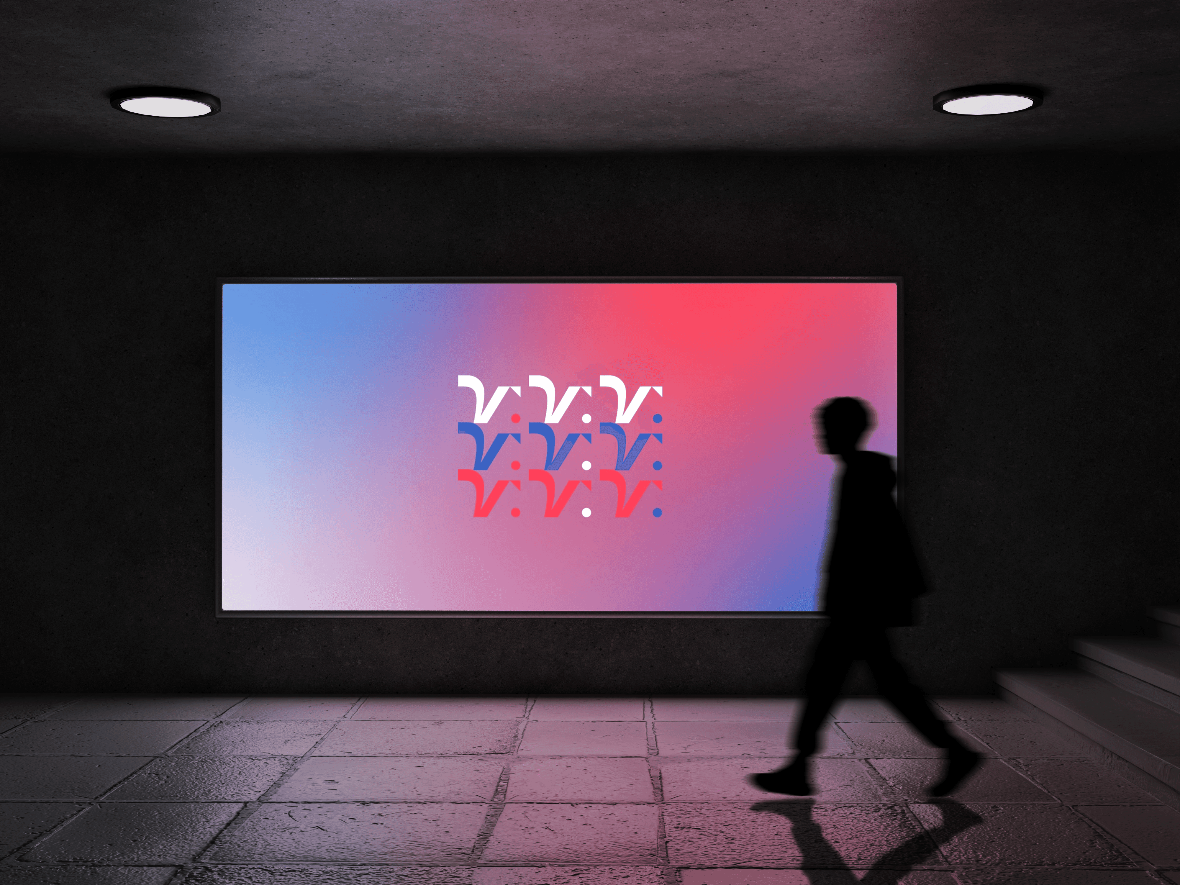
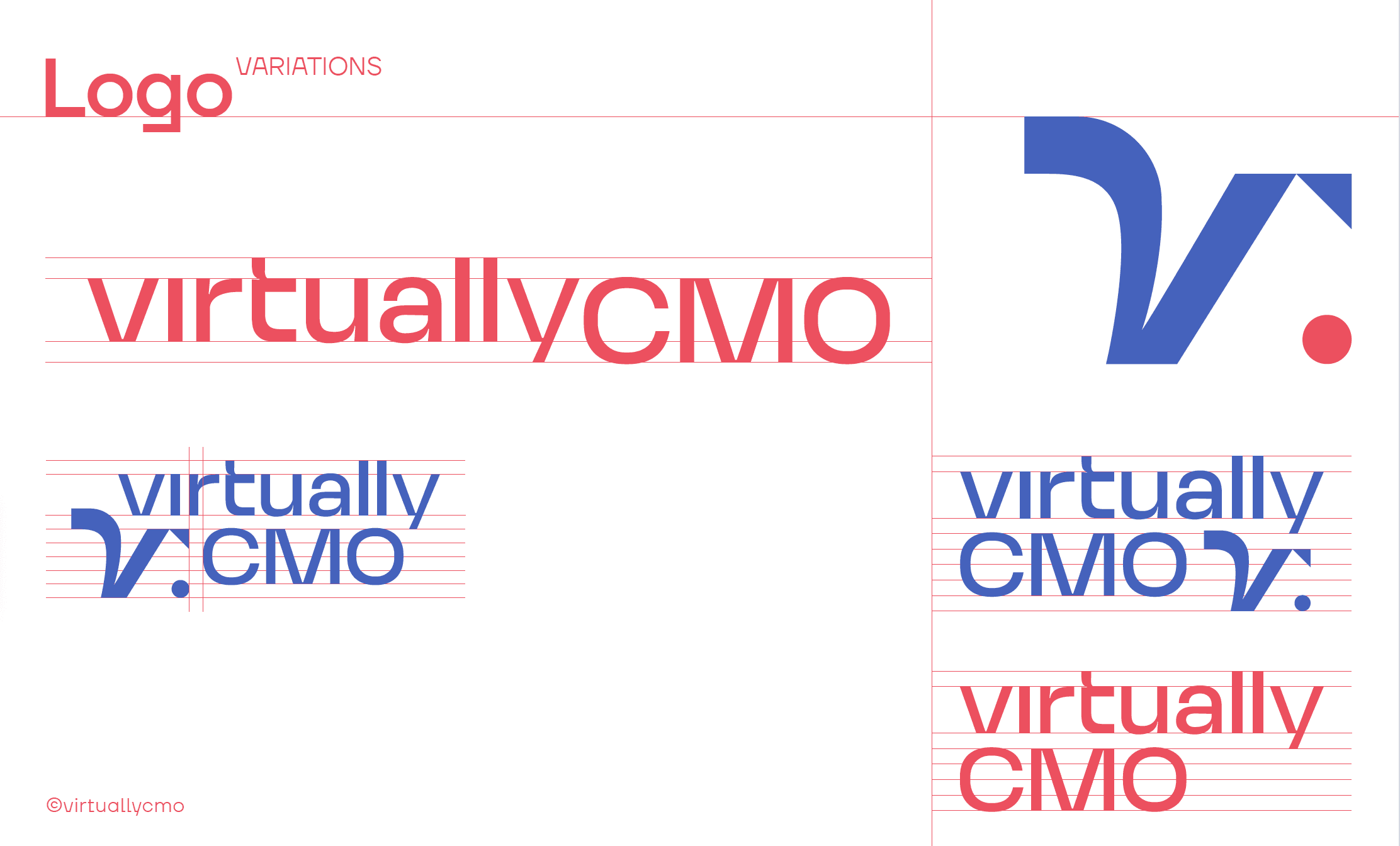
Logo
The logo system includes a primary lockup, a secondary icon, and a supportive wordmark to maximise utility. The icon can stand alone where recognition is high; the full lockup leads in external contexts. Construction and spacing rules ensure legibility and consistency, including vertical alignment and clear-space guidance, plus a “never do” list for distortion, effects, and colour misuse.
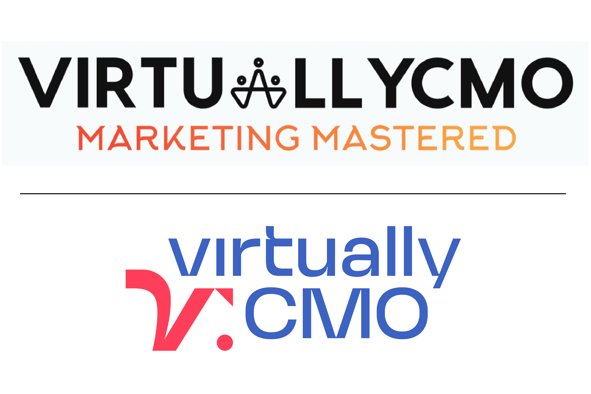
Before and After
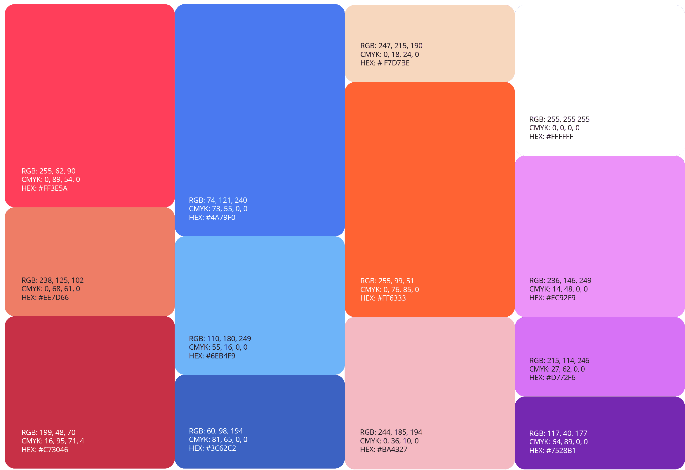
Colours
A vibrant, high-contrast palette leads with signature red and blue, balanced with black and white, then extended by a complementary range for nuance. We defined accessible pairings and guardrails for legibility, contrast, and restraint to keep the system striking yet coherent.
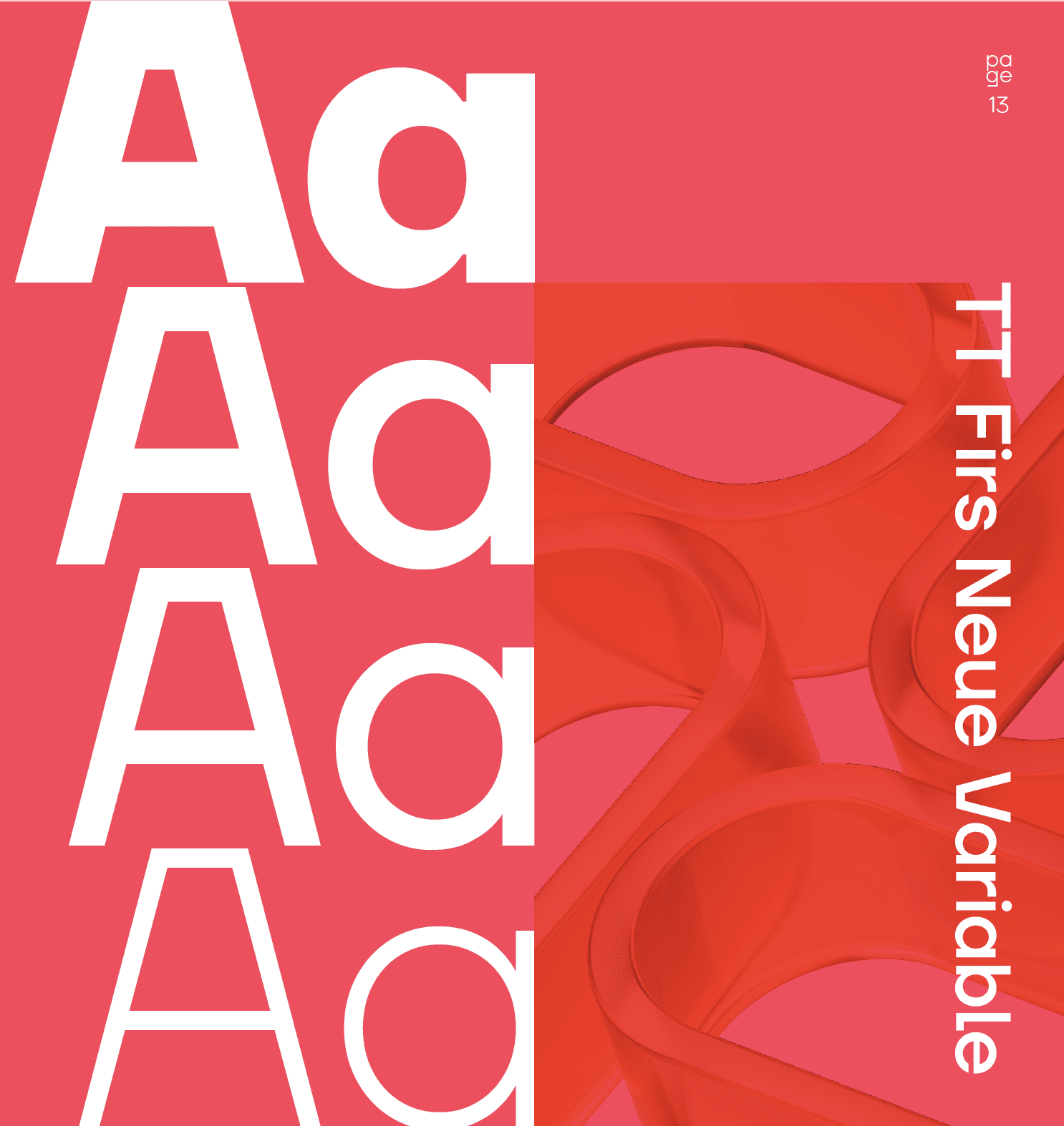
Typography
Open Sans Bold drives display headlines, Open Sans Regular supports headlines and subheads, and Source Sans Pro Regular delivers clear, readable body copy. A simple typographic hierarchy keeps communication direct and scalable across formats.
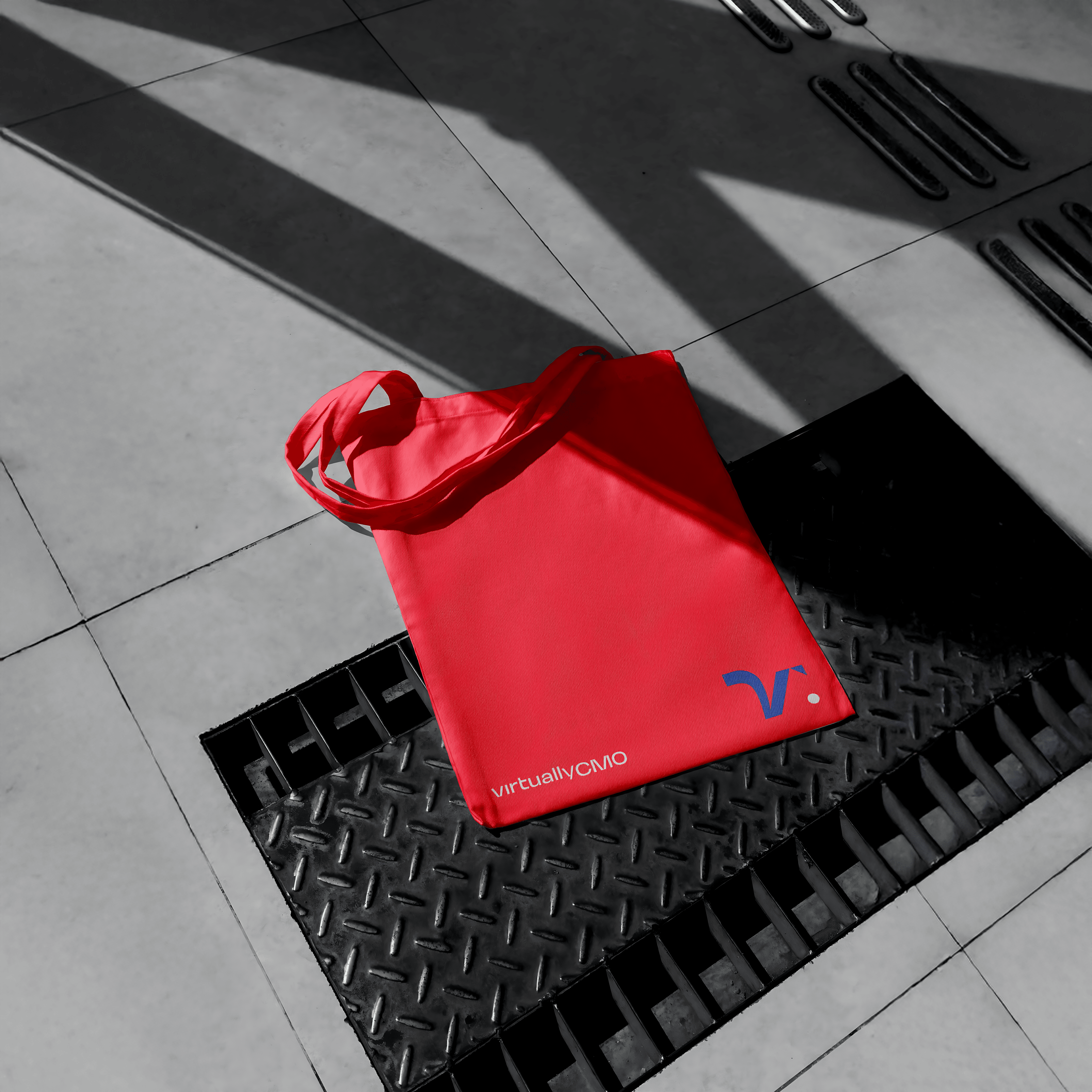
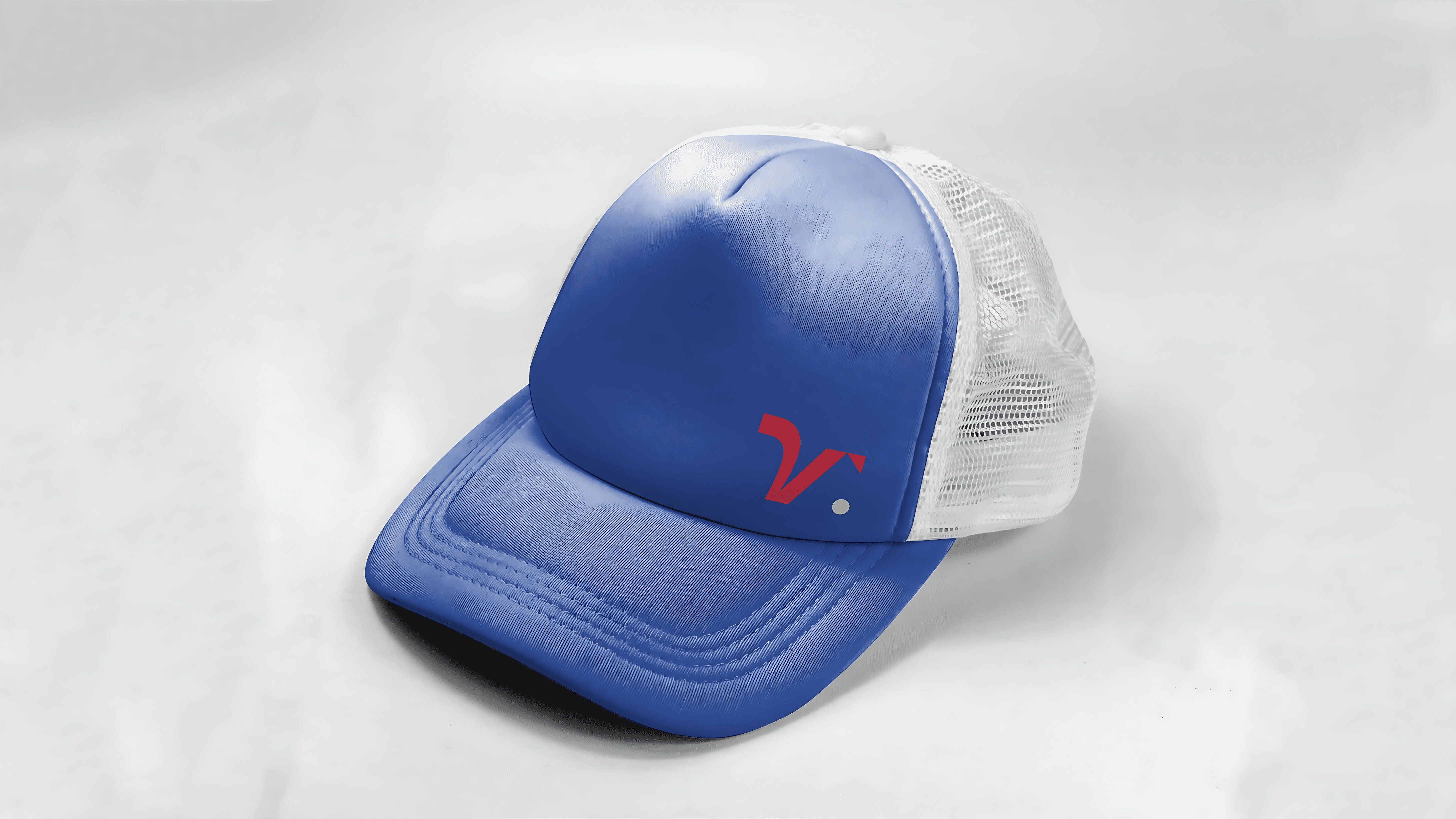
Application
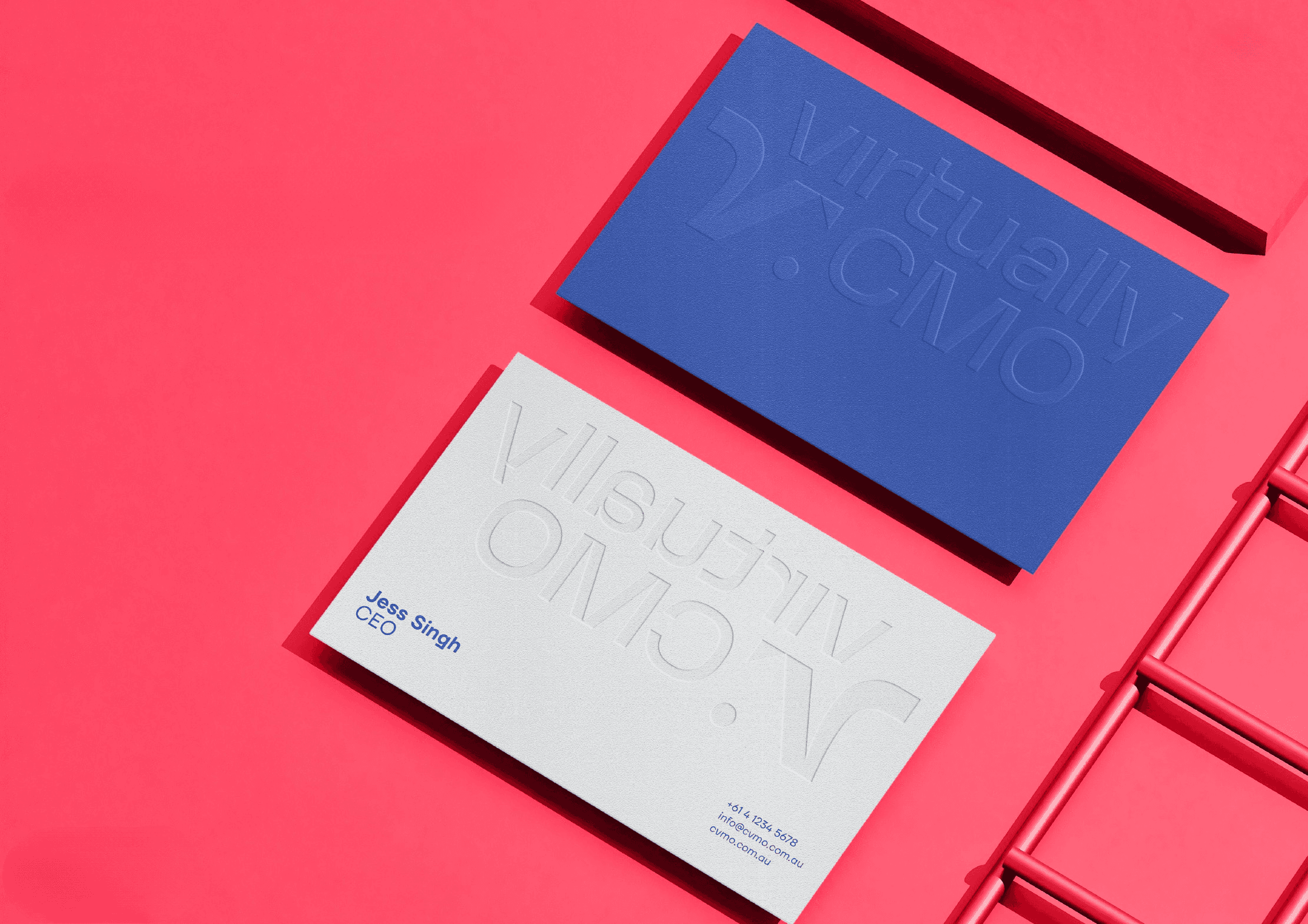
The system comes to life through practical brand assets, from premium uncoated business cards with clear type specs to email signatures that carry the brand with consistency in a daily channel. Rules for colour, type, and spacing make production straightforward for internal teams and partners.

Not sure if Koollab is the right fit? Let’s chat.
We’ll answer all your questions and give you an honest assessment on if we can add substantial value to you.

