
Entertainment
Brand Development, Brand Strategy, Discovery & Research, Positioning, Visual Identity, Web Design
The Brand
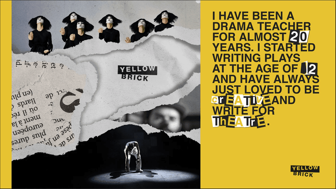
Yellow Brick Theatre is an independent creative company that brings theatrical storytelling to life through bold imagination and emotion. Founded by Charlaina, a lifelong drama teacher and writer, the company celebrates the power of stories that connect, challenge, and inspire.
As their performances grew in scale and recognition, they needed a brand that reflected their distinct personality. The goal was to create something creative, unconventional, and full of energy, while positioning them for future growth and recognition in the performing arts industry.
The Challenge
Yellow Brick’s existing identity didn’t capture the spirit of their work or their ambition to stand out in the national theatre scene.
They needed a brand that expressed their creative edge and their love for storytelling, while staying simple, recognisable, and practical across every platform.
The challenge was to create a visual and verbal system that felt bold, expressive, and unmistakably theatrical, while remaining cohesive and professional.
Brand Strategy
We started by defining Yellow Brick’s story as one that celebrates imagination, performance, and connection.
Our strategy focused on finding the balance between creative freedom and structure, mirroring the way theatre blends emotion and precision.
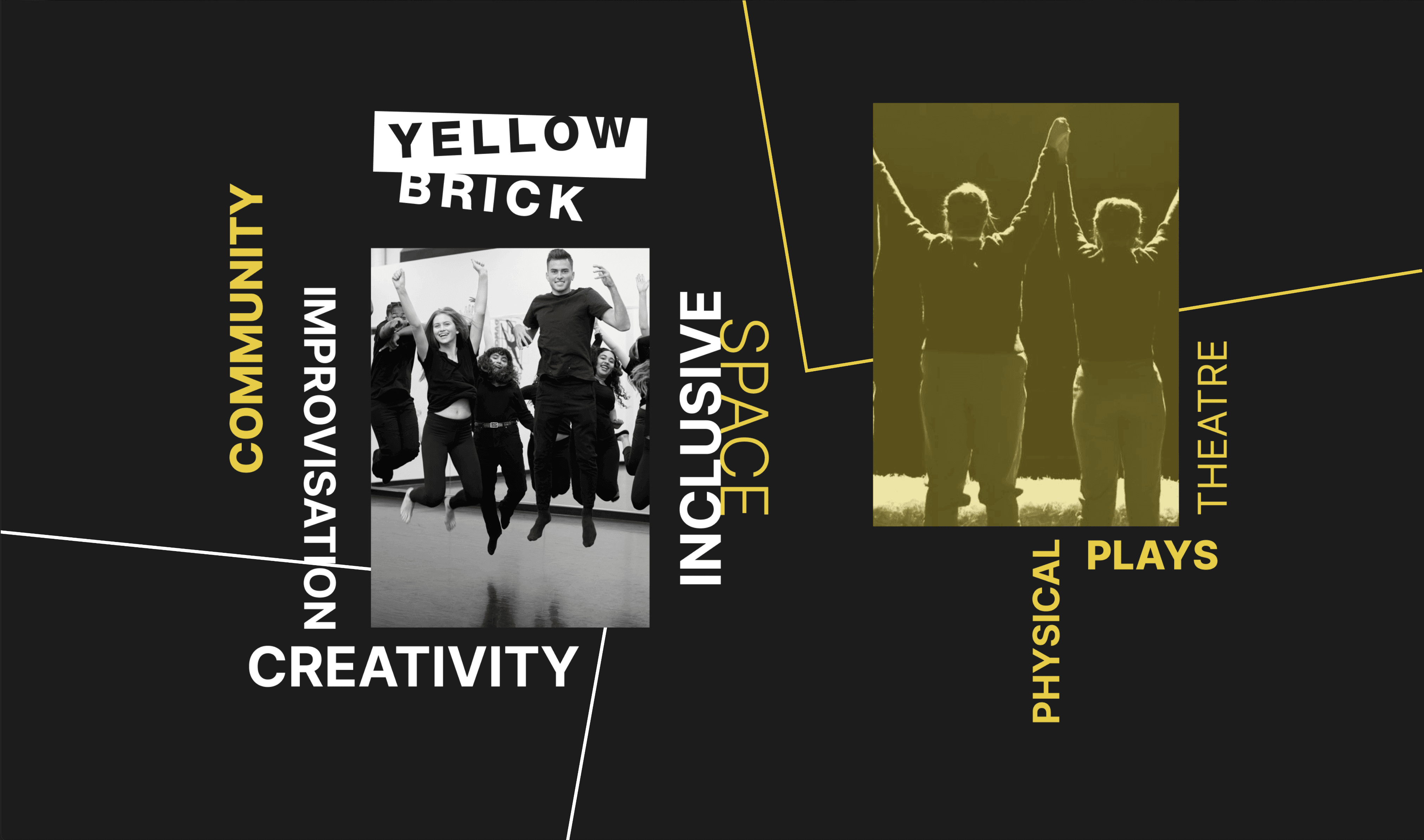
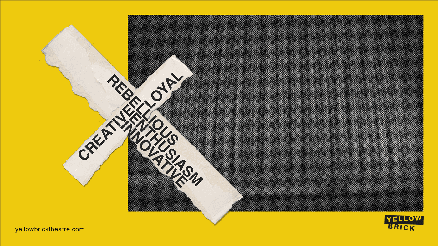
Through research and positioning workshops, we identified three core principles that guided the creative direction: playfulness, confidence, and movement.
These ideas became the foundation for every design and communication choice. The brand was built to celebrate the artistic process and the energy that happens when creativity meets collaboration.
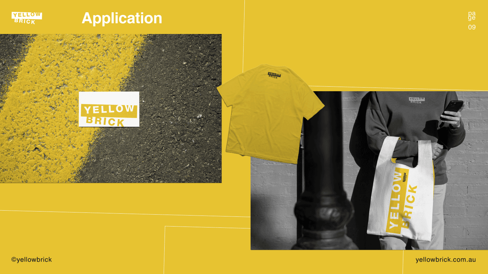
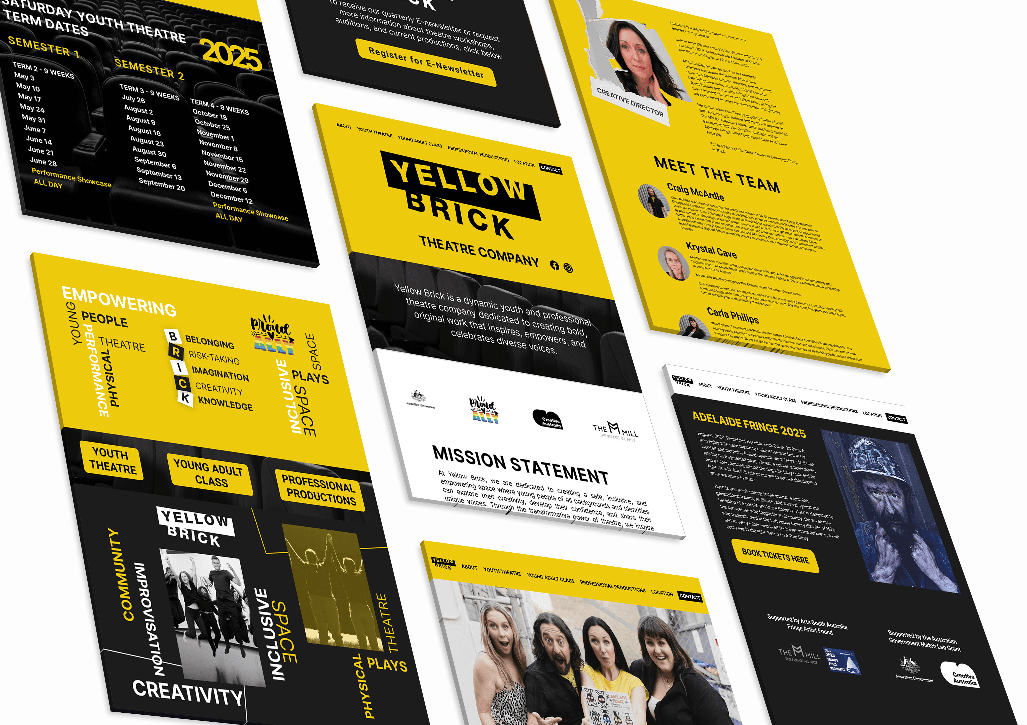
Visual Identity
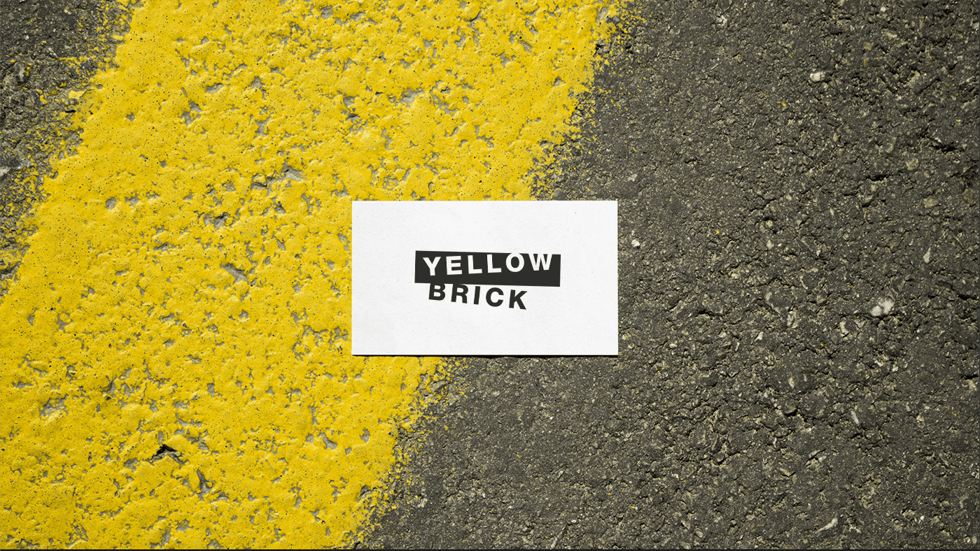
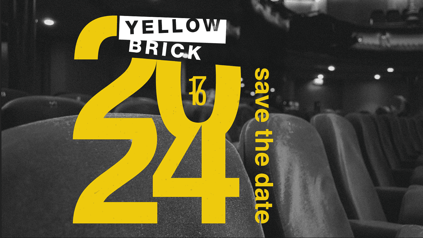
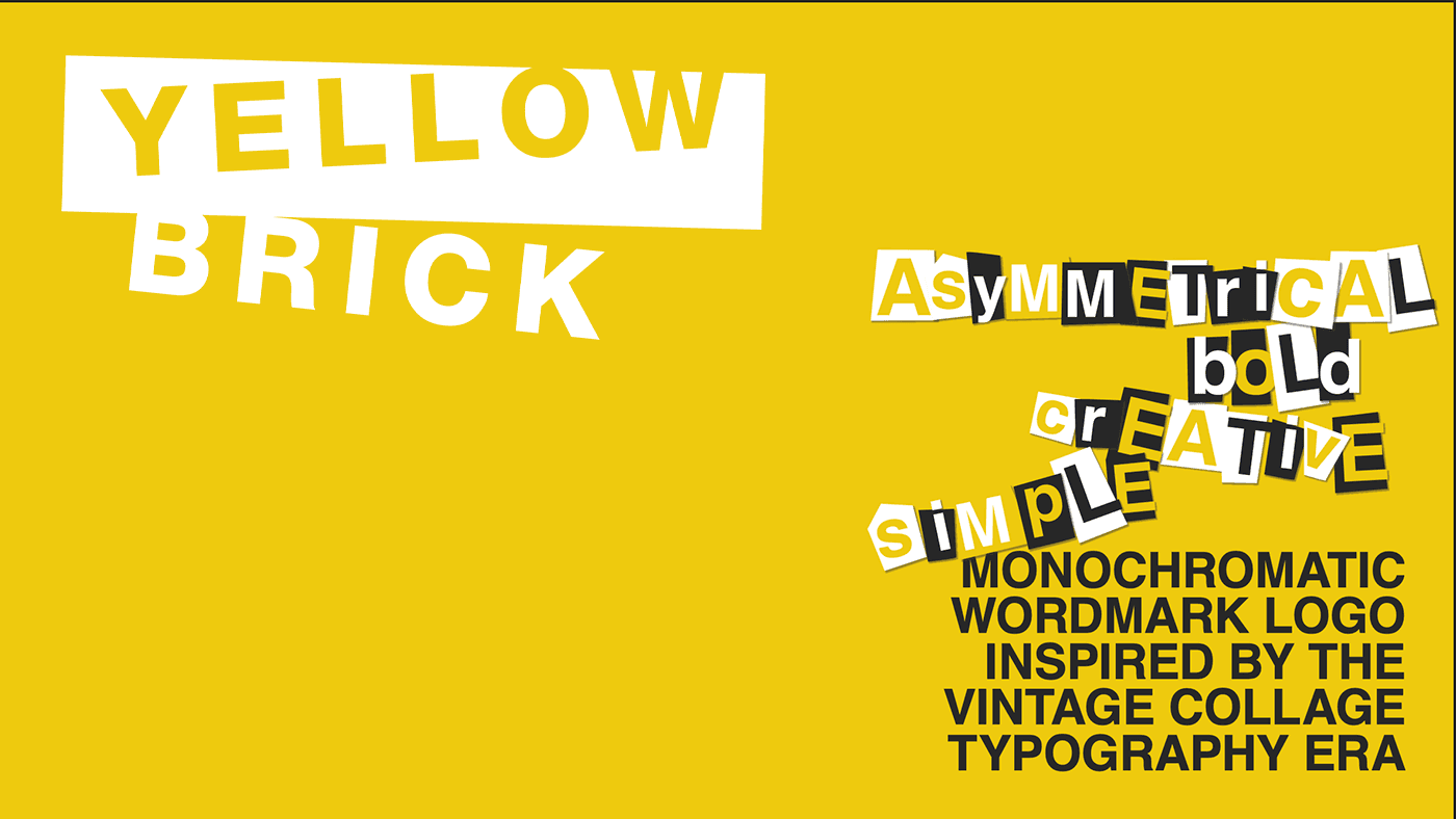
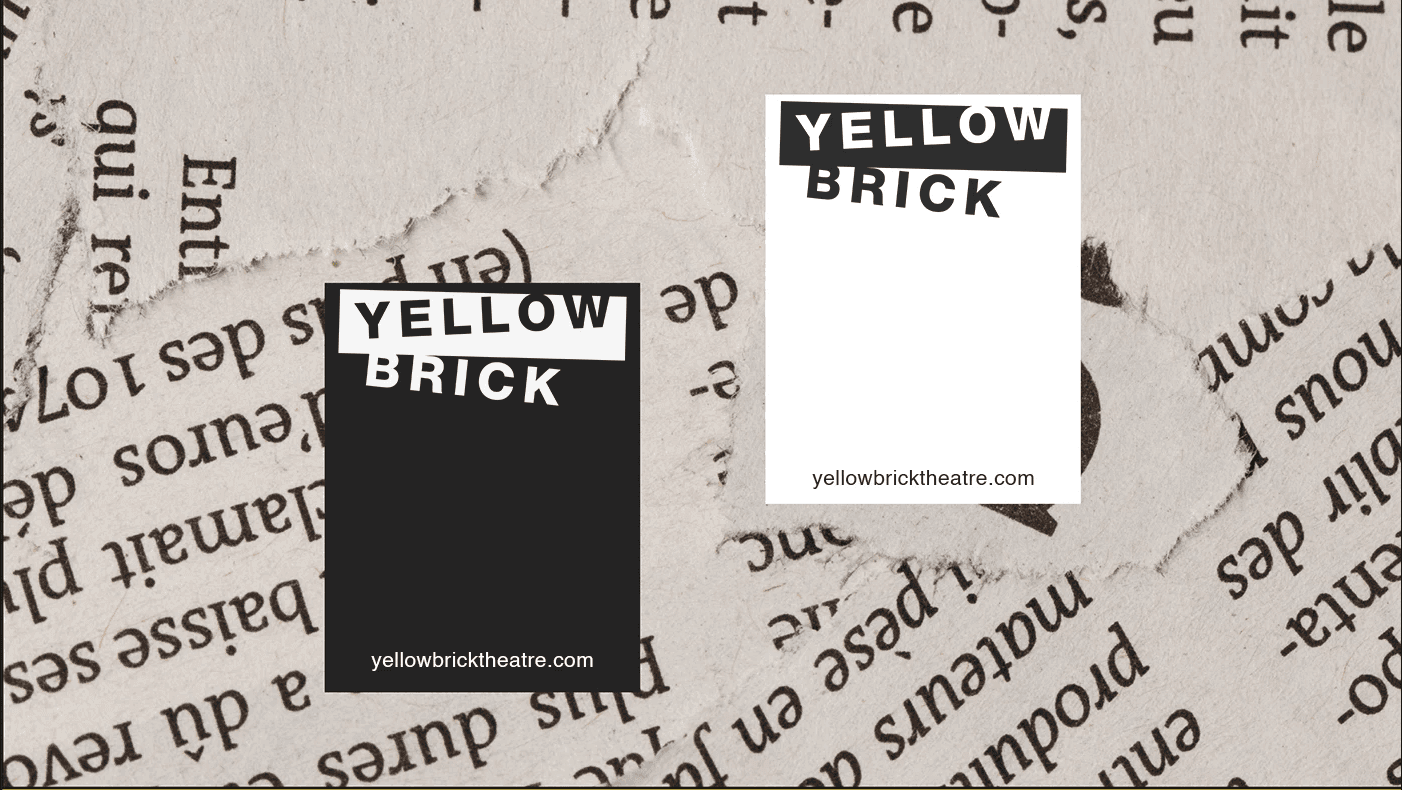
Logo
The logo was designed to feel expressive and full of personality.
The cut-out letterforms and stacked layout bring a sense of rhythm and play, capturing the feeling of stage movement. The yellow block creates structure while adding warmth and energy, turning a simple wordmark into a visual performance.

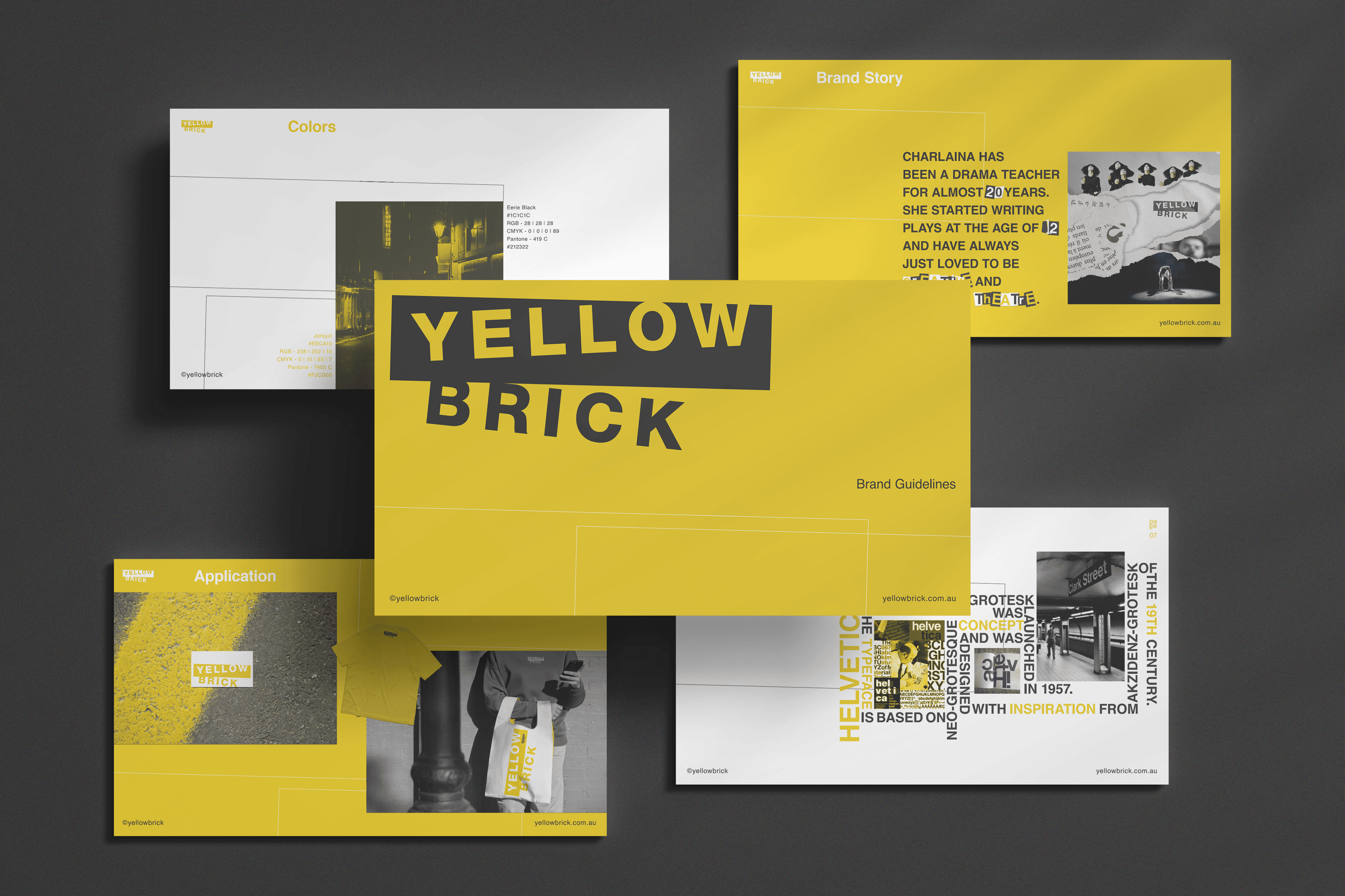
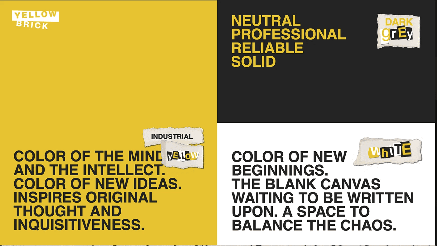
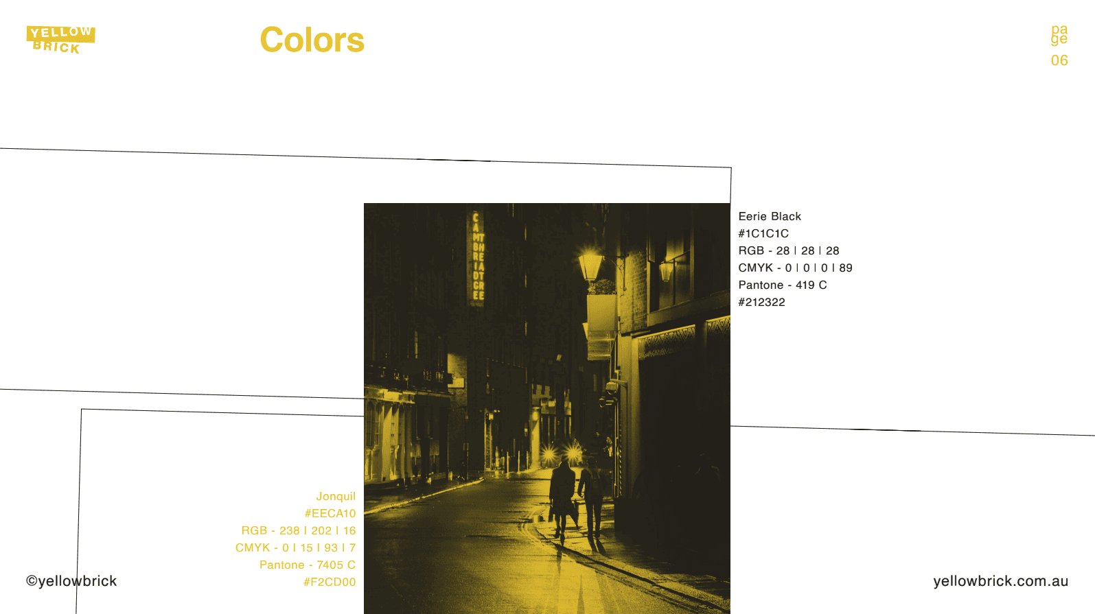
Colour Palette
The colour system is bold and confident.
Jonquil Yellow represents creativity, warmth, and optimism.
Eerie Black brings balance and sophistication.
Together, they create a powerful visual contrast that feels both artistic and grounded, ensuring the brand stands out across print, digital, and stage applications.
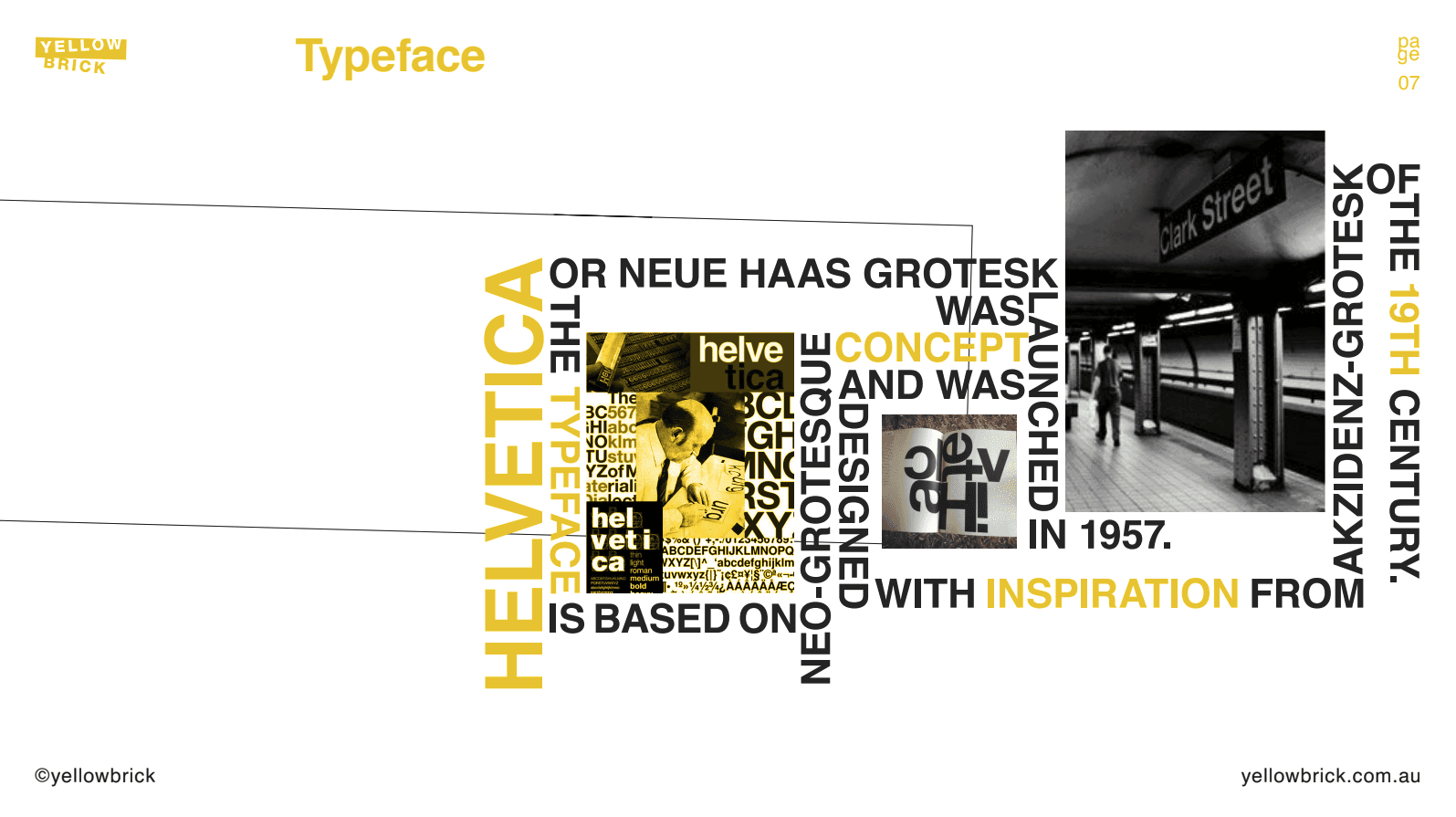
Typography
Typography is designed to support the same sense of character found in the performances themselves.
Strong uppercase lettering in the logo establishes presence and confidence, while clean, modern sans-serif fonts are used for headlines and body text to maintain clarity and professionalism.
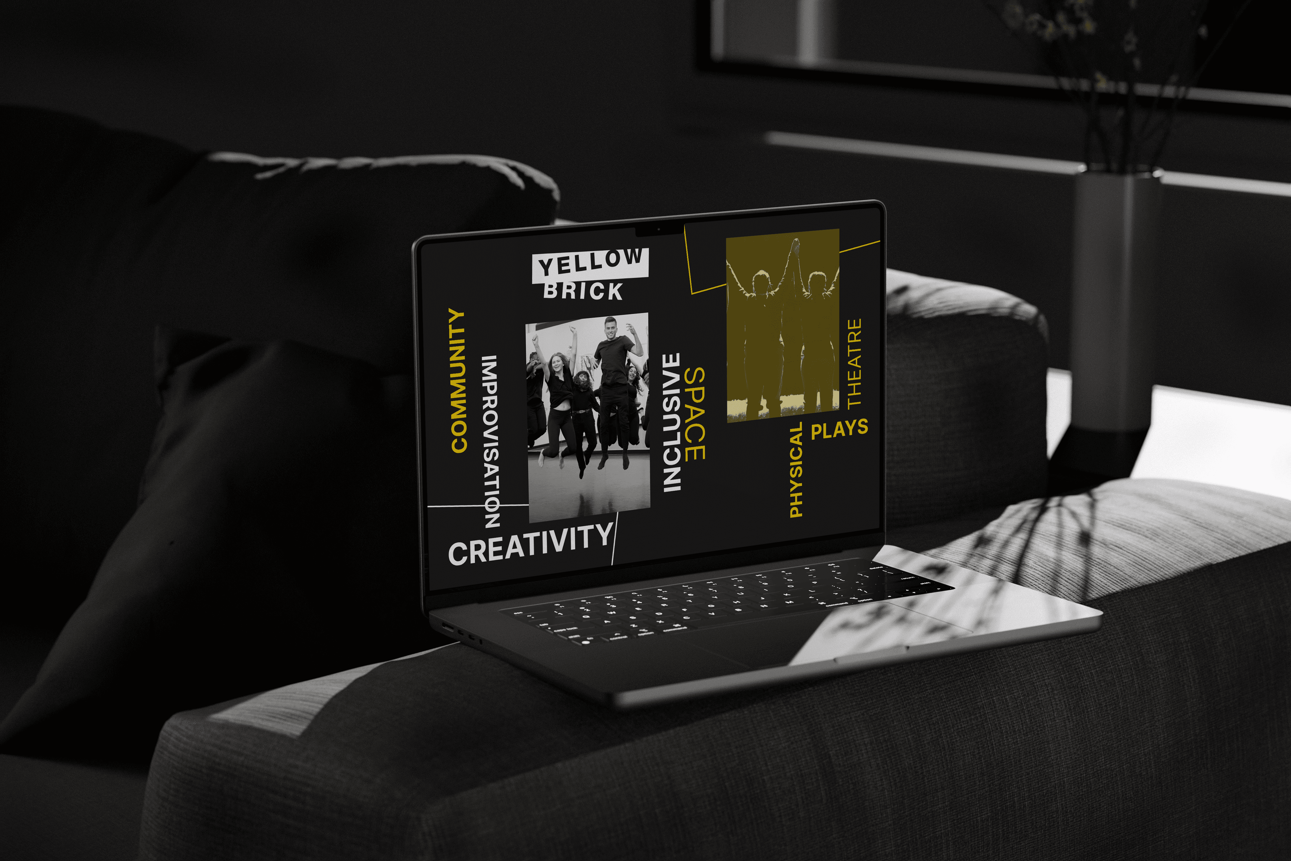
Imagery
Photography and design treatments focus on emotion, light, and storytelling.
The imagery captures moments of performance, rehearsal, and connection between actors and audience. Every visual reinforces the sense of movement and creativity that defines Yellow Brick Theatre.
Outcome
The rebrand gave Yellow Brick a confident and memorable identity that feels alive and unmistakably theirs.
It reflects who they are — a company built on creativity, courage, and connection — while giving them the clarity and consistency they need to grow.
Since launching the new identity, Yellow Brick has secured the Australian Government’s Match Lab grant, sold out their debut show, and won the Inspace Award.
Today, they stand as one of Australia’s most exciting emerging theatre companies, ready to take their story to a national audience.

Not sure if Koollab is the right fit? Let’s chat.
We’ll answer all your questions and give you an honest assessment on if we can add substantial value to you.

